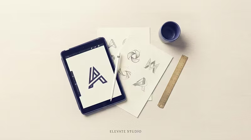


Why most creator logos fail (and how to fix it in one pass)
Been designing logos for a while now, and the same mistake shows up over and over with creators launching new brands/communities: they treat the logo like an afterthought — a Canva template slapped on at the last minute before launch day.
Here's the problem with that: your logo is the first trust signal anyone sees. Before they read your pitch, see your pricing, or check your reviews — they see your mark. If it looks generic, people subconsciously assume the product is generic too.
A few things that actually move the needle:
Simplify until it hurts. If you can't recognize it as a tiny favicon, it's too complex.
Pick ONE distinct shape or letterform and build around it — don't combine five ideas into one mark.
Color should do the differentiation, not add more shapes.
Test it in black and white first. If it doesn't work in one color, it won't work in five.
Started Logo.Co because I kept seeing solid creators undersell themselves with weak branding. If you're launching something new and want a mark that actually earns trust on first glance, happy to help — custom concepts, fast turnaround, real revisions until it's right.