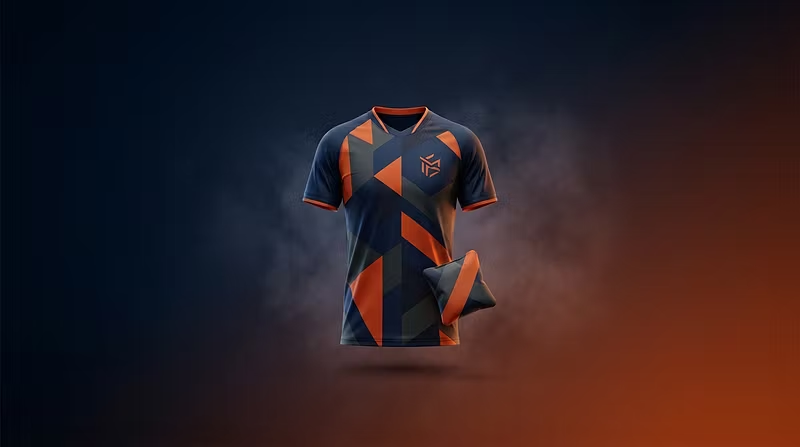


3 things that make or break a custom jersey/cornhole design (from someone who prints them)
I've been building GYS Designs around one thing: taking someone's idea and making it real on a jersey, a cornhole board, or a set of bags. A few things I've learned that save people money and headaches before they order a custom piece anywhere:
1. Vector beats photo, every time. If your logo or artwork is a screenshot or a low-res photo, it'll come out blurry or pixelated once it's blown up to jersey or board size. If you don't have a vector file, that's fine — just say so, a clean redraw is usually quick.
2. Contrast matters more than color count. Two colors with strong contrast (navy/gold, black/white, red/white) almost always look sharper at a distance than five colors crammed together. Cornhole boards especially get viewed from 20+ feet away — bold and simple wins.
3. Say the 'why' not just the 'what'. Instead of "make it look cool," tell me the story — team name, mascot, colors that matter to you, an inside joke for a bag design. The best pieces I've made came from people who gave me context, not just a color hex code.
If you're working on a custom jersey, cornhole set, or a background design and want a second opinion before you commit to printing anywhere, drop it below — happy to give honest feedback.