Mayar Studio

Premium design & branding agency. We craft bold identities, logos, and visual systems that make brands unforgettable.
Los Angeles, US
Created byProfile pictureMohib Mehraban
1 joined
Profile picture
Mohib MehrabanProfile picture@mehraban·Apr 23

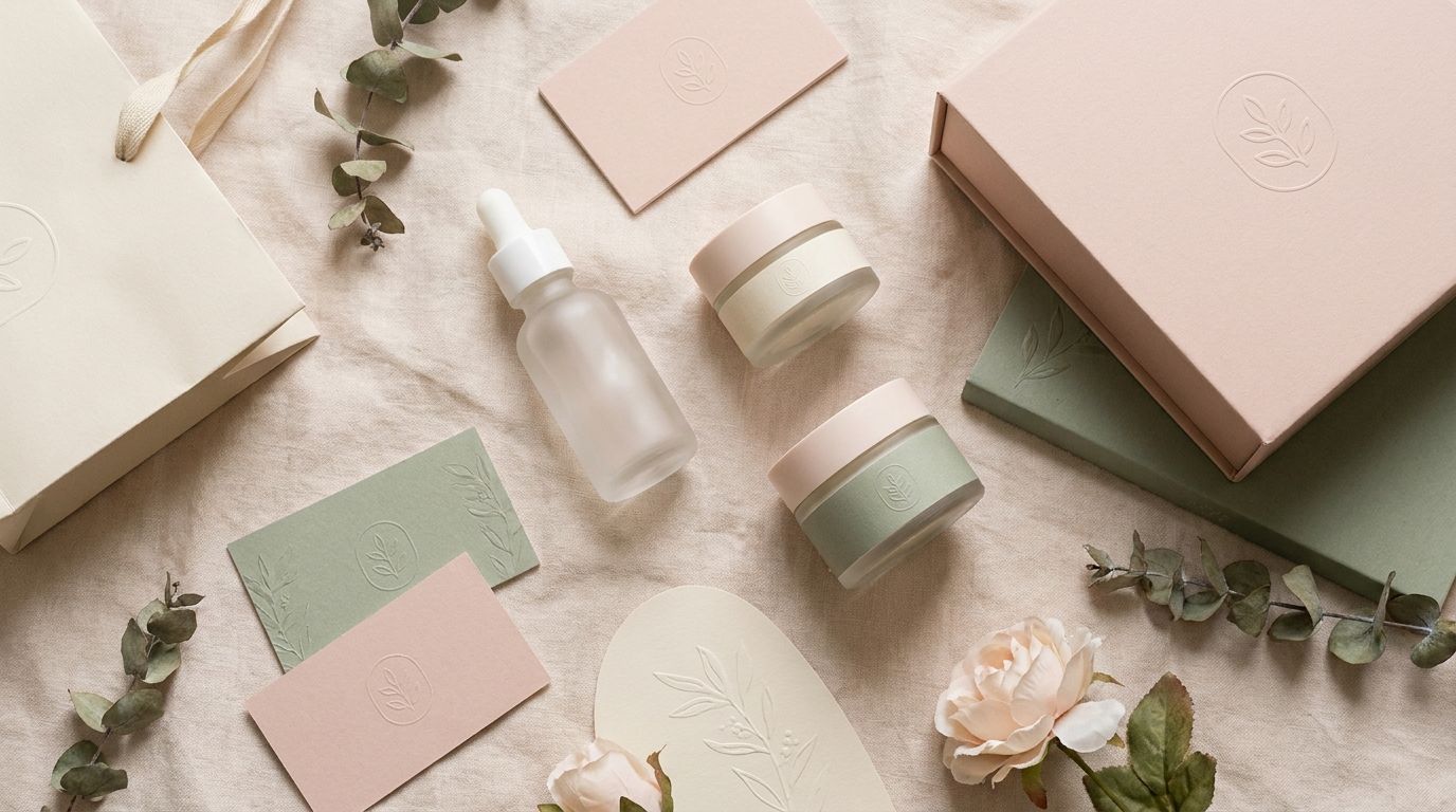
Brand Identity: Botanical Skincare 🌿

Client: Small-batch skincare brand selling through Etsy and Instagram, ready to go DTC.


The challenge: Their existing brand looked homemade. Needed to compete with brands like Glossier and Aesop without a massive budget.


What I delivered:

  • Elegant minimalist logo with botanical line illustration

  • Soft, elevated color palette: blush pink, sage green, cream

  • Product packaging design (boxes, labels, dropper bottles)

  • Business cards and thank-you cards for orders

  • Social media template kit (Stories, Reels covers, posts)


Result: Average order value went up 40% after rebranding. Customers perceive higher quality when the packaging matches the product.


Good design isn't a luxury — it's an investment that pays for itself.
file_5ElFhD50I2iqZ
Profile picture
Mohib MehrabanProfile picture@mehraban·Apr 23

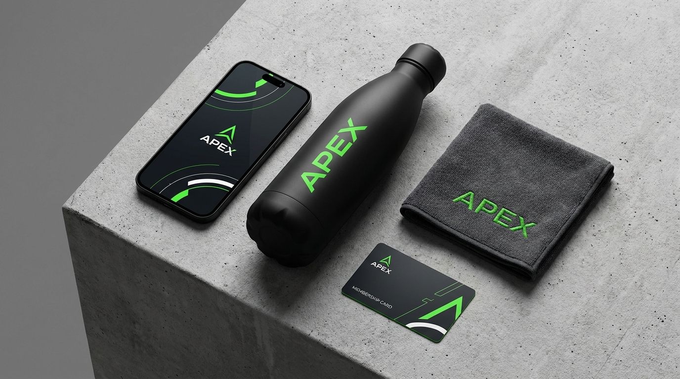
Brand Identity: APEX Fitness 💪

Client: Fitness coach launching an online training app and merch line.


The challenge: Wanted to stand out in a saturated fitness market dominated by red-and-black "BEAST MODE" branding.


What I delivered:

  • Bold geometric logo that works at any size (app icon to billboard)

  • Color system: matte black, electric green, white — premium but energetic

  • App UI brand guidelines

  • Merch mockups (water bottles, gym towels, hoodies)

  • Complete brand guidelines document


Result: The client's app downloads doubled in the first month because the brand looked legit from day one. First impressions matter.

file_otQmIzAWShGa2
Profile picture
Mohib MehrabanProfile picture@mehraban·Apr 23

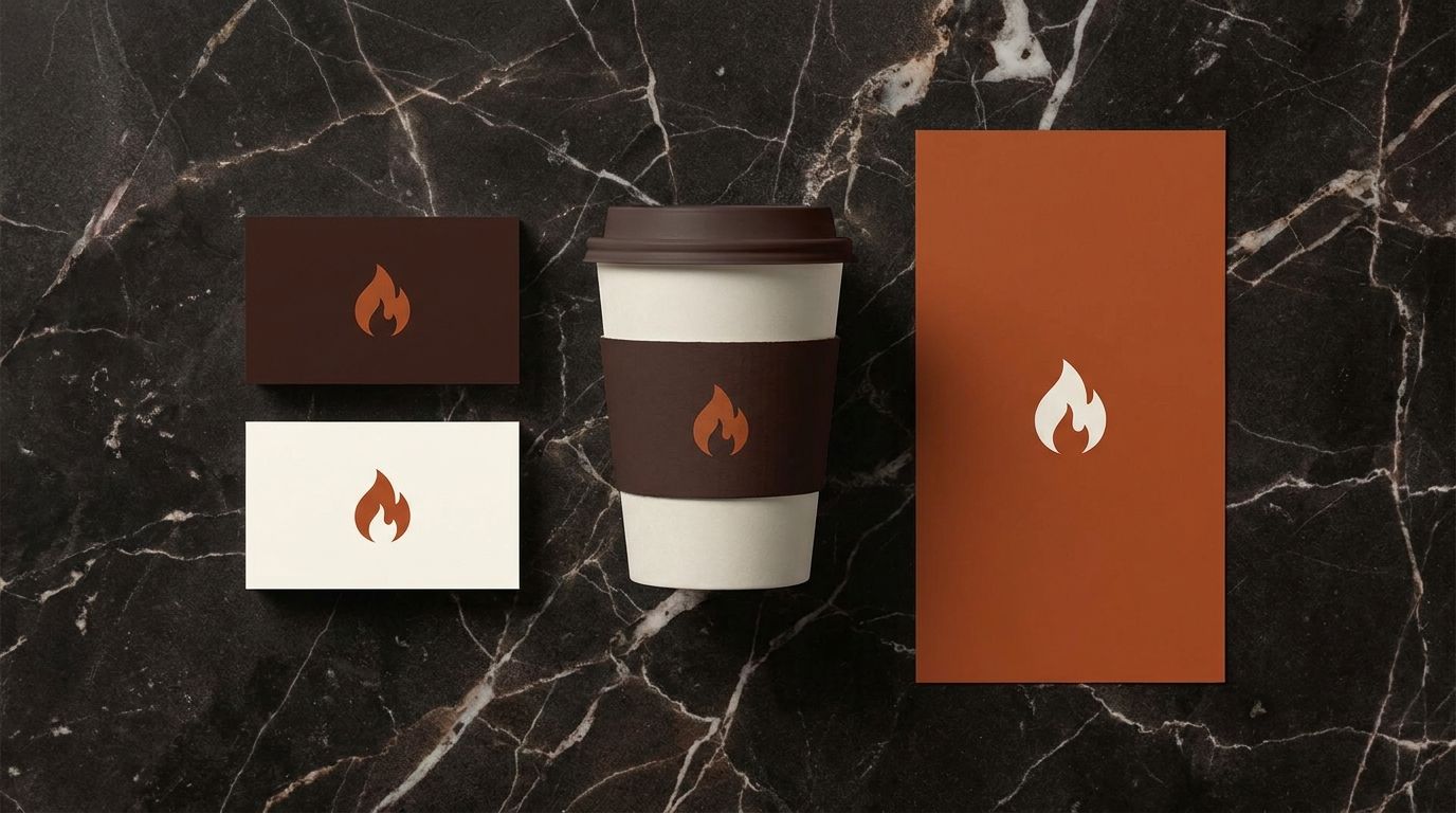
Brand Identity: Ember Roast ☕

Client: Specialty coffee roaster expanding from farmers markets to a brick-and-mortar location.


The challenge: They had a hand-drawn logo on a napkin and zero brand consistency. Needed to look premium enough to justify $7 lattes.


What I delivered:

  • Custom logo mark (flame icon that doubles as a coffee bean)

  • Full color palette: deep brown, burnt orange, cream

  • Typography system for menus, signage, and packaging

  • Branded cup sleeves, business cards, and menu templates

  • Social media templates for Instagram


Result: The client said customers started asking if they were a franchise because the branding looked so professional.


This is what a $499 brand identity package looks like.

file_7IsevZCe4SsCz
Profile picture
Mohib MehrabanProfile picture@mehraban·Apr 23

Why 90% of new brands look the same (and how to actually stand out)

I've designed brands for dozens of businesses and I keep seeing the same mistakes:


1. You picked your colors from a "trending palettes" Pinterest board

Everyone's using the same muted earth tones or neon gradients. Your brand ends up looking like a clone of 50 other businesses in your space.


2. Your logo is just your name in a trendy font

A wordmark can work — but only if the typography is custom and intentional. Slapping your name in Montserrat Bold isn't a brand identity.


3. You skipped the strategy

Colors and logos mean nothing without understanding WHO you're trying to attract. A luxury coaching brand shouldn't look like a Gen-Z streetwear label.


The fix is simple: Start with your audience, not your aesthetic. Define who you're talking to, what they value, and how you want them to feel. The visuals come last.


I build full brand identity systems at Mayar Studio — logo, color palette, typography, guidelines, and social templates. Everything you need to look like you've been in business for years, even if you launched yesterday.