
MonteVera Design Studio

Professional architectural design commissions — 2D & 3D plans for residential, commercial, and institutional projects. From exteriors and in...
Tarlac City, PH
Created byProfile pictureYwengz
2 joined
Profile picture
YwengzProfile picture@ywengz·Apr 24

Small Cafe Design: Why Most Layouts Waste 30% of Their Space

I've seen it too many times — a cafe owner gets excited about aesthetics, picks a gorgeous design, then opens to discover half the seats are unusable during peak hours.


Here's what actually matters in small commercial spaces:


The 60/40 rule.

In a cafe under 80sqm, roughly 60% should be customer-facing (seating, counter, display) and 40% back-of-house (kitchen, storage, staff area). Most owners flip this ratio and wonder why it feels cramped.


Counter placement is everything.

Your service counter should be the first thing visible from the entrance. It anchors the space and directs foot traffic naturally. If customers have to hunt for where to order, your layout is already broken.


Seating variety wins.

Don't fill the entire floor with 4-tops. Mix it: bar seating along windows for solo workers, 2-tops for couples, one communal table for groups. Different configurations serve different customer types and maximize occupancy.


The invisible line.

Draw a line from entrance → counter → seating → restroom. If that path has any bottleneck where customers block each other, redesign before you build.


Acoustics matter more than you think.

Hard surfaces (concrete, tile, glass) look modern but create an echo chamber. A 30-seat cafe can sound like 100 people. Strategic soft materials make a massive difference.


Planning a commercial space? I design floor plans and 3D visualizations that solve these problems before you spend a single peso on construction. Check out MonteVera Design Studio.
Profile picture
YwengzProfile picture@ywengz·Apr 24

How to Brief an Architect (So You Actually Get What You Want)

Hired a designer and got something completely different from what you imagined? 9 times out of 10, it's a briefing problem — not a design problem.


Here's how to write a project brief that actually works:


1. Start with function, not style.

Before you send Pinterest boards, answer: How many people will use this space? What activities happen here? What's the flow from entry to exit? Style comes later.


2. Set a realistic budget range.

You don't need an exact number, but "I have no budget" means "I haven't thought about this enough." A good designer can work within any range — but they need to know it upfront.


3. Share reference images WITH context.

Don't just send 50 photos. For each one, explain WHAT you like about it. "I like the natural lighting in this cafe" is 100x more useful than just a photo dump.


4. List your non-negotiables.

Every project has must-haves. "The kitchen must face east for morning light." "We need ADA-compliant pathways." "Storage is the #1 priority." Put these front and center.


5. Mention your timeline.

Rush jobs cost more and compress the revision process. If you have flexibility, say so — you'll get better results.


6. Be honest about what you don't know.

"I'm not sure if I need 2D plans or 3D renders" is a perfectly valid thing to say. A good designer will guide you.


I design custom 2D and 3D architectural plans for residential, commercial, and institutional projects. If you need help figuring out your brief, that's literally what I'm here for — MonteVera Design Studio.

Profile picture
YwengzProfile picture@ywengz·Apr 24

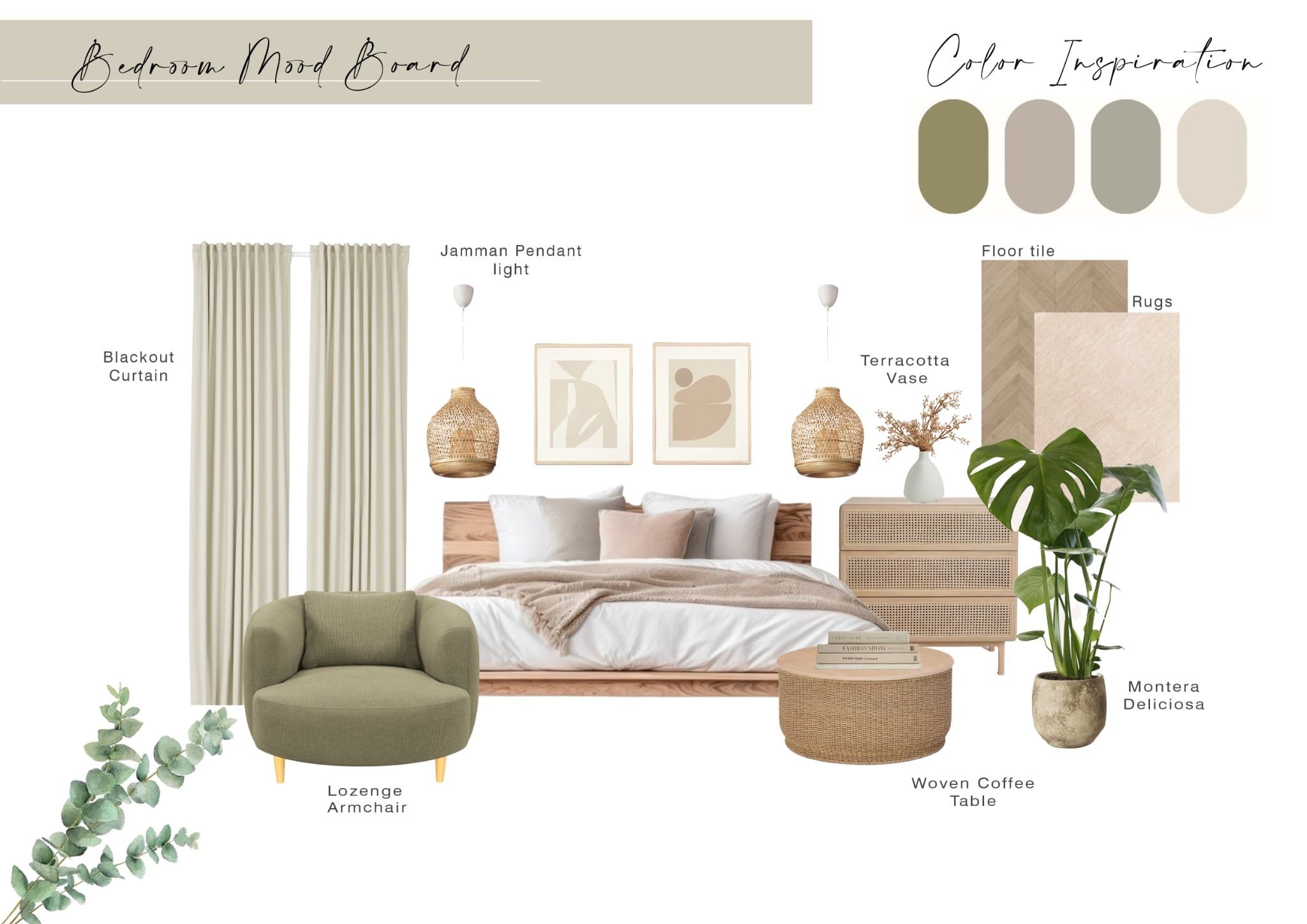
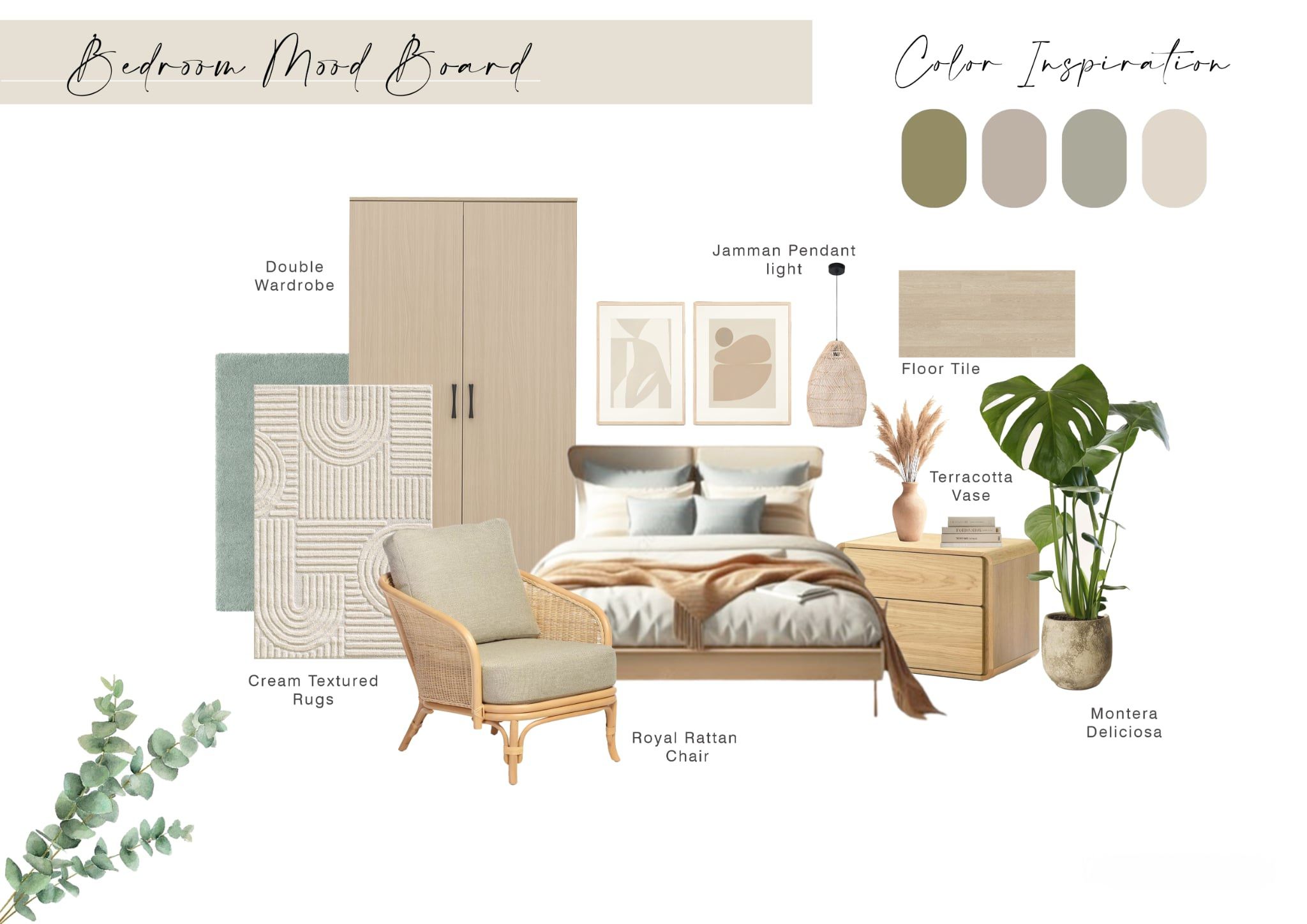
A calm and cozy Scandinavian-style bedroom mood board 🤍

file_tdsIuM9kyR3ij
file_BxY8KepJDHu6Y
Profile picture
Clash Clan@cland7·Apr 24

Can you offer any different interior style?

Profile picture
YwengzProfile picture@ywengz·Apr 24

5 Things Most People Get Wrong When Planning a Space

As someone who designs architectural plans — from residential homes to cafes and office layouts — I keep seeing the same mistakes. Here's what to avoid:


1. Ignoring traffic flow.

Your floor plan might look clean on paper, but if people bump into each other just trying to get to the bathroom, it's a bad design. Always map out how people move through a space first.


2. Overcomplicating the facade.

More details ≠ better design. The best exteriors are intentional — every material, window placement, and roofline serves a purpose.


3. Forgetting natural light.

Nothing replaces proper window orientation. A well-lit cafe or living room feels 10x more inviting.


4. Designing for aesthetics, not function.

That open-concept commercial space looks amazing in renders — until there's no storage, no privacy, and terrible acoustics. Form follows function.


5. Skipping the 3D visualization.

2D plans are essential, but seeing your space in 3D before construction saves you from expensive mistakes.


If you're planning a project — residential, commercial, institutional — I design custom 2D and 3D architectural plans. Check out MonteVera Design Studio.