

Why most print-on-demand tee brands look cheap (and how to avoid it)
Started a POD tee brand recently and spent way too long figuring out why most POD merch looks... off. A few things that actually move the needle if you're doing this too:
1. Heavyweight cotton or nothing. Anything under 180gsm feels like a free conference shirt. Buyers can tell in the photos even before it arrives.
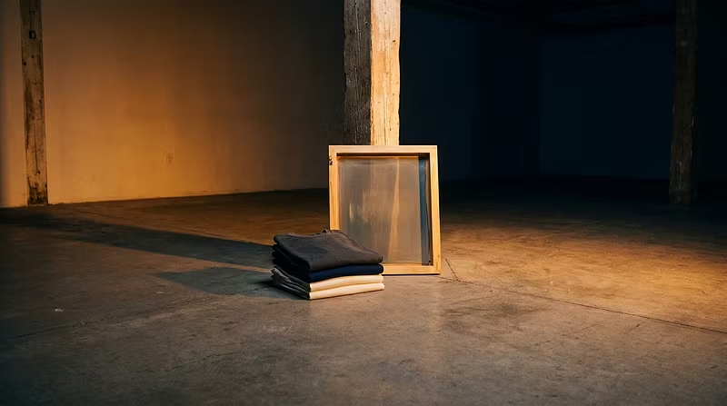
2. Screen print > DTG for bold graphics. DTG is convenient but the colors look washed out and the hand-feel is stiff. Screen printing costs more per unit but the finish is what makes people repurchase.
3. Scarcity isn't a gimmick, it's inventory management. Running numbered, limited drops instead of an always-available catalog does two things: it forces you to actually sell out (proving demand) and it gives buyers a reason to check back instead of window shopping once and leaving.
4. Your product photo is doing 90% of the selling. One dramatic, well-lit shot of the actual garment beats five flat-lay stock-looking images.
Building this out as a series of small, limited drops rather than a big catalog launch — feels more honest about what a one-person operation can actually fulfill well. Happy to answer questions if anyone's building something similar.