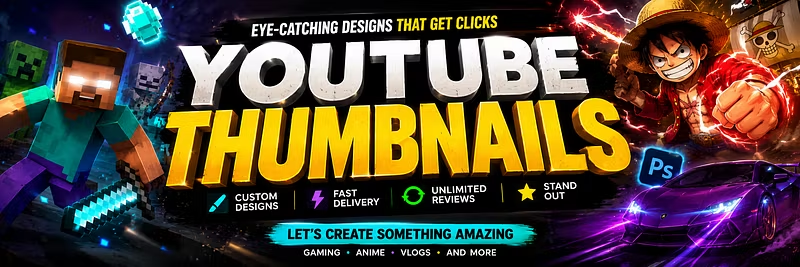


Why 90% of small YouTubers lose views before anyone even clicks
I've designed thumbnails for creators going from 1K to 50K subs, and the pattern is always the same: the video is good, the title is fine, but the thumbnail kills the click.
A few things I see over and over that quietly tank CTR:
Too much text. If someone can't read your thumbnail in 0.5 seconds on a phone screen, it's too busy. 3-5 words max.
No focal point. Your eye should land on ONE thing first — a face, an object, a number. If everything competes for attention, nothing wins.
Weak contrast. Thumbnails compete against every other video on the page. If your colors blend into YouTube's white/dark UI, you lose before the click.
Copying big creators exactly. What works for a 2M-sub channel with brand recognition doesn't work for a channel people don't know yet. You need to sell the video, not the brand, first.
The fix isn't complicated — it's a design problem, not a content problem. I've been doing graphic design for 5 years and now focus specifically on YouTube thumbnails for smaller creators (1K-50K subs) who don't have a designer yet. If you want a second pair of eyes on your thumbnails, happy to chat.