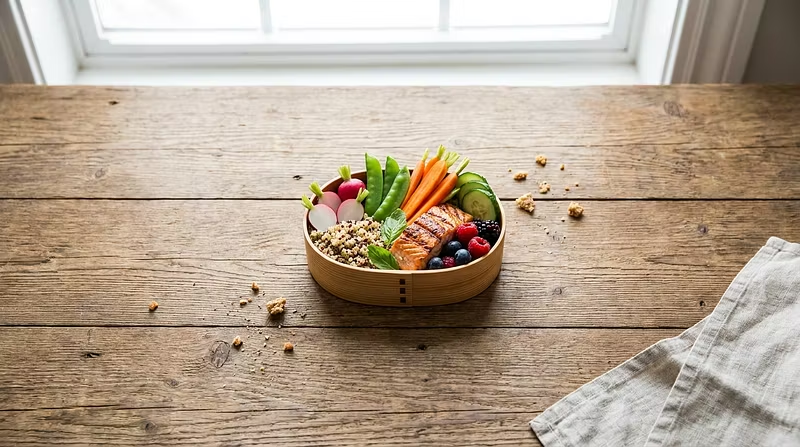


The 3-Zone Method: How to Design a Lunch That Actually Looks Good
Most "healthy lunches" fail for one reason: they're just sad piles of food thrown in a container. Here's the free version of the framework we teach beginners inside Bento Blueprint.
The 3-Zone Plate Method
Split your container into three zones — don't overthink ratios, just make sure all three show up:
Zone 1: Anchor (30-40%)
Your protein or main carb — grilled chicken, baked tofu, a grain like quinoa or rice. This is what makes the lunch filling.
Zone 2: Color (30-40%)
Vegetables or fruit, ideally 2+ colors. Color = nutrients AND visual appeal. Think roasted carrots + purple cabbage, or cucumber + cherry tomatoes.
Zone 3: Texture (20-30%)
Something crunchy or creamy that contrasts the rest — nuts, seeds, a dip, pickled veg, or a sauce drizzle.
Why this works
It forces balance without counting macros
It's visually intuitive — 3 zones = automatically looks composed instead of chaotic
It scales to literally any cuisine or dietary preference
Try it this week
Pick one lunch. Before you pack it, ask: "What's my anchor, my color, and my texture?" If you're missing one, you'll notice immediately — and that's the fix.
If you want the full system (container selection, color theory, batch prep for the week, plating walkthroughs, and a weekly design challenge), the full beginner course is linked on our page. Would love to see what you build either way — drop a photo of your next lunch below 👇