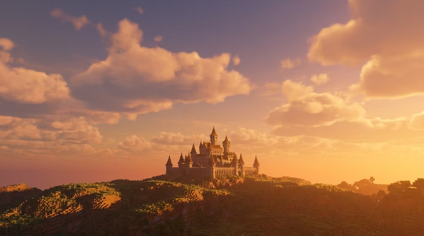
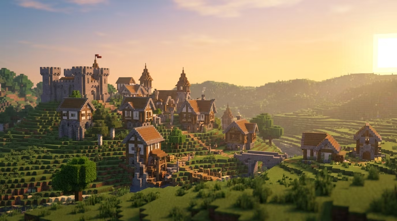
5 block palette mistakes that make your Minecraft builds look amateur
Most builders plateau at the same spot: their shapes are fine, but their builds still look flat and boring. 9 times out of 10, it's the palette.
Here are the 5 most common mistakes I see:
1. Using only one shade of a material
Stone brick walls look 10x better when you mix in cracked stone bricks, andesite, and cobblestone. Texture variation is what makes a wall feel real.
2. No contrast between structural elements
Your walls, trim, and roof should be in different color families. Dark oak trim on spruce walls with a deepslate roof? Chef's kiss. All oak everything? Flat.
3. Ignoring the "warm vs cool" rule
Warm blocks (wood, terracotta, copper) and cool blocks (stone, prismarine, ice) create natural visual tension. Mix them intentionally.
4. Forgetting about accent blocks
Lanterns, flower pots, banners, trapdoors — small detail blocks break up large surfaces and add life. A medieval house without window boxes and hanging lanterns feels empty.
5. Not testing palettes in a flat world first
Build a 5x5 sample wall before committing to a 200-block castle. Saves hours of pain.
I break down advanced palette theory, terraforming techniques, and large-scale building strategies inside BuildVault. If you're past the "dirt house" phase and want to build stuff that genuinely impresses people, come check it out.