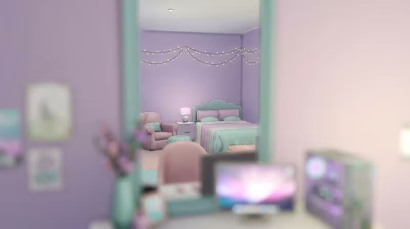


Why your Sims 4 builds look generic (and how to fix it)
No shade — but most Sims 4 lots feel the same. Same open floor plan, same Maxis furniture, same beige walls.
The issue isn't talent. It's reference. Real interior design has so many micro-decisions that are impossible to replicate without studying the source: how light falls on a built-in shelf, the scale difference between pieces, the intentional "imperfect" clutter.
Here's what I do for every build commission:
1. Anchor with one statement piece
Every room needs one thing that makes you stop. A fireplace, an arch, a big window. Build around that — not the other way around.
2. Mix furniture scales on purpose
Pairing a chunky sofa with a spindly side table creates visual tension. Rooms where everything is the same scale look flat.
3. Think about foot traffic
Where does a sim naturally walk? Leave that path clear. Push the interesting stuff to the edges. It makes rooms feel lived-in.
4. CC is a layer, not the foundation
Custom content looks best when it enhances a well-thought-out build. A full CC room with no underlying design logic still reads as messy.
If you want a build or custom skin done right — commissions are open at whop.com/desimmer 💜