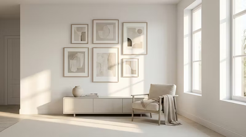


The 3 rules that make any gallery wall look expensive
Most gallery walls look like a Pinterest board threw up on a wall. Here's how to actually make yours look intentional:
1. Stick to 3 colours max.
Pick a palette before you buy a single frame. Cream, charcoal, and one accent tone (sage, dusty rose, warm brass). Every piece needs to live within that palette. No exceptions.
2. Use the 60/30/10 frame rule.
60% of your frames should be one material (e.g. natural oak). 30% a second material (matte black). 10% something unexpected — a clipframe, a floating shelf, a textile piece. This creates depth without chaos.
3. Start with one anchor piece, build outward.
Don't hang 8 prints at once. Place your largest piece first, slightly off-centre. Then add pieces around it like a constellation. Step back after every addition.
The difference between a €200 gallery wall and a €2,000 one isn't the price of the art — it's the curation.
I break down exactly where to source gallery-worthy pieces (without the gallery markup) inside The Curated Wall.