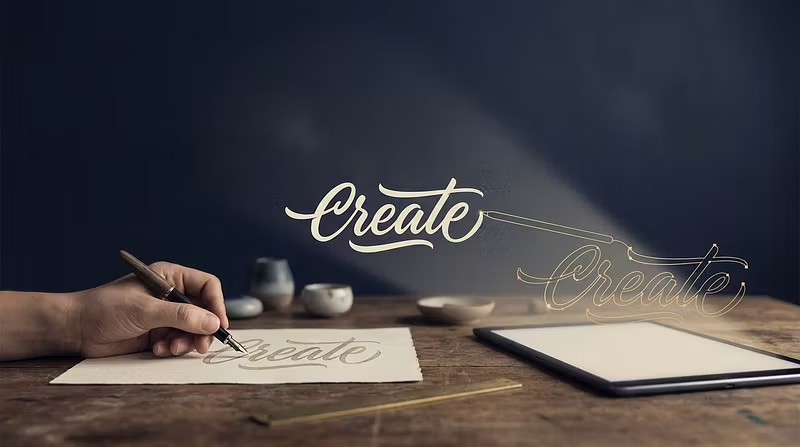


5 Mistakes That Ruin Your Hand Lettering When Converting to Vector
5 Mistakes That Ruin Your Hand Lettering When Converting to Vector
You spent hours — maybe days — perfecting a piece of hand lettering. The ink is crisp, the letterforms flow beautifully, and the composition is exactly right. Then you scan it, run it through auto-trace, and... it looks terrible. Bumpy curves. Lost details. Bloated file sizes. Letterforms that look like they were drawn by a robot having a bad day.
Sound familiar? You're not alone. Converting hand lettering to clean vector art is one of the most common pain points for lettering artists, and most of the frustration comes down to five avoidable mistakes. Let's break each one down so you can fix them for good.
---
Mistake #1: Scanning at Too Low a Resolution
The Problem
You scan your lettering at 150 or 200 DPI because that's what your scanner defaults to, or because you're trying to keep file sizes small. The scan looks fine on screen at first glance. But when you zoom in — or when the tracing algorithm tries to interpret it — everything falls apart. Edges look jagged, thin strokes disappear, and fine details like serifs, ink splatter textures, or hairline connections between letters turn to mush.
Why It Happens
Most scanners default to 150-300 DPI because that's sufficient for general document scanning. But hand lettering isn't a document — it's artwork with subtle details that exist at a level of precision that low-resolution scans simply cannot capture. When the tracing software processes a low-res scan, it has to guess where edges are, and those guesses are almost always wrong.
The Fix
Always scan at a minimum of 600 DPI. For especially detailed work — fine-point pen lettering, intricate flourishes, textured brush strokes — go to 1200 DPI. Yes, the files will be larger (a single letter at 1200 DPI might be 50-100MB), but storage is cheap and you can always downsample later. You cannot, however, add resolution that was never captured in the first place.
If you're using a phone scanner app like Adobe Scan or CamScanner, make sure you're capturing at the highest resolution setting available. Shoot in bright, even lighting (natural daylight near a window works great) and hold the phone directly above the work to minimize perspective distortion. Some apps have a "high quality" or "detailed" mode — use it.
Pro tip: Scan in grayscale or black-and-white mode, not color. This reduces file size without sacrificing the edge detail that matters for tracing.
---
Mistake #2: Skipping Threshold and Levels Cleanup Before Tracing
The Problem
You take your raw scan and feed it directly into the tracing tool. The result is noisy — the software picks up paper texture, pencil guidelines, smudges, and subtle variations in your ink that you didn't even notice. Your vector output has hundreds of extra shapes and stray paths that don't belong there.
Why It Happens
No scan is perfect. Even the best flatbed scanner on pristine white paper will capture some background noise. Your eyes are remarkably good at filtering this out — you look at the scan and see clean lettering. But tracing algorithms are literal-minded. They see every speck, every shadow, every micro-variation in paper color, and they faithfully trace all of it.
The Fix
Always run a threshold or levels adjustment before tracing. In Photoshop or GIMP, use Image > Adjustments > Levels (or Threshold) to push your blacks to pure black and your whites to pure white. You want a clean, high-contrast binary image with no gray areas.
Here's a quick workflow:
Open your scan in Photoshop/GIMP
Convert to grayscale if not already
Open Levels (Ctrl/Cmd + L)
Drag the white point slider left until the paper background is pure white
Drag the black point slider right until your ink is solid black
Check edges at 200-300% zoom — they should be crisp, not fuzzy
If needed, use the Threshold adjustment for an even cleaner binary result
Save as a high-quality PNG or TIFF (avoid JPEG — its compression adds artifacts that become noise in your trace)
This single step eliminates 80% of the "garbage in, garbage out" problems that plague auto-tracing. It takes 60 seconds and saves you 60 minutes of cleanup later.
---
Mistake #3: Using Auto-Trace Defaults Without Adjusting Settings
The Problem
You open Illustrator's Image Trace panel (or Inkscape's Trace Bitmap), hit the default preset, and accept whatever comes out. The result is either too simplified (lost details, rounded corners where there should be sharp points) or too complex (thousands of unnecessary anchor points, wobbly paths that follow every pixel edge).
Why It Happens
Auto-trace defaults are designed to be "good enough" for a wide range of images — photographs, logos, clip art, technical drawings. They're not optimized for hand lettering, which has unique characteristics: flowing curves with specific tension, sharp corners that need to stay sharp, stroke width variations that carry artistic intent, and fine connections between letters that must be preserved.
The Fix
Learn the key settings and adjust them for lettering. Here's what to focus on in Illustrator's Image Trace:
Threshold: Controls what the algorithm considers black vs. white. Start at 128 and adjust. Higher values capture more detail but also more noise.
Paths (Fidelity slider): This is the most important setting. Slide it toward "Accurate" for hand lettering. The "Smooth" end removes detail you want to keep.
Corners: Higher values preserve sharp corners in your letterforms. For most lettering styles, set this higher than default.
Noise: Sets the minimum area (in pixels) that gets traced. Increase this to ignore small specks without losing thin strokes. Start around 10-20px for 600 DPI scans.
Ignore White: Turn this ON. You almost never want the white background traced as a shape.
In Inkscape's Trace Bitmap:
Use the Brightness Cutoff mode for clean, pre-processed scans
Set the threshold to match your levels adjustment
Check Remove Background and Smooth Corners
Adjust Optimize to reduce unnecessary nodes while preserving shape
The golden rule: Run the trace, zoom to 400%, and compare the vector output against your original scan side by side. Every letterform should match. If curves are too smooth, increase fidelity. If paths are too jagged, decrease fidelity slightly or increase your noise filter.
---
Mistake #4: Not Optimizing Anchor Points After Tracing
The Problem
Your auto-trace produced a decent result, so you call it done. But when you zoom in, you notice your curves have 15 anchor points where 4 would do. The paths are bumpy — not the smooth, confident curves your hand drew. And the file size is enormous because every letterform is defined by hundreds of redundant points.
Why It Happens
Auto-trace algorithms work by following pixel edges, which means they place anchor points based on computational convenience, not artistic intent. A smooth curve that your hand drew in one confident stroke gets interpreted as dozens of tiny straight segments stitched together. The visual result is "close enough" at normal zoom, but falls apart under scrutiny.
The Fix
Post-trace optimization is not optional — it's where your vectors go from auto-generated to professional. Here's the workflow:
Simplify first. In Illustrator, select your traced paths and go to Object > Path > Simplify. Start with a high accuracy percentage (95-98%) and reduce until you see shapes changing. In Inkscape, use Extensions > Generate from Path > Simplify, or manually select nodes and use the "Delete Node" tool.
Smooth anchor points. Select individual anchor points and convert them from corner points to smooth points where appropriate. On curves, anchor point handles should flow through in a straight line, creating a continuous curve.
Align handles for consistent curves. The direction and length of your Bézier handles determine curve shape. For professional-looking letters, handles should generally be horizontal or vertical on key points (tops of curves, baseline intersections), and their lengths should be proportional to the curve segment they control.
Reduce point count intelligently. Ask yourself: does removing this anchor point change the shape? If not, delete it. A well-optimized letter 'O' might need only 4-8 anchor points. An auto-traced one might have 40.
Check file size. A well-optimized vector lettering piece should be surprisingly small — often under 100KB for a single word. If your file is several megabytes, you likely have too many points.
This step is the difference between vectors that scream "auto-traced" and vectors that look hand-crafted in the digital space. It's tedious at first, but as you develop the muscle memory, it becomes second nature — and it's where your artistic eye matters most.
---
Mistake #5: Exporting in the Wrong Format for the Use Case
The Problem
You finished your beautiful vector lettering and exported it as... a PNG. Or you sent a client an SVG when they needed an EPS. Or you uploaded an AI file to a stock site that only accepts EPS or SVG. The result: rejected submissions, frustrated clients, lost time re-exporting, or worst of all, rasterized artwork that defeats the entire purpose of vectorizing.
Why It Happens
Vector file formats are confusing, and different contexts demand different formats. Most lettering artists learn one export workflow and use it for everything, which works until it doesn't.
The Fix
Know the right format for every context:
SVG (Scalable Vector Graphics): The web standard. Use SVG for websites, digital products, Etsy digital downloads, and anywhere the artwork will be displayed on screen. SVGs are lightweight, scale infinitely, and can be styled with CSS. For lettering that will be used in web design, SVG is almost always the right choice.
EPS (Encapsulated PostScript): The print and stock licensing standard. Use EPS for stock sites (Shutterstock, Adobe Stock, Creative Market), print vendors, and client deliverables destined for print production. EPS files are universally compatible with professional design software. Save as EPS version 10 or later for broad compatibility.
AI (Adobe Illustrator): Use when your client or collaborator works in Illustrator and needs to edit the vectors. AI files preserve layers, appearances, and Illustrator-specific features. Not useful outside the Adobe ecosystem.
PDF (Portable Document Format): Great for client proofs and final deliverables that don't need editing. PDFs preserve vector data while being viewable by anyone. Use "Preserve Illustrator Editing Capabilities" if the recipient might need to extract vectors.
PNG (Portable Network Graphics): A raster format — use only when you specifically need a flat image at a fixed resolution. Good for social media previews, mockups, and quick shares. Export at 2x or 3x your target display size for crisp results on high-DPI screens. But remember: a PNG is not a vector. If you're exporting only PNGs, you've eliminated the primary benefit of vectorizing.
Quick reference:
Use Case | Format | Notes |
|---|---|---|
Website/app | SVG | Smallest file, infinite scale |
Stock licensing | EPS | Industry standard for stock sites |
Print production | EPS or PDF | Check vendor requirements |
Client editing | AI or SVG | Depends on their software |
Social media | PNG at 2x | Rasterized preview only |
Digital download product | SVG + EPS + PNG bundle | Cover all bases |
---
The Bottom Line
Converting hand lettering to vectors doesn't have to be painful. Most of the frustration comes from these five fixable mistakes. Nail the scan quality, clean up before tracing, dial in your trace settings, optimize your anchor points, and export in the right format — and your vectors will match the quality of your hand-drawn originals.
These are exactly the kinds of workflows we build, practice, and master inside the VectorCraft Studio 30-Day Lettering-to-Vector Cohort. If you're tired of fighting with auto-trace and want a repeatable, professional-grade process for turning your lettering into clean vectors, the cohort walks you through every step with hands-on assignments, peer feedback, and structured accountability.
Your hand lettering deserves vectors that do it justice. 🖊️➡️📐