Stock trading charts show you key data such as opening and closing price along with trading volumes. Here’s how to analyze stock trading charts!
Key takeaways
- Candlestick charts efficiently display opening, closing, high, and low prices using color-coded bodies and wicks.
- Support and resistance levels, identified through volume and price patterns, help predict where stocks may bounce or break.
- Institutions can manipulate breakouts through bull and bear traps, making independent technical trading inherently risky.
If you’re just getting into the technical trading game, it can be very easy to get overwhelmed by talk of patterns and breakouts. Reading stock charts can be a complicated endeavor, but the best-performing traders have narrowed it down to a very simple art.
So, if you want to take your first steps when it comes to reading stock charts, you’ve come to the right place! This guide is going to give you all the basics and put you in the best possible position to make full use of the technical trading tools and communities you can find on Whop.
Types of stock trading chart
The first thing to know about trading charts is that there are several types of them, each of which can give you different information or at least present information in a different way. Generally though, every chart attempts to visualize the trading activity of a stock across a trading period of your choosing, whether that’s 5 minutes, a single trading day, or a whole year.
On the horizontal X-axis of most charts you’ll find time, with intervals marked based on the period you’ve chosen to view. The vertical Y-axis meanwhile represents stock price, so any upward movement of the chart corresponds to the stock gaining value.
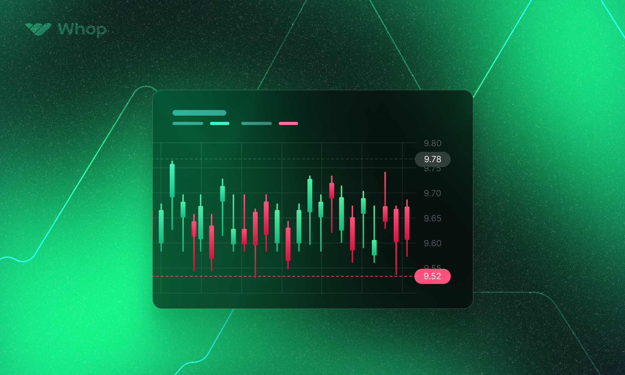
Candlestick chart
The candlestick chart is the most prevalent among stock trading charts and therefore needs priority mention. First and foremost, it helps you identify at a glance whether trading sentiment was bullish (positive) or bearish (negative) on the stock by the use of green and red coloration.
A candlestick chart is notable because it allows the presentation of several data points in an effective manner. A green candle “body” means that the stock has closed higher than it opened on your chosen time period, and vice versa—the top of a green candle’s body is therefore its closing price, while the top of a red candle’s body is its opening price.
The wicks and “shadows” of the candles, or the lines above and below the body, represent the movement of the price outside of the opening and closing range during the selected period. If a stock opens at $50, drops to $40, pumps to $200 and closes at $60, you’ll see a stubby green candle with a small shadow but a very tall wick.
| Green Candle | Red Candle | |
| Opening Price | Bottom of Body | Top of Body |
| Closing Price | Top of Body | Bottom of Body |
| Day’s High | Wick | Wick |
| Day’s Low | Shadow | Shadow |
If you see charts with black and white, or filled and hollow candle bodies, don’t panic—a black or filled candle is the same as a red candle, and a white or hollow candle is the same as a green one.
Line and bar charts
The candlestick chart is one of the most commonly used because it provides traders with a lot of information that’s easy to glean at a glance. Line and bar graphs are also widely used, but they’re subtly different from candlestick charts in a couple of key ways.
Line charts, for example, present an extremely simple graphical representation because it uses less information. If you’re after a more high-level view of a stock’s performance, you can use a line chart to track closing prices across time. You’ll find that many technical analysts swear by closing prices, and they therefore stick with line charts.
Bar charts, meanwhile, provide exactly the same information as a candlestick chart but display said information in a slightly different manner. Opening and closing prices are denoted by small horizontal lines instead of candle bodies, so choosing between a bar and a candlestick chart might simply come down to personal preference and what suits your eye better.
Volume
When you look at a stock trading chart, whether it’s a candlestick chart or one of the other types, you might also notice a bar chart running along the X-axis that looks a bit like a cityscape. This represents trading volume, with the taller bars showing you higher volume days.
Trading volume tallies the total amount of shares that change hands when orders are filled during the trading session. It can often be a complete illusion, such as when in 2005 a trader called Robert Simpson bought the entire stock of a company called Global Links.
Not only was Simpson somehow able to acquire more shares than were ever issued by the firm, he sat with the entire float of the company in his brokerage account and watched over the next two days as the exchanges somehow posted vast trading volumes in the stock.
Technical traders aren’t really interested in these systemic issues, because even if the actual trading volume on the exchange is purely phantom stock, it’s still possible to use those volume trends to make money.
There are two main things traders try to identify when analyzing trading volume:
#1. Support and resistance
One of the most frequently used concepts in technical analysis is the support and resistance levels on a stock. What this essentially comes to is that certain price points might see a large number of trades being made in a certain direction—you might see a stock bouncing against psychological price points like $100, for example, before establishing itself in either direction.
Support is simply a price point at which a large number of traders–or algorithms run by trading firms–are buying a stock, while a resistance represents a similar point at which a stock tends to see selling pressure. In either case, a significant volume of trades at these points is required to establish support or resistance.
If you have access to deeper levels of the stock’s order book, you might also be able to get an idea of what support and resistance there may be—just remember to watch out for tactics like order spoofing.
#2. Average daily volume
The total volume of trading on a single day can give traders an indication of how significant that particular trading session was in the greater scheme of things. It’s also useful for identifying patterns such as accumulation or distribution, which can set expectations for future movements.
Accumulation days are when the stock finishes in the green but also posts a higher volume than on the previous day. This suggests that institutions are accumulating shares, and it’s good news for the stock. The opposite scenario, with a falling price and higher volume than the previous day, is called a distribution day and suggests institutions are bearish on the stock.
Daily moving averages
DMA’s are a commonly used technical indicator, and come in the form of a line added to a stock chart representing the stock’s average price over the last however many days. The most commonly used one is the 50-day moving average, but different technical analysts might look to others from time to time.
When you plot a DMA on a stock chart, you might find that it tends to act as a support or resistance. You could argue that it’s a self-fulfilling prophecy, but that’s probably a good thing since it brings a higher level of confidence to a potential money-making trade you might make.
Commonly used indicators
Here are some things that you can look out for when analyzing charts and attempting to identify patterns of support and resistance:
#1. Weekly/monthly highs/lows
Thanks to various factors including the timing of options expiration, weekly and monthly highs and lows can be crucial to setting, or breaking, stock trends. Keep an eye out for supports and resistances at these price points.
#2. 50 DMA
We’ve mentioned the 50 DMA already, but it’s worth repeating given how many traders plot it and draw up their strategy accordingly. When a stock is performing well, the 50 DMA often acts as a consistent indicator of what the support level might be.
#3. Fibonacci retracement
Technical traders often overlay the key Fibonacci retracement levels over their stock charts, taking the absolute highs and lows of a given move and then drawing lines at 38.2%, 50%, and 61.8%. These might then show support and resistance levels.
#4. 100 DMA and 200 DMA
These are longer-term moving averages but can establish support and resistance levels over longer term trends. The 200 DMA especially isn’t used frequently but is held to a certain level of esteem by technical analysts.
Technical trading basics
Here are some other key concepts in technical trading, summarized at a glance. You don’t need these to read a stock chart, but they’re what a lot of technical traders are looking for:
#1. Channels
Traders often look for channels between support and resistance levels developing on the chart. These channels can be ascending and descending as well as sideways, and can provide opportunities to profit multiple times during a trend by buying at the bottom of a channel and shorting at the top.
#2. Breakouts
This happens when a stock literally breaks through support or resistance and out of a channel, solidifying the direction of a trend. Traders take this as a great indicator of future movement and tend to buy in fast, further lending power to the movement through volume.
#3. Wedges
Channels are formed by parallel support and resistance, but you might find these lines converging instead. This is called a wedge or a pennant and often signals that a shift out of the pattern is nigh.
#4. Bull and bear traps
We’ve already touched on the importance of institutions to the market and the fact that you can’t always trust the numbers thanks to various systemic issues. Unfortunately, these institutions also have billions in leverage and all the information at hand to move the market as and when they will.
Hedge funds and high-frequency trading houses (who can see your stop buy or stop loss orders) often engineer moves that signal a breakout, but then reverse the move to leave independent traders in the dust. This is one of the big risks of technical trading—it’s not just betting against the house, the house can also see your cards and draw whatever it wants to at will.
Key takeaways
A stock chart might look complicated, but it gets a lot easier when you understand that it’s trying to feed you a set of key data points in as efficient a manner as possible. The classic candlestick chart is one of the best examples of this, using color coding to show you the opening and closing prices of a stock as well as its highs and lows along with volume.
With all of this information at hand, you can begin to analyze the chart. Many traders look for different patterns such as channels and wedges, sniffing for breakouts. As varied as these signals and indicators can be, they’re all just factors of price and trading volume—an expression of when market participants are buying and selling the stock.
👉 If you want to dive deeper into the world of stock charts and technical trading, or get deeper insights into all of these signals and indicators, we’ve got just the thing for you! Whop.com’s trading page features all of the top Discord servers that you can join for access to the very best in trading intelligence.
🏆 Read next: Whop's Top 10 Best Trading Discord Servers