Boost your email marketing game with these awesome email newsletter examples. Learn from the best and start converting today!
Key takeaways
- Clean, minimalistic newsletter designs with white space make content easy to skim and improve engagement.
- Problem-solution framing builds trust with readers before presenting your product or offer.
- Breaking content into clear sections with strategic CTAs guides readers naturally toward conversion.
You know what they say: "The money is in the list," but if your email newsletters aren’t hitting the mark, that list might feel more like a lost opportunity.
For most marketers, the real struggle isn't just getting the email opened—it's keeping people hooked long enough to convert.
And let's be real, that's tough.
A recent study found that 30% of emails are glanced at for less than two seconds, while only 29% get more than eight seconds of attention.
If you’re struggling with email engagement, don’t worry. This blog will walk you through some standout newsletter examples that know how to grab attention and drive action. Let’s get started!
23 best email newsletter examples
1. MAC
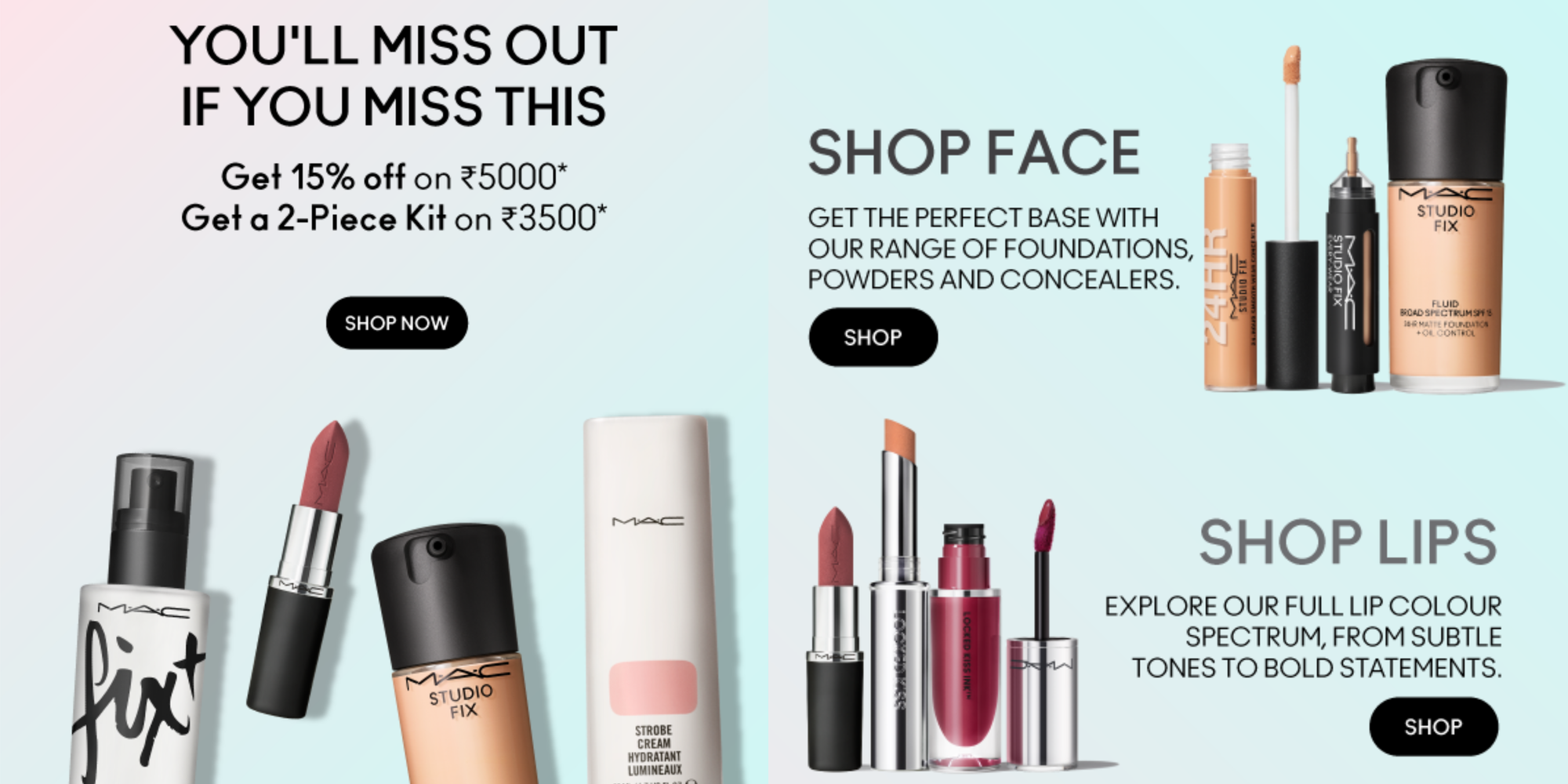
MAC newsletters are a true masterclass in grabbing attention and guiding readers smoothly through product offerings.
In this particular example, you immediately see a dynamic banner that screams urgency—a limited-time offer. It’s bold, eye-catching, and makes you want to act fast before you miss out. The combination of bold visuals and strong language is designed to pull you in immediately.
As you scroll, you’ll notice how the newsletter breaks down MAC’s products into neat sections—face, lips, and skin. It’s a smart way to keep things simple and focused, showing readers exactly what they need without overwhelming them. Each section is brief but packed with just enough detail to make you want to explore more, using clickable links that subtly guide you to shop-specific products.
High-quality images of MAC’s products paired with strategic CTA buttons go beyond displaying what the brand is selling, inviting you to engage and take action.
2. Huel
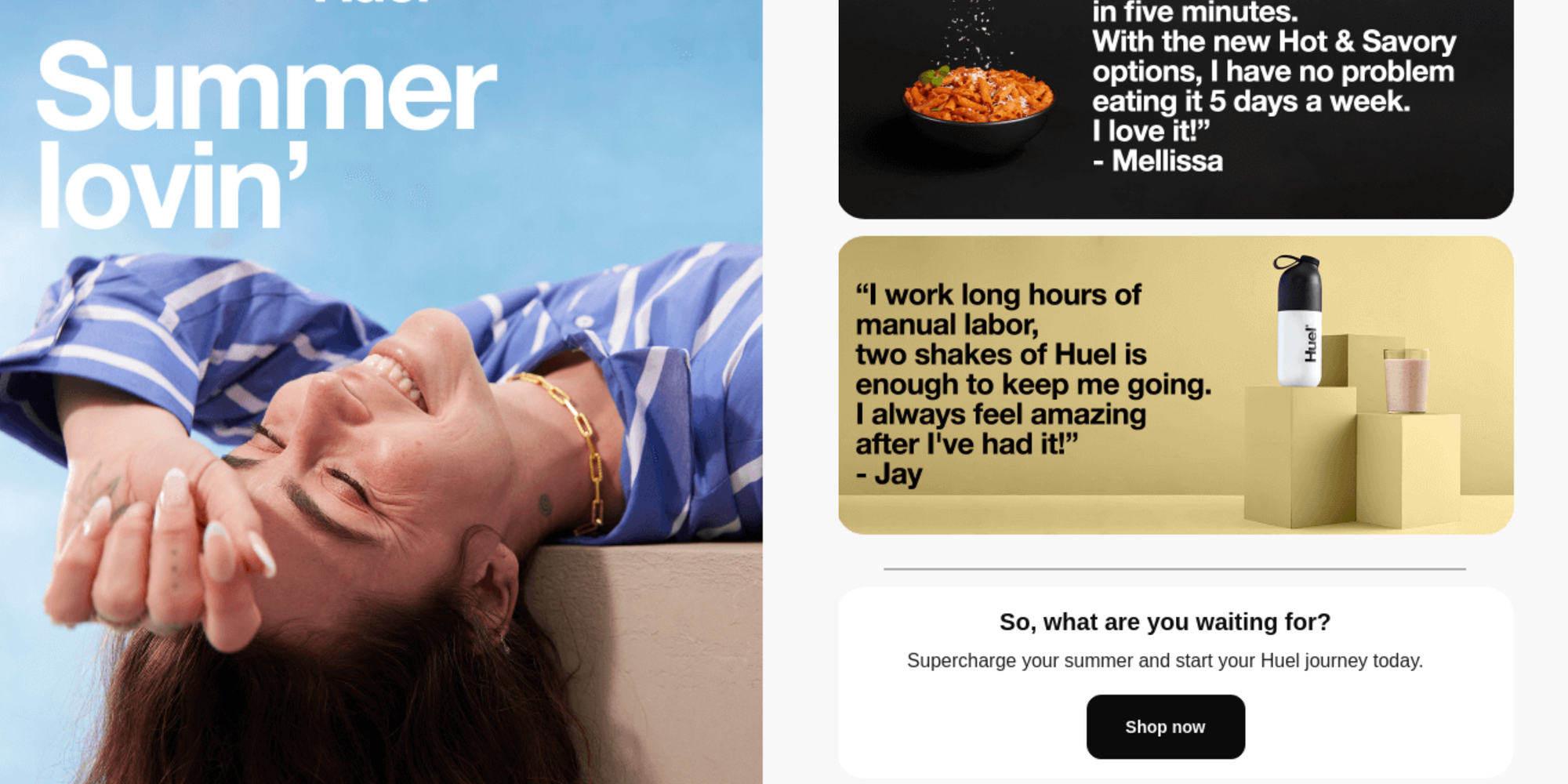
Huel's newsletter kicks off with a playful, summer-themed headline, "Summer lovin’," paired with an inviting image that immediately sets a fun, laid-back vibe. No flashy graphics or over-complicated designs here—just clean, minimalistic sections with lots of white space that make everything easy on the eyes.
What we love about this newsletter is how quickly it gets to the point. Huel’s key message of convenience, nutrition, and affordability is clear right from the start. There’s no fluff—just a straightforward "Shop now" CTA that speaks to its audience’s needs. And the brand backs it all up with real testimonials from customers who reflect the health-conscious, on-the-go lifestyle Huel target audience.
Every element in this email has a clear purpose, whether it’s the CTA buttons or product images, all working together to guide you effortlessly toward a purchase. It’s proof that sometimes, less really is more. Especially when the message is focused and perfectly aligned with what the brand stands for.
3. Miro
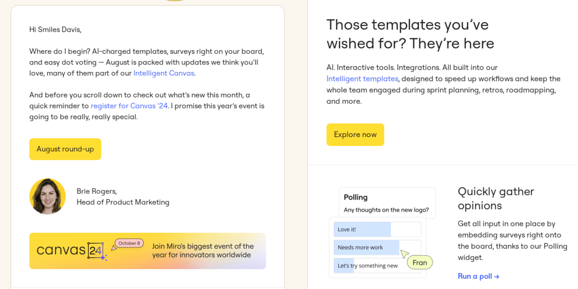
Miro’s newsletter is a perfect blend of product updates and user engagement wrapped in a clean, visually appealing layout.
Right from the start, the header pulls you in with a clear tease of the August updates, making it obvious there’s a lot of exciting new stuff to explore. The simple layout with clear sections and well-placed CTA buttons makes it super easy to navigate through all the content.
Notice how Miro doesn’t just list new features—it positions them as problem-solvers. Tools like intelligent templates and voting widgets are framed as solutions to speed up your workflow and boost collaboration. It’s an educational approach that shows you exactly how these updates benefit you.
Then, there are the interactive CTAs, like “Explore now” and “Run a poll,” along with images of the features. They create a sense of action, making you want to dive in and try them out.
And just when you think Miro is done, it amps up the community vibes by promoting its major event, Canvas24. This not only builds excitement but reinforces the importance of staying connected with the brand. Toss in integration updates like the Miro x Microsoft Outlook feature, and it’s clear Miro is all about keeping you connected and on top of your game.
4. Klaviyo
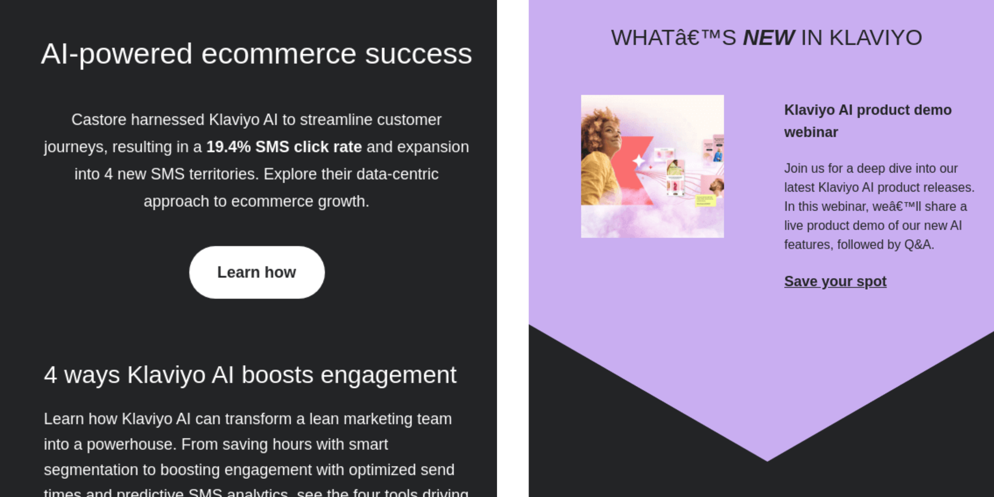
Klaviyo’s newsletter delivers value with a sleek, no-fuss design. The email header gets straight to the point: "AI-powered ecommerce success." For any ecommerce professional, this promises a clear solution—using AI to improve customer journeys. And they back it up with an image of Castore, a big-name brand, alongside a real success metric—a 19.4% SMS click rate—instantly giving the message credibility.
The newsletter is well-structured, focusing on practical value. Klaviyo highlights four ways its AI can level up your engagement, with each section featuring a simple, direct CTA like “Read more.” It’s a straightforward, benefit-driven message that focuses on how Klaviyo can save you time and help you target smarter.
In the middle, the brand spices things up with a spotlight on its latest innovations and an invitation to a product demo webinar. This section piques your curiosity and encourages you to sign up for a deeper dive into what’s new. A live demo offer is another thoughtful addition, showing Klaviyo isn't just there to sell—it's here to help you learn and succeed.
5. Kat Boogard
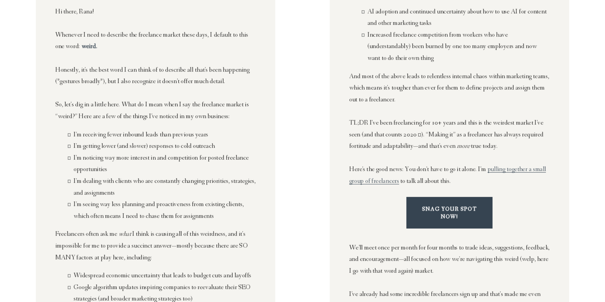
If you’re selling a product through email, focusing on shared problems before offering a thoughtful solution can be a much softer—and often more effective—approach. Like this Kat Boogard newsletter—it shows how to sell a premium service without coming across as overly promotional.
She opens with a warm, conversational tone that feels empathetic, speaking directly to freelancers and acknowledging the challenges they face. The phrase “weird market” strikes a relatable chord, making readers feel seen and understood, rather than targeted by a sales pitch.
Then, Kat skillfully shifts from discussing those challenges to presenting her mastermind group as a timely solution. By addressing specific pain points like a slow pipeline or shifting client priorities, she creates a sense of urgency.
The clever part is she doesn’t rush into the offer—she first builds trust by focusing on shared experiences. The subtle inclusion of social proof (“incredible freelancers sign up”) and a note on limited availability (“THREE spots left”) adds credibility and urgency without being pushy.
6. Canopy
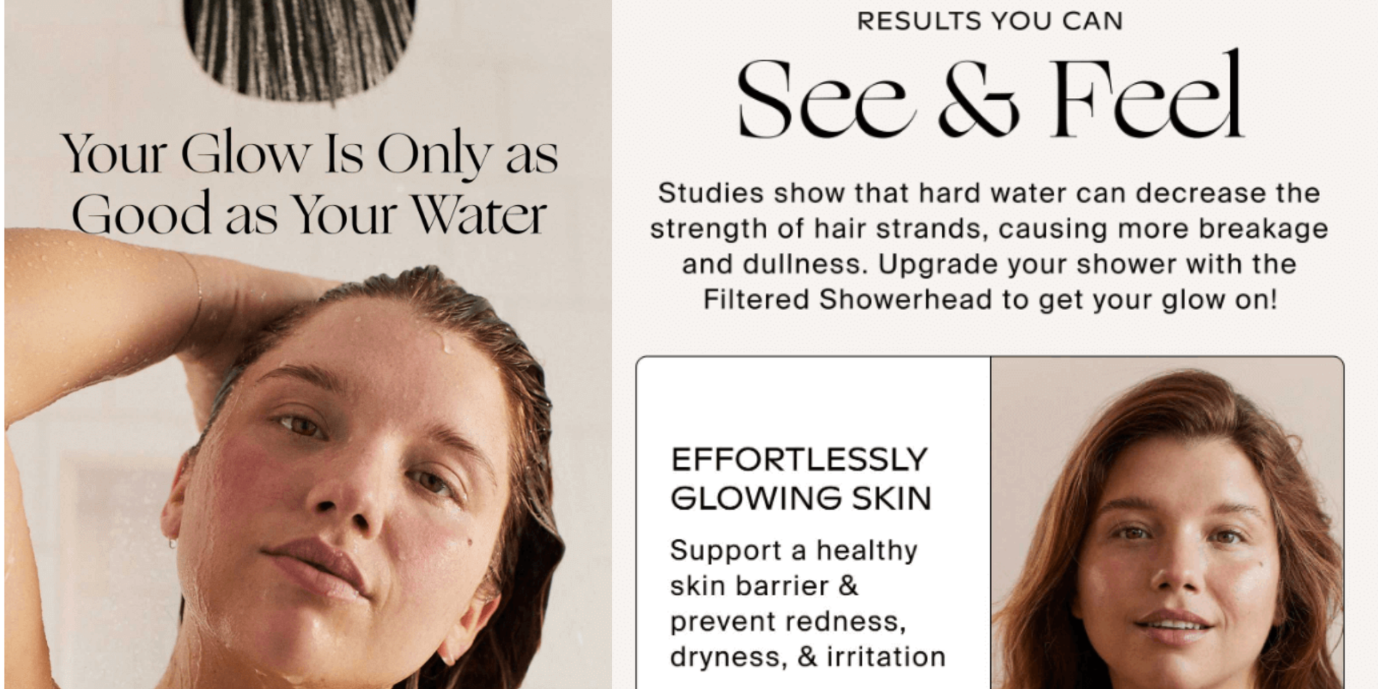
The headline "Your Glow Is Only as Good as Your Water" does more than just catch your attention—it sets up the problem and hints at the solution in one concise phrase. It immediately taps into the reader's desire for healthy, glowing skin and hair, subtly implying that the key to unlocking that glow lies in something as simple as water.
Then, we get the solution handed to us in the very next section of copy. Upgrade your showerhead to the Filtered Showerhead to remove the damage hardwater can do to skin and hair - as backed by studies.
The visual design complements the message perfectly—clean, soft, and minimal, mirroring the subtle color palette of the model’s hair. This not only reinforces the aesthetic of purity and cleanliness but also makes the entire newsletter feel calming and professional.
Canopy delivers a newsletter that speaks directly to its audience's needs, both visually and practically.
7. Ask Phill
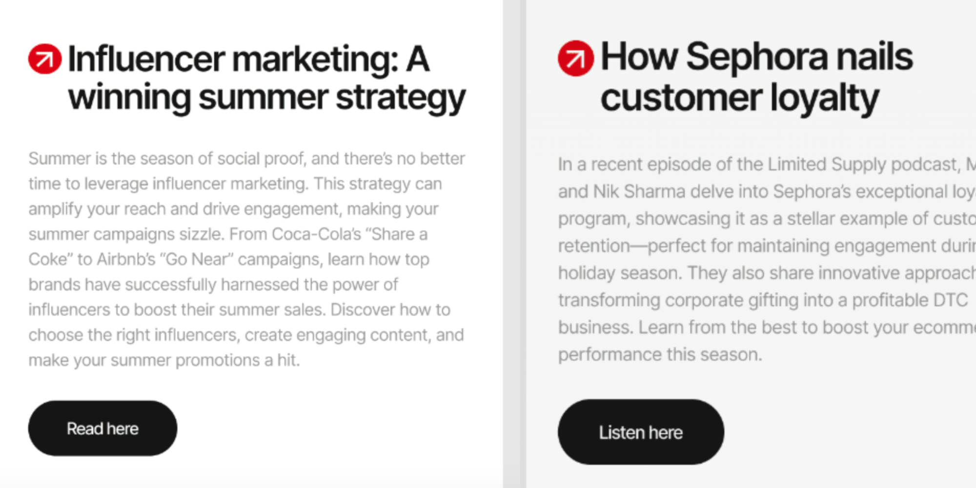
Ask Phill’s newsletter shines with its sleek, clean design that makes navigating the content a breeze. What catches the eye first? The high-quality images. They don’t just sit there looking pretty—they break up the text and give the reader visual breathing room, making everything feel more approachable.
The email copy itself is refreshingly concise. No fluff—just actionable insights. Take the section on influencer marketing as a summer strategy, for instance. Timely, relevant, and a direct hit for ecommerce brands. Weaving in case studies, like the piece on ID&T festival brands, is another good tactic to build trust.
Then there’s the smart use of call-to-action (CTA) buttons. Right where they should be—under key sections—like “Learn more” or “Unlock now.” You don’t have to go hunting for them, and that makes it easy to engage without any distractions.
8. Dose
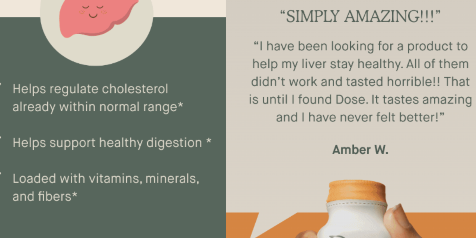
Dose keeps it simple but impactful, focusing on what matters: the products and their benefits. From the jump, you’re introduced to clean, natural ingredients like Dandelion and Chamomile, setting the tone for trust and health.
The newsletter leads with Dandelion, breaking down key benefits like cholesterol regulation and digestive support in bullet points. So, it's quick and easy to see why this product is worth your time.
Right after, there's a glowing 5-star review to back up the claims. The testimonial, paired with an image of a hand holding the product, gives it a personal, relatable feel. This mix of product benefits and real-life proof gets the message across without overwhelming you.
Chamomile for immunity gets the same treatment, offering consistency in format, which is great for readability. Another strong customer review follows the health benefits, reinforcing the message.
9. Tumble
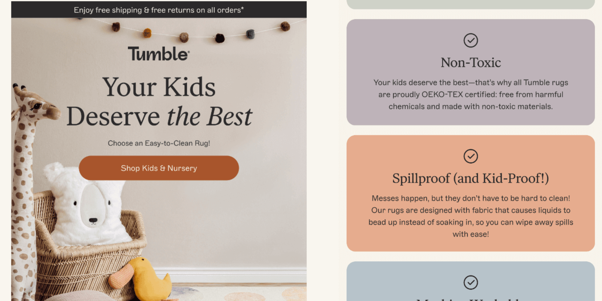
The Tumble newsletter speaks to parents in a calm, reassuring way, hitting all the right notes with its design and tone.
Right from the headline, "Your Kids Deserve the Best," it connects emotionally with parents (the targeted audience for Tumble), tapping into their desire to give their kids high-quality, safe products. The soft, neutral colors and simple imagery add to that cozy, family-friendly vibe, reinforcing that Tumble rugs are made with thoughtfulness and care.
A gentle call to action—"Shop Kids & Nursery"—invites readers to browse without any pressure.
The standout here is the “Kid-Friendly Rug Checklist,” which breaks down the key selling points in a way that directly addresses parents’ concerns. Safety, non-toxic materials, spillproof capabilities, and machine-washability are all framed around making life easier for parents, who are likely juggling multiple responsibilities.
Notice how each feature gets its own section with easy-to-read icons and quick explanations, so parents can instantly see the value at a glance.
The layout is clean, with plenty of white space that makes the whole thing feel approachable and easy to skim. Lastly, product visuals at the end tie it all together, giving parents a clear picture of what they're getting.
10. United Sodas of America
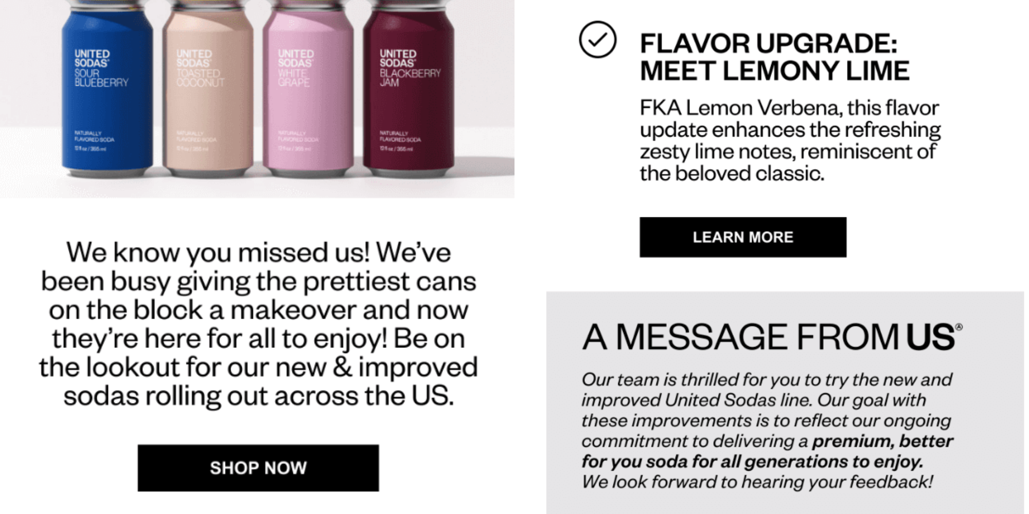
The headline of this United Sodas of America newsletter ("Fresh New Look, Same Iconic Soda") paired with colorful cans, instantly hooks the reader by showcasing both the updated design and the classic product. The "Back in Stock" badge adds a sense of urgency, nudging readers to act quickly without being overbearing.
We particularly like how it keeps things simple yet effective. The “What’s New?” section breaks down the key changes—better packaging, cleaner ingredients, and improved flavor—in no-nonsense bullet points. Everything’s easy to digest, making it perfect for busy readers who just want the facts fast.
A brief message from the team at the bottom adds a nice personal touch, showing that these changes are more than just cosmetic—they’re part of the brand’s commitment to offering a premium soda experience. It’s a subtle way of building brand trust and customer loyalty.
11. &Open
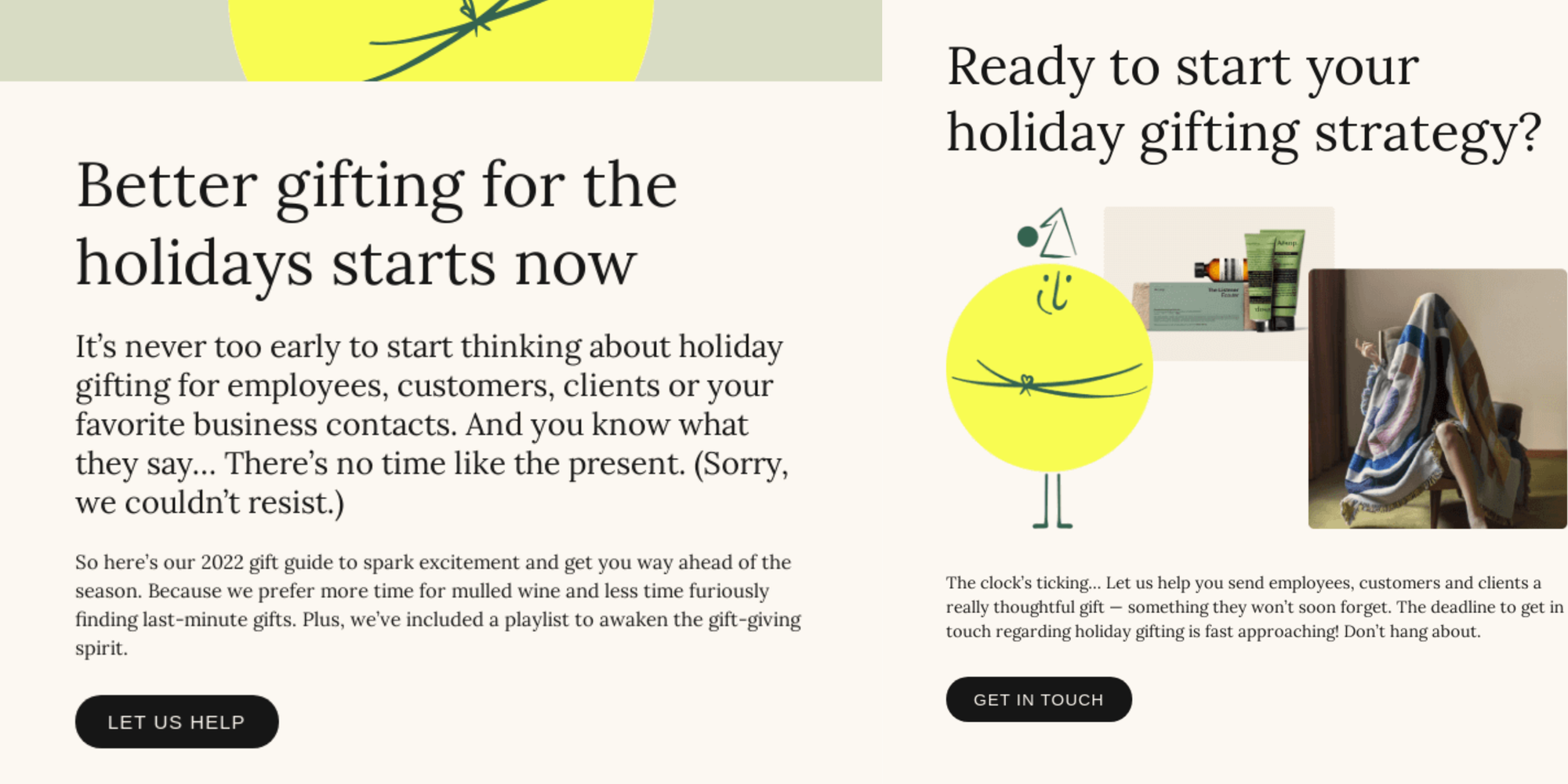
This newsletter grabs attention right away with its direct, no-nonsense header: "Better gifting for the holidays starts now." It's a clear nod to corporate decision-makers, reminding them that the holiday season is creeping up fast. The message focuses on easing the stress of corporate gifting and avoiding last-minute chaos, perfectly in line with &Open's mission to simplify gifting.
The design keeps things fun and approachable with playful illustrations, creating a lighthearted vibe. Highlighting the "2022 holiday gift guide" seamlessly ties into the theme of helping businesses find well-curated, thoughtful gifts, making the whole process feel effortless. And when the copy playfully suggests readers might want these gifts for themselves, it adds a dash of personality and keeps the tone engaging.
The "Set the scene" section introduces a festive playlist, which goes beyond just selling products—it builds on the holiday mood. This extra touch deepens the emotional connection with the audience and shows that &Open is thinking about the full experience of gifting, not just the transaction.
Wrapping things up, the call to action—“Ready to start your holiday gifting strategy?”—is clear and inviting. It nudges readers to take action without feeling rushed, perfectly aligning with &Open's promise to make gifting stress-free.
- How to create and launch your very first newsletter in only 8 steps
- How do newsletters make money? Insider secrets
12. Sideserf Cake Studio
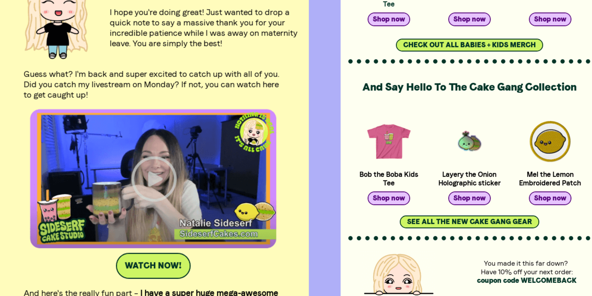
Sideserf Cake Studio’s newsletter kicks off with a warm, personal greeting from Natalie Sideserf herself, using the subscriber’s name. That casual, friendly tone instantly makes the reader feel like part of the community, and not just another recipient of a promo email.
The lively and fun visuals perfectly match the studio’s quirky brand—an animated Natalie, paired with bright product images. The “Watch Now” button invites readers to join a livestream, blending seamlessly into the message, making the call-to-action feel more like a suggestion from a friend than a sales pitch.
It also highlights the latest product collection with short, playful descriptions that align with the brand’s creative identity. By featuring items like apparel and kids’ sizes, the newsletter expands beyond cakes, showing off the studio’s broader appeal.
A coupon code at the bottom is a sweet little reward for sticking around, giving you even more value.
13. Rogue American
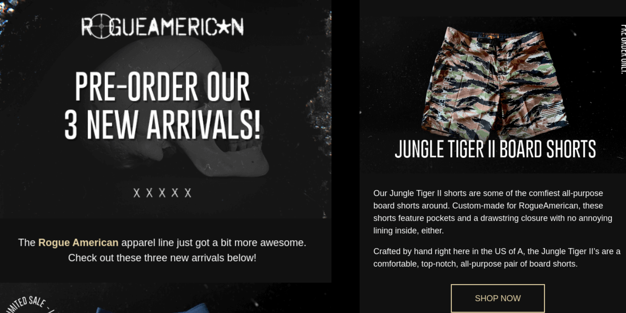
Rogue American hits the mark with bold product launches that match its rugged, no-nonsense vibe.
Right from the headline, "Pre-order our 3 new arrivals!" there's a sense of exclusivity and urgency that pulls you in. The direct, energetic language aligns with its audience, making readers feel like they’re getting early access to something special.
Each section highlights the new arrivals with sharp visuals, like the AR with Flag Agoge Shorts, paired with playful, patriotic phrases (“in the name of Uncle Sam”). This combination of strong visuals and punchy copy taps into the brand's tough, American-made identity. The copy emphasizes the limited availability, playing on scarcity to nudge readers toward quick action.
The product descriptions are short and punchy, focusing on key details like the handmade quality and durability. The clear, well-placed "SHOP NOW" buttons make it easy to jump straight into pre-ordering.
14. Taylor Stitch
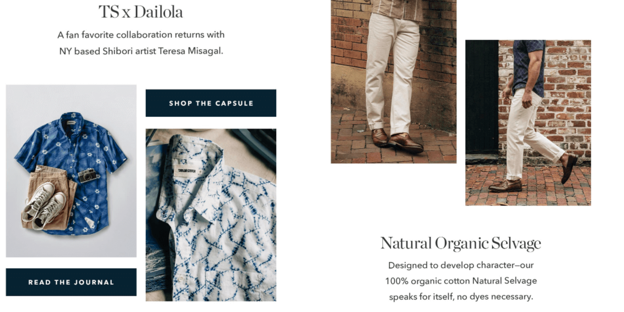
Taylor Stitch’s newsletter weaves storytelling into product launches, making the brand's clothing feel personal and part of a broader lifestyle.
Instead of simply listing new items, it crafts a narrative around each piece—whether it’s a jacket or pants—giving more context, like where it’s been tested in the outdoors or during specific adventures. You can't help but imagine wearing the product in real-world scenarios—a strong move that adds a layer of emotional connection.
The visuals match the story, showing the clothes in action, and reinforcing the idea that Taylor Stitch’s products are meant to be lived in. Earthy tones and simple layouts focus attention on the craftsmanship, echoing the brand’s commitment to sustainability.
Lastly, clear calls to action finish the story without feeling pushy. By the time you see them, you're already connected with the brand, making shopping feel like a natural next step.
15. Test Kitchen
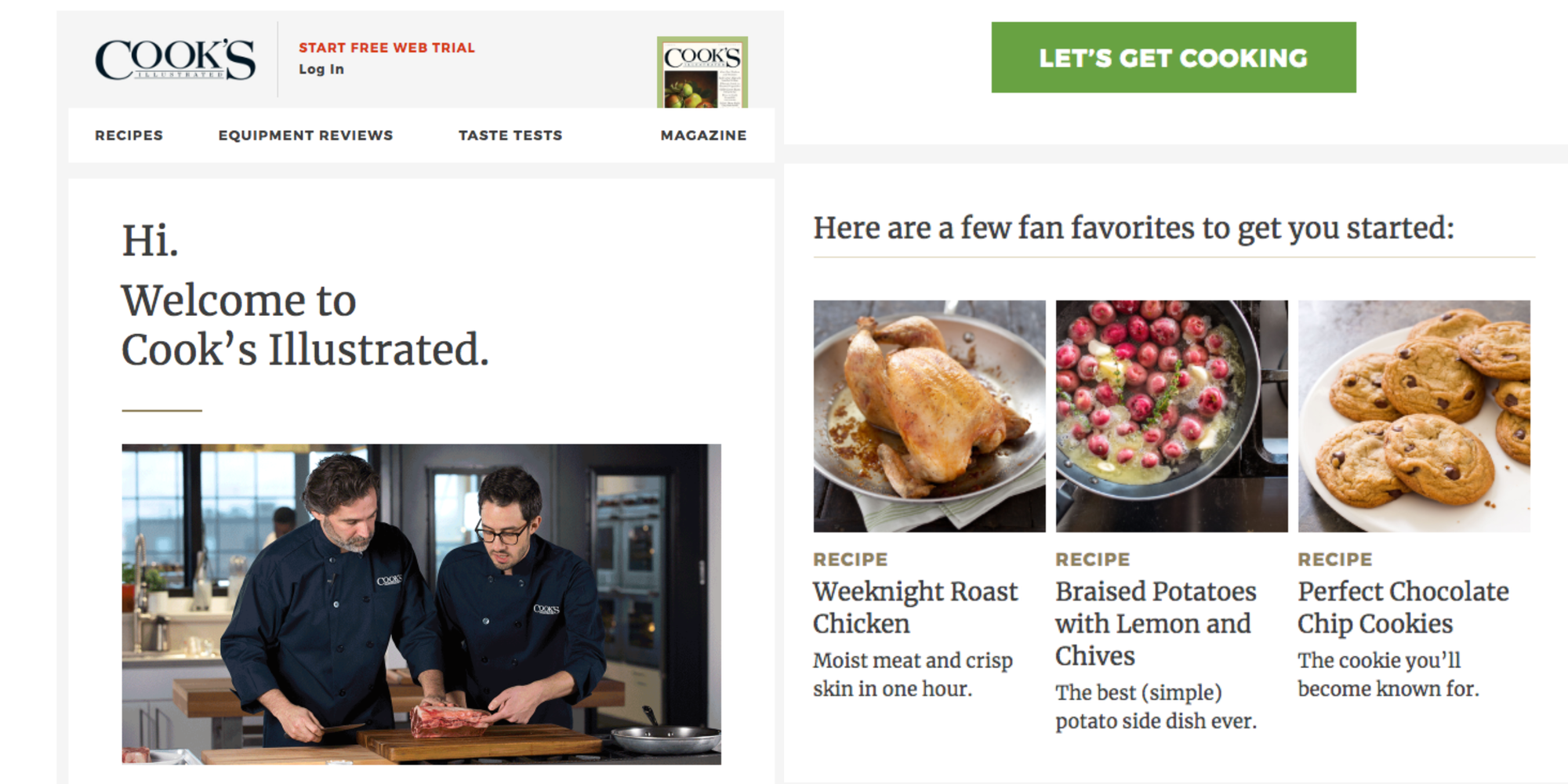
Test Kitchen makes new subscribers feel like they're stepping into a warm, welcoming kitchen. It kicks off with a simple “Hi. Welcome to Cook’s Illustrated,” setting the stage for what the readers can expect: top-tier recipes, honest equipment reviews, and expert tips straight from the Test Kitchen.
This quick intro builds immediate trust, giving you a taste of the quality you'll receive.
As for the newsletter design, it's crisp and clean. Sections are laid out in a way that feels easy to navigate, so even first-timers can explore it easily. Right from the start, fan-favorite recipes are spotlighted—a smart move that delivers instant value and encourages readers to get cooking.
It’s not just about recipes, though. The newsletter also teases a variety of content, from techniques to product reviews, showing off the full range of Test Kitchen expertise. What's more, the images go beyond complementing the text—they pull readers in, making the experience visually engaging.
With a recurring call to action like “Let’s Get Cooking,” you're gently nudged to take that next step and dig into the brand's culinary adventures.
16. One Trick Pony
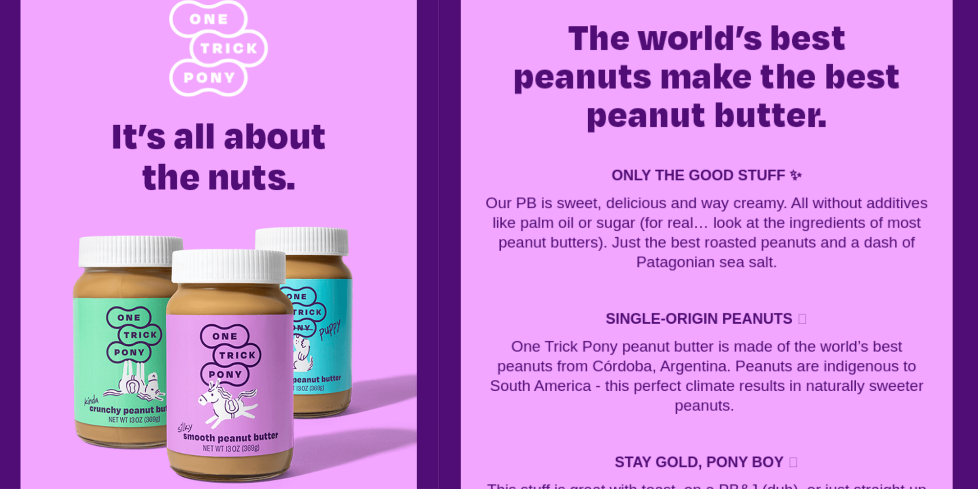
This newsletter from One Trick Pony puts the product front and center—literally. The vibrant images of peanut butter jars pop against a bold backdrop, ensuring they grab attention right away. It's a visual win that immediately draws the reader’s eye to the star of the show.
The email copy follows suit, staying clear and to the point. It highlights exactly what makes this peanut butter stand out, from “single-origin peanuts” to “only the good stuff.” No additives, no fluff. By calling out the absence of palm oil and sugar, the newsletter speaks directly to health-conscious readers looking for cleaner, more natural options.
Toss in mentions of Patagonia sea salt and Córdoba-sourced peanuts, and suddenly, this peanut butter feels a little more artisanal and a little more premium.
There’s a playful tone throughout, with lines like “Stay gold, pony boy” keeping things light and fun without pushing too hard for a sale. The whole vibe feels friendly and approachable, making it easy for readers to connect with the brand.
When it’s time to take action, the “Shop Now” button makes the next step clear, ensuring the reader isn’t overloaded with info but still feels guided enough to click through.
17. Hilma
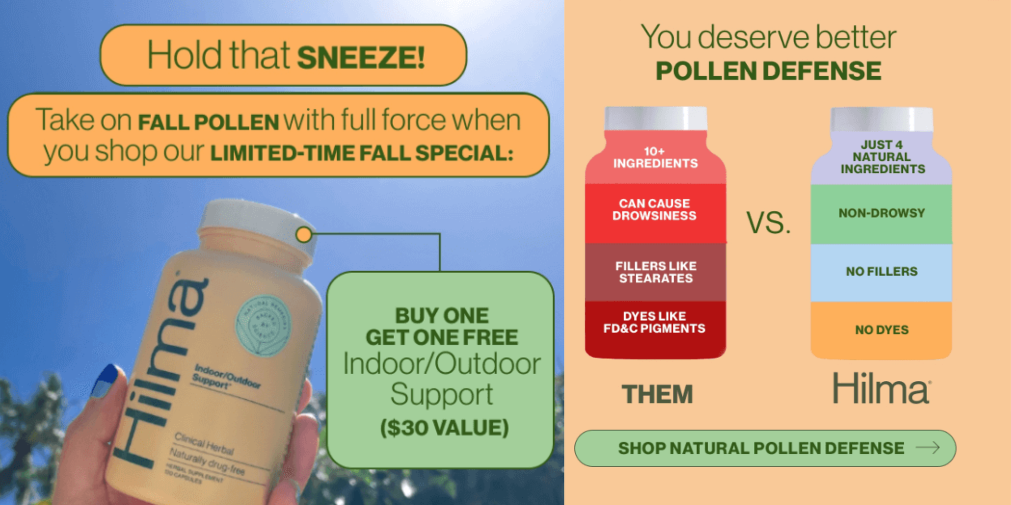
Hilma makes it easy to see why its product stands out using a smart side-by-side comparison with traditional allergy remedies. The clean visual layout puts "Them" (traditional allergy products) and "Hilma" right next to each other, highlighting the differences in a clear, impactful way.
You instantly get why Hilma is the better choice: they have just four natural ingredients, compared to the 10+ in typical products, and no fillers, dyes, or drowsiness to worry about.
The minimalist design, along with easy-to-read bullet points, makes this comparison a breeze to absorb. You don't have to dig for details—everything you need to know is laid out for you. In just a few seconds of scanning, it's obvious Hilma is the clean, healthy alternative.
To sweeten the deal, the brand throws in a “Buy One Get One Free” offer, adding a layer of urgency that’s hard to ignore. The strategic placement of the “Shop Now” buttons keeps things actionable without overwhelming you, creating a smooth experience from start to finish.
18. Hipcamp
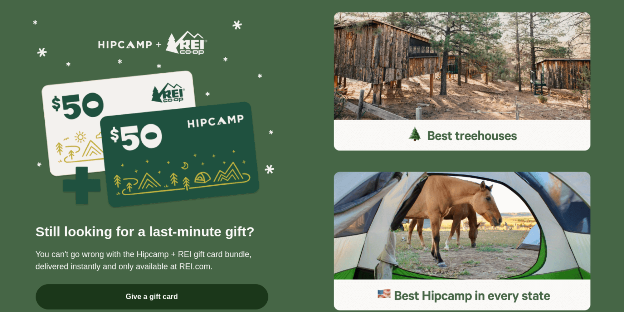
Hipcamp’s newsletter feels like an open invitation to adventure. It opens with beautiful imagery of campsites, ranging from tents and RVs to treehouses and cabins, instantly drawing you in.
You can almost picture yourself there, and that’s exactly the point. Each image ties perfectly to a different type of camping experience, giving you a little spark of curiosity to explore more.
Another strong element is how the newsletter organizes its content. It breaks down the different types of stays—tent sites, glamping, and cabins—into neat sections, making it super simple to find what suits you. Next, little icons, like treehouses and RVs, add a fun, adventure-themed touch while keeping things easy to follow.
The newsletter adds value with its “Best Hipcamp in every state” feature. It’s a clever way to ensure everyone finds something relevant, no matter where they’re located. To top it off, there’s a Hipcamp + REI gift card bundle, which is a practical addition for those looking for last-minute gifts.
19. Fellow
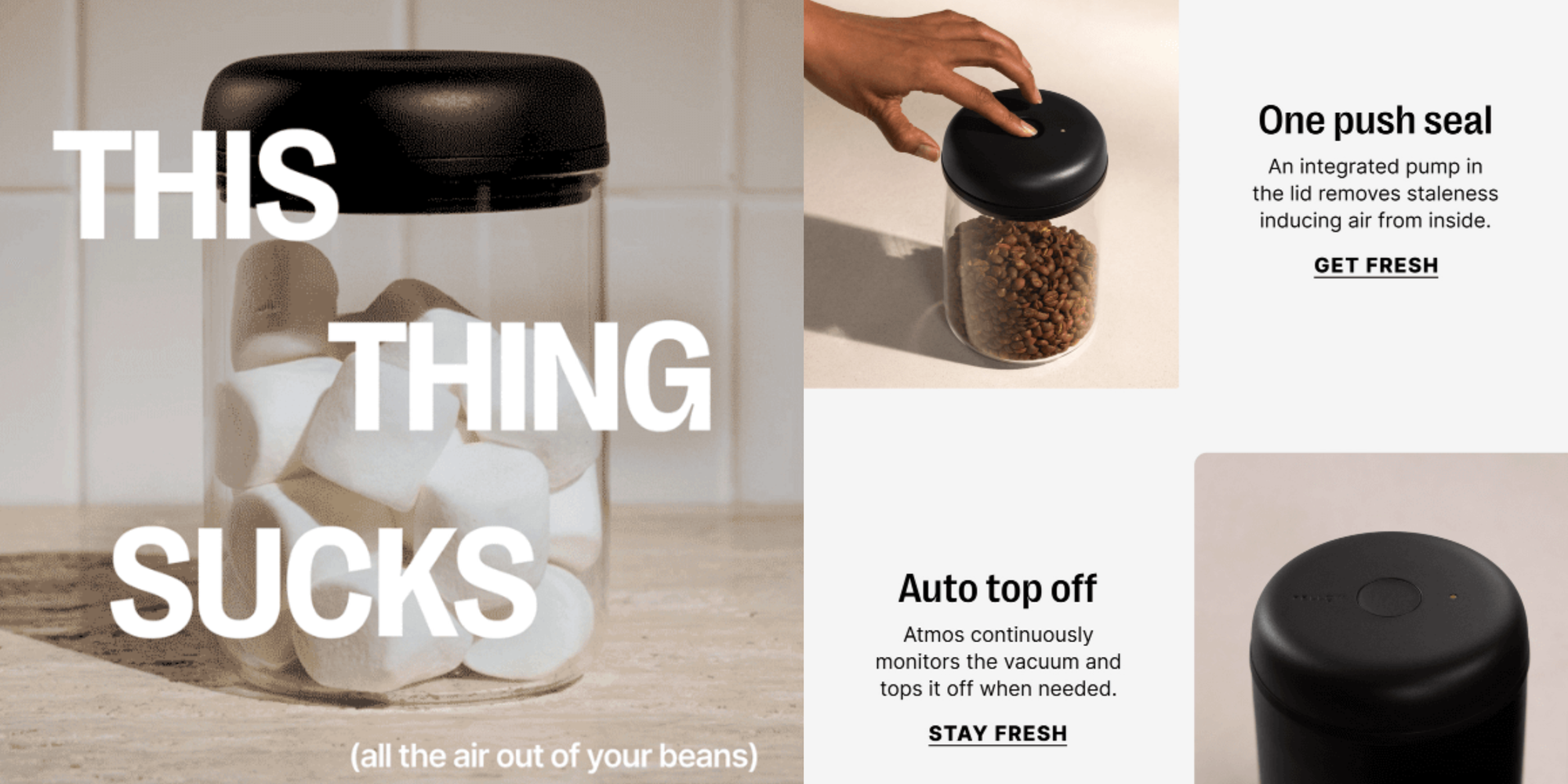
Fellow’s newsletter instantly grabs attention with its playful headline, “This thing sucks,” paired with an image of a vacuum canister.
It’s a bold opener that piques curiosity and sets a fun tone, perfectly in line with Fellow’s modern, innovative vibe. The headline, combined with concise and benefit-driven email copy, highlights the product’s functionality without getting bogged down in technical details.
Phrases like “One push seal” and “Auto top off” quickly communicate the vacuum canister’s key features, focusing on practical benefits like keeping snacks and beans fresh. The visuals support each section, showing the product in action, which helps readers visualize its everyday use.
Visually, the newsletter uses a clean and minimalist layout that mirrors Fellow’s elegant design philosophy. Plenty of white space ensures easy navigation, while sharp, professional photography highlights the vacuum canisters’ aesthetic appeal.
The “Shop Now” CTAs are strategically placed throughout, making it easy for readers to act after seeing the product’s features.
20. Good On You
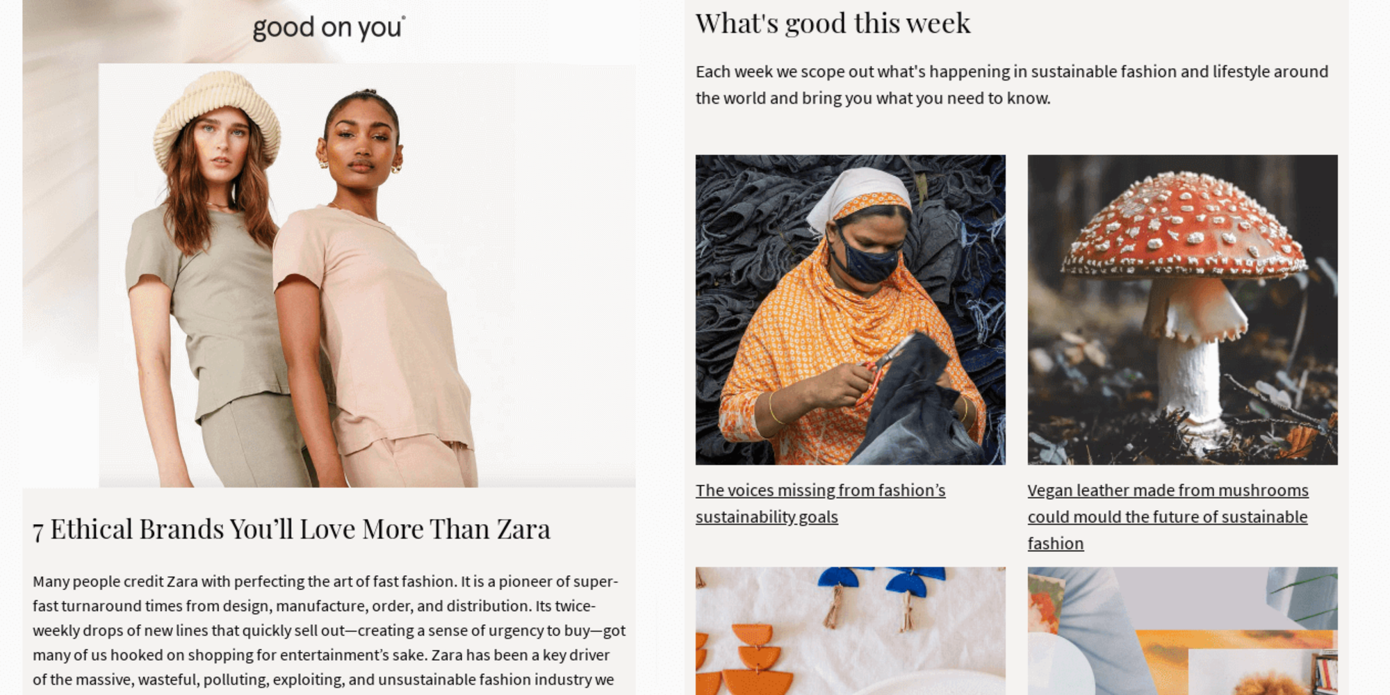
The Good On You newsletter is a perfect mix of education and actionable shopping tips, all while sticking to its core mission: promoting sustainable fashion.
It introduces readers to ethical brands in a relatable way, like with lists such as “7 Ethical Brands You’ll Love More Than Zara.” It’s a practical, value-packed resource for those who want to shop consciously without the guilt of fast fashion.
The clean design is easy on the eyes, featuring beautiful product images paired with short, to-the-point text. Each product or article link has a clear call-to-action (CTA), guiding readers to dive deeper into the world of sustainable fashion or shop-featured picks.
The balance of curated products, educational articles, and brand spotlights keeps things interesting and varied, avoiding any potential to overwhelm.
Notice how the “What’s good this week” section adds an exciting, fresh element by showcasing new sustainable finds, encouraging readers to stay engaged. Plus, the “Good offers” section makes it easy to shop ethically without breaking the bank, showing that sustainability and style can go hand in hand.
Toward the end, social media links and an app download option build a sense of community, inviting readers to stay connected on multiple platforms. All in all, this newsletter does an outstanding job of blending its eco-friendly mission with content that’s both engaging and actionable for its audience.
21. Selfmade
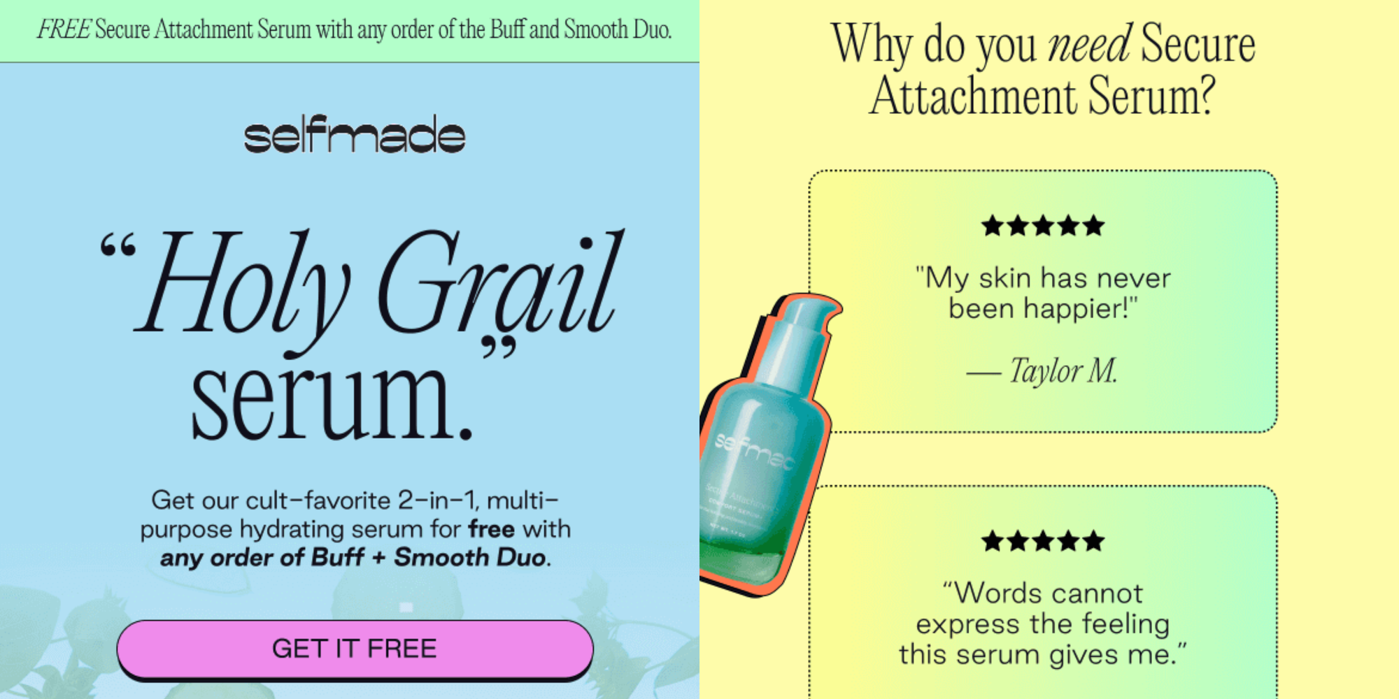
Selfmade’s soft, pastel palette creates a calm, welcoming vibe that echoes the brand’s soothing skincare message. The gentle blues, greens, and pinks feel refreshing and pure, perfectly matching the hydrating serum it highlights. The color choices are subtle, letting the product shine without competing for attention.
Customer testimonials are a powerful highlight. Phrases like, “My skin has never been happier!” and “It’s the ONLY serum I feel comfortable using” deliver a punch of authenticity. Placing these quotes near the product gives readers a sense of trust, letting them see real experiences that back up the product’s promise.
The “How It Works” section is a clever move, too. It lays out how buyers can snag the serum for free with the Buff + Smooth Duo in a way that’s easy to grasp and act on—no extra thinking needed.
Wrapping it up, the newsletter features a model applying the serum, which paints a relatable picture. You can almost feel the product in action. Paired with the model’s glowing skin, it creates an aspirational image that subtly speaks to the serum’s benefits.
22. SeaVees
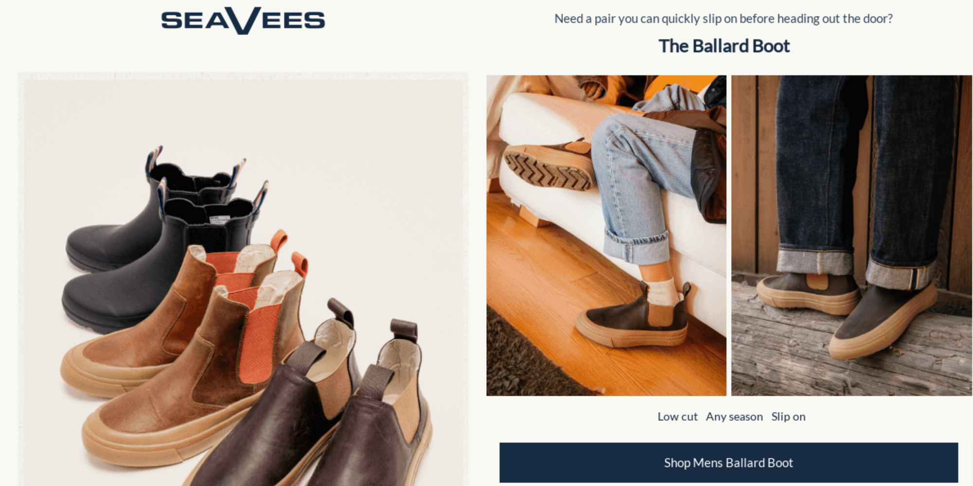
Each SeaVees boot gets its own space, with images that show them in action and natural settings, making it easy for readers to picture wearing them day-to-day. Close-up shots highlight practical features like the slip-on design and waterproof materials, making the boots even more appealing.
The calls to action are simple and direct—“Shop Men’s Ballard Boot” and “Shop Women’s Bolinas Boot”—so readers can take action quickly without wading through extra content. The layout is intuitive and easy to follow, creating a smooth shopping experience.
SeaVees blends style and function in its messaging, with phrases like "100% waterproof" and "strong traction" highlighting the boots' practicality. A playful question, “Perhaps something to match your adventurous side?” adds a personal touch, encouraging readers to imagine their next adventure.
Lastly, the color scheme, with earthy tones and neutral backgrounds, complements the brand’s rugged yet refined aesthetic perfectly.
23. Sips By
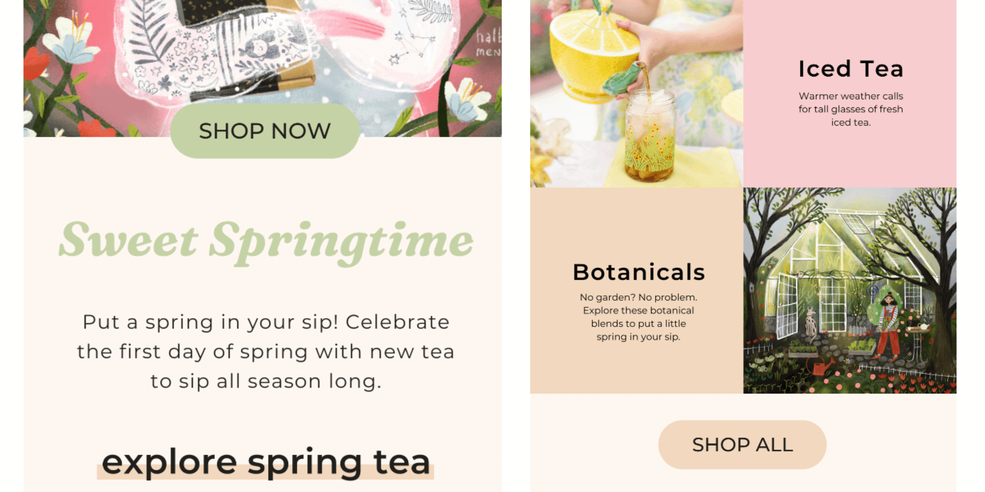
The fresh, vibrant illustration of this Sips By newsletter sets the tone for a seasonal refresh, aligning perfectly with the theme of discovering new teas. It’s visually delightful, and you can almost feel the energy of spring just by looking at it.
The result? An instantly engaging email newsletter. But what really makes this email click is the short, snappy copy.
Phrases like “Put a spring in your sip!” and “Celebrate the first day of spring with new tea” tap into that seasonal excitement, sparking curiosity.
You're invited to explore categories like Floral Tea, Spring Teaware, Iced Tea, and Botanicals, all laid out in a simple, easy-to-follow way that helps you discover new products without feeling lost or overwhelmed.
The images in each section add a sensory touch, from the elegant floral teaware to a cool glass of iced tea, helping you picture the experience. The balance between text and visuals is spot on, capturing the beauty of spring tea rituals without overloading the reader.
Finally, the light, pastel color palette ties it all together, keeping the newsletter cohesive and airy, while the “SHOP NOW” and “SHOP ALL” buttons are perfectly placed for easy action. There’s no hard sell, just a gentle nudge to explore.
Monetize your newsletter with Whop
Feeling inspired by these awesome newsletter campaigns? Keep that energy going and start monetizing your newsletter with Whop today.
With Whop it's easy to supercharge your newsletter by offering way more than just a subscription. As you've seen with the leading ecommerce brands above, there are so many ways you can monetize your newsletter effectively, such as offering:
- Links to a vibrant community with chat apps and forums
- Interactive giveaways and contests to drive engagement
- Exclusive courses to position yourself as an authority
- Downloadable files like ebooks and digital products
All of this is customizable within your whop. Plus, Whop handles all payments for you—including options for subscriptions, tiered memberships, and much more. Whop can help you turn your newsletter into a fully-fledged income.