Want more views for your webinars? You need an effective landing page. Find inspiration with Whop’s 30 webinar landing page examples.
Key takeaways
- A high-converting webinar landing page needs a compelling title, clear value proposition, and strategically placed CTAs throughout.
- Social proof through testimonials and presenter credentials builds trust and significantly increases sign-up rates.
- Keep landing pages focused and scannable with bullet points highlighting specific takeaways attendees will gain.
Webinars are one of the easiest ways to connect with your audience, and they don’t have to break the budget.
If you want to sell, build authority, or grow your email list, a well-run webinar gives you direct access to the people who matter most.
But here’s the catch: even the best webinar won’t hit if no one shows up.
That’s where a strong landing page comes in. A killer LP doesn’t just share info, it convinces people to sign up, show up, and engage.
To help you nail it, we’ve rounded up 30 standout webinar landing pages from across different industries. Use them for inspiration, tweak what works for your brand, and start turning browsers into attendees.
Plus, you’ll see why Whop is the go-to platform for hosting webinars and selling digital products.
Why do you need a webinar landing page?
A good landing page is one of the best tools to promote your webinar, allowing you to:
- ✅ Share basic information about your webinar (subject, time, platform, etc.)
- ✅ Create awareness about your brand and the webinar
- ✅ Collect contact details (usually a name and email address)
- ✅ Post a CTA (call to action) to get people to participate
It acts as a kind of window display showing off the merchandise to encourage people to go into the store - or, in this case, sign up for your webinar.
“I think that your landing page is the most important part of your marketing strategy… If someone is even a little interested in your webinar, they’re going to that page.”
— Kaitlin Milliken, Senior Program Manager at HubSpot
Webinar landing page examples
So let's get into it. Here's a list of our favorite landing page examples which clearly communicate and likely convert.
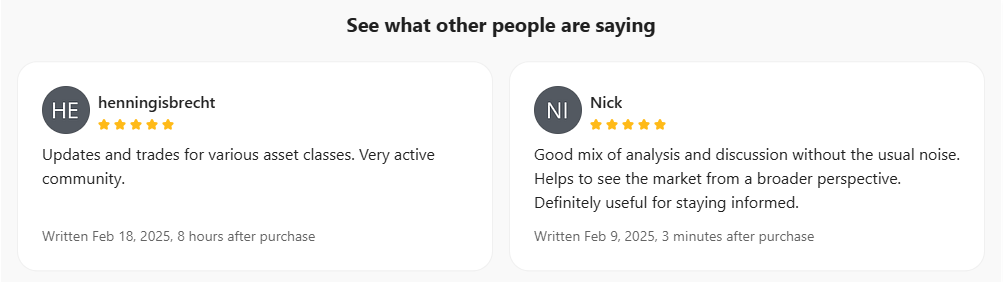
1. My Freedom Club "Trading Education & Macro Webinars"
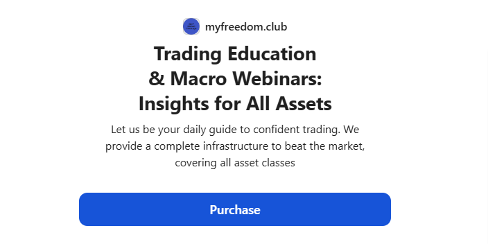
This landing page for My Freedom Club (built on Whop) is a perfect example of how you can showcase multiple products, including webinars.
It’s also the only entry on our list that highlights the monetization potential of webinars. The title tells us what the offering is all about, and there’s also a video introduction from the creator, personalizing the page.

Further down the page is a creator bio and a full list of what people who sign up can access. Plus, there are reviews for social proof.
Overall, this shows how a landing page can become an effective storefront for webinars and other types of digital content.
What else do we like about this webinar landing page?
👍 The inclusion of lots of 5-star reviews from satisfied customers
👍 The reader-friendly layout of the page
👍 The use of FAQs and social sharing buttons
2. Slack “The Rise of the Digital Coworker”
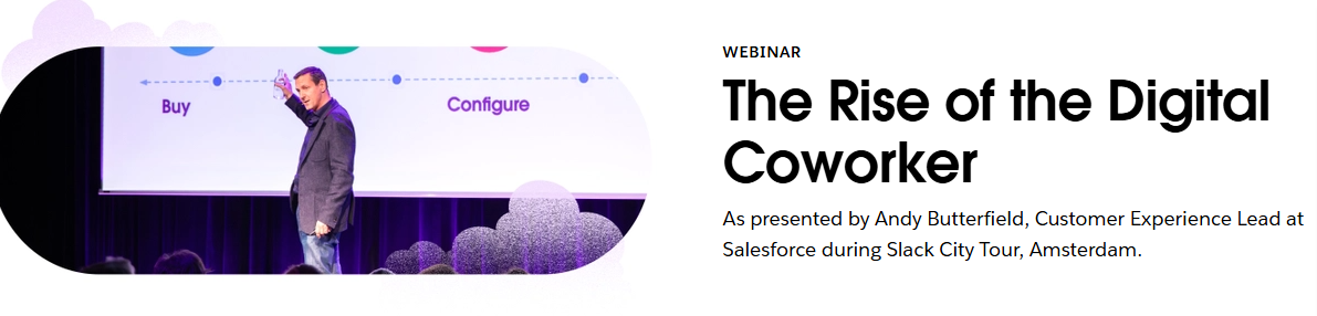
Communication and productivity tool Slack offers a range of webinars, each of which has a dedicated landing/sign-up page.
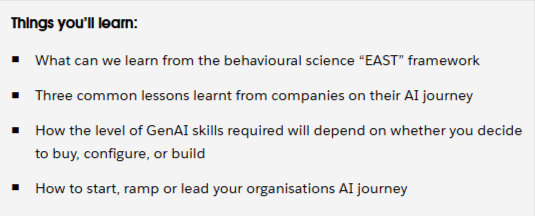
The page for this on-demand webinar, The Rise of the Digital Coworker, is quite wordy compared to some others on our list, but it features a professional layout that leaves no doubt as to what people who watch will learn.
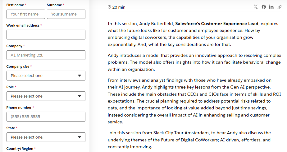
In addition to the basics, the form asks for users’ company and role. Think about the kind of information that is most useful for your business and tailor the form accordingly (but keep it user-friendly).
What else do we like about this webinar landing page?
👍The presenter’s credentials are put front and center
👍The details are presented as a block of text and an easy-to-read bullet-point list
👍The landing page includes the duration of the webinar
3. Hootsuite "Content Experimentation"
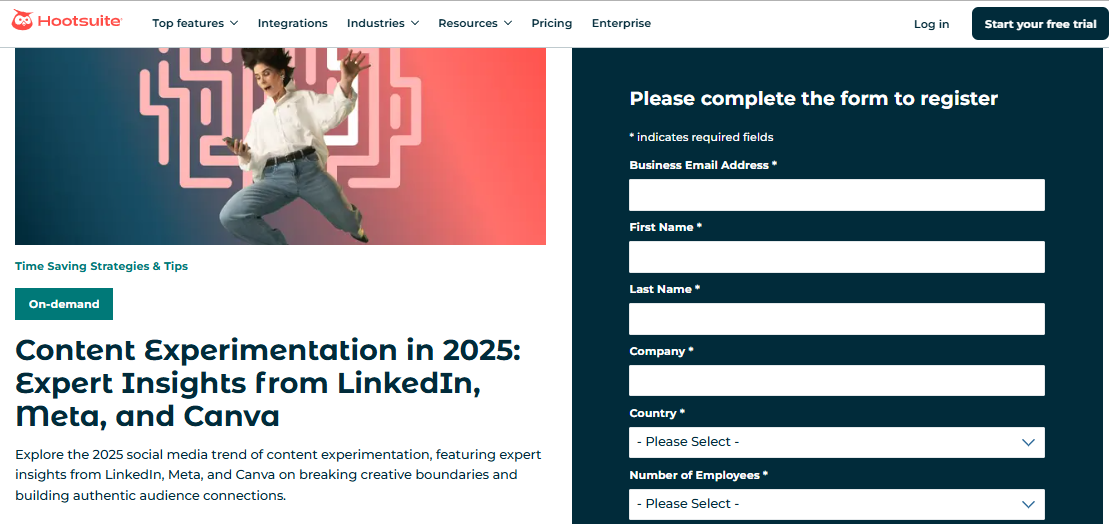
This webinar landing page from Hootsuite features an eye-catching color scheme and image. The wording is simple and to the point, without any fluff.
Okay, the title is a bit clunky, but it’s obvious what the webinar is about. It also lets readers know that the contributors will offer “expert insights” from three leading players in the content space.
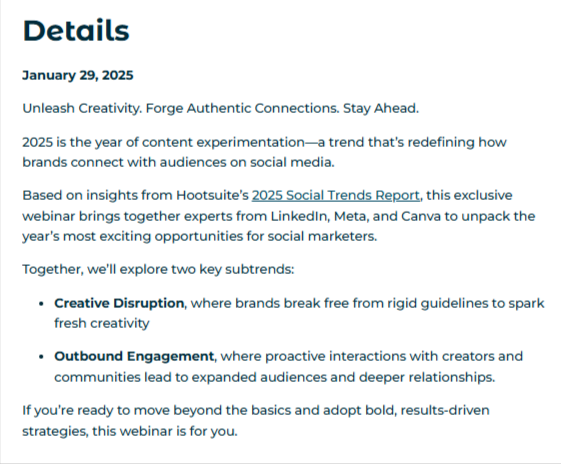
The details section is brief and to the point, with clear takeaways for anyone who watches the webinar. It also links to a relevant Hootsuite report.
What else do we like about this webinar landing page?
👍 It makes a bold claim to grab viewers – that this is the “year of content experimentation”
👍 Putting a date in the title lets people know the info is current
👍 Social media sharing buttons are included at the bottom of the page
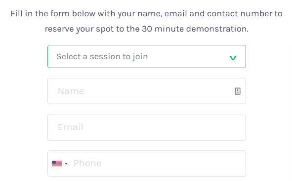
4. Calendly: "Getting started with Calendly"
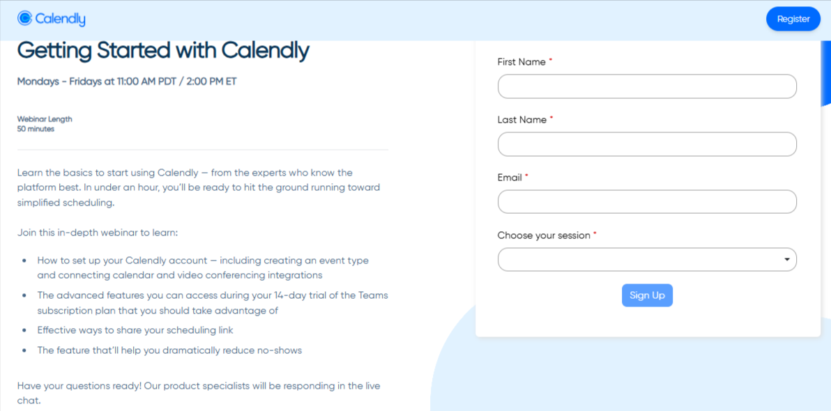
Less is more, and appointment scheduling platform Calendly knows it.
The webinar is aimed at helping new users get up to speed with the features, so it has a defined target audience.
This is a great example of a simple webinar landing page that still includes (almost) all the required information. The only thing missing is a named host, which is less important here, as it’s an instructional webinar.
It promises to get people up and running in just 50 minutes. In this case, the events are held live regularly, so people who sign up can choose a date to join.
What else do we like about this webinar landing page?
👍 The title is succinct and to the point
👍The bullet points clearly set out what people will learn
👍 It lets viewers know they can ask questions at the end of the webinar – there is an interactive element
👍 There is a simple form which only asks for users’ name and email
👍The CTA stands out against the light blue color scheme
5. Tailwind "Create an Unstoppable Instagram Strategy"
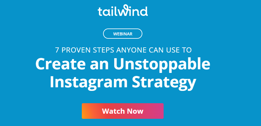
Social media marketing tool Tailwind created a landing page that combines elements of a sales page, pushing people to sign up for its free video on creating a winning Instagram strategy.
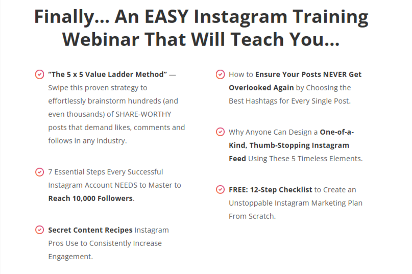
The bold color scheme and lofty promises entice people to sign up, with action terms like “proven strategy”, “one-of-a-kind”, and “essential steps”.
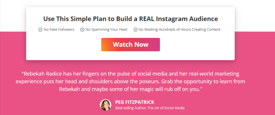
Plus, there's a bio on the presenter, which tells people she’s an expert in the field.
What else do we like about this webinar landing page?
👍It has a strong title – not just a strategy but an “unstoppable strategy”
👍There are three clear CTAs within the copy – top, middle, bottom
👍It includes a testimonial from an author in the social media space
👍The text is persuasive but short in length
6. Melissa K. Norris: "Plan Your Most Productive Garden Ever"

This webinar landing page is a good example of one that is more casual in tone and appearance – but no less effective. In this case, it’s a free webinar from a homesteading specialist who covers gardening, DIY, and lifestyle topics.
The page has a great title which includes the topic as well as the main takeaways from the webinar. The short descriptive text below further tells people that it’s going to teach them about organic farming, with the goal of improving their diet.
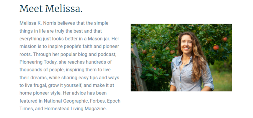
The page features a short but compelling bio. Even if people don’t know anything about Melissa, it’s clear she has experience and authority in this space.
What else do we like about this webinar landing page?
👍It features a colorful background image showing us a visual of what the webinar’s about – growing your own food
👍 There are two CTAs
👍 It has a “rustic” or homemade feel, which adds a layer of personalization – like we’re being invited into someone’s home
7. Mobileforce"Turbocharged Sales Hub"
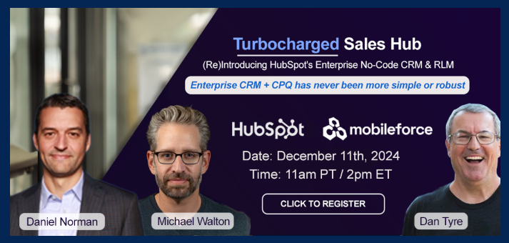
This webinar landing page is an example of an older-school design. It’s a simple, one-page layout telling people what the webinar is about, with two CTAs.
The image tells people that it’s presented by experts from two leading players – customer relationship management platform HubSpot and software firm Mobileforce.
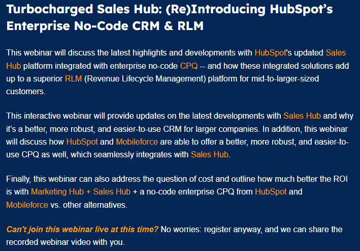
The text is simple if a bit wordy. However, it hits SEO requirements and tells people what the webinar will cover and why they should attend.
All the basic info is there, except the length (for live events, the running time is often flexible).
What else do we like about this webinar landing page?
👍 The bold color scheme of blue, white, and orange - the landing page is clearly segmented with a strong CTA and certain words highlighted
👍 The note at the end letting people know they can still sign up to get a recording even though the live date has passed
👍 The inclusion of a clear privacy policy on the form to let people who sign up know how their data will be used
8. NP Digital "Switch or Stay"
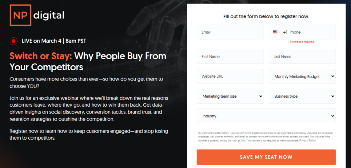
It’s no surprise that a digital marketing agency led by Neil Patel (one of Forbes’ top 10 online marketers) knows how to craft a high-converting webinar landing page.
This page is neatly split into above- and below-the-fold sections, with all the must-have details (including the signup form) right at the top.
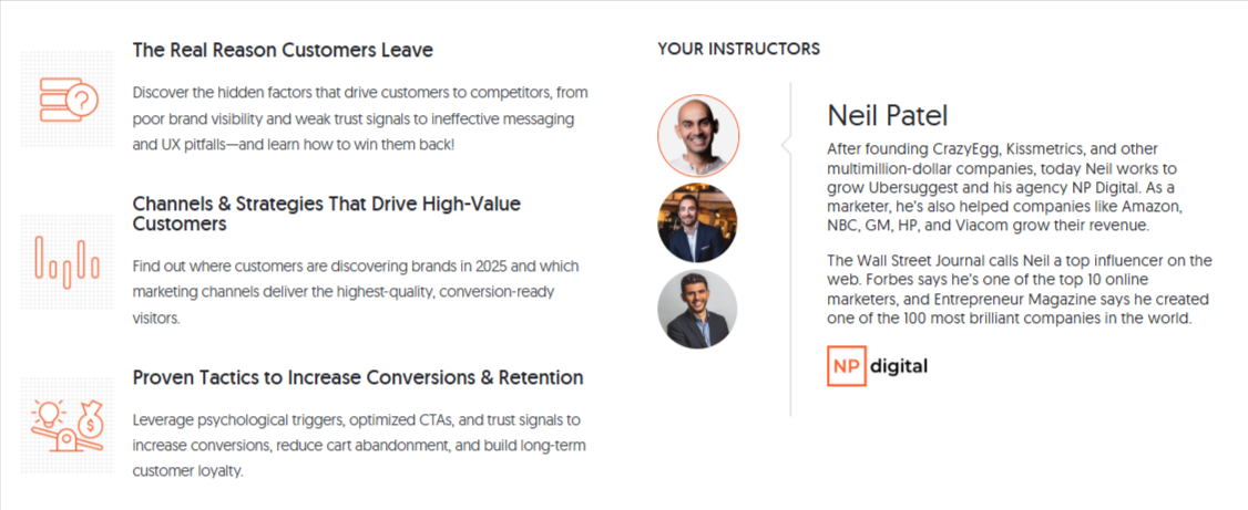
However, if people scroll to the bottom half, there’s an eye-catching bullet point list of reasons to watch and bios of the instructors. Again, it sets out the challenges companies face and positions the webinar as offering a solution.
What else do we like about this webinar landing page?
👍 The “save my seat now” CTA – suggests places are limited and people need to act quickly
👍The use of emotive language in the text – “stop bleeding customers”
👍 The clean layout and color scheme
👍 The red dot at the top – a subtle detail which flags to people that the event is live and coming up soon so they should sign up ASAP
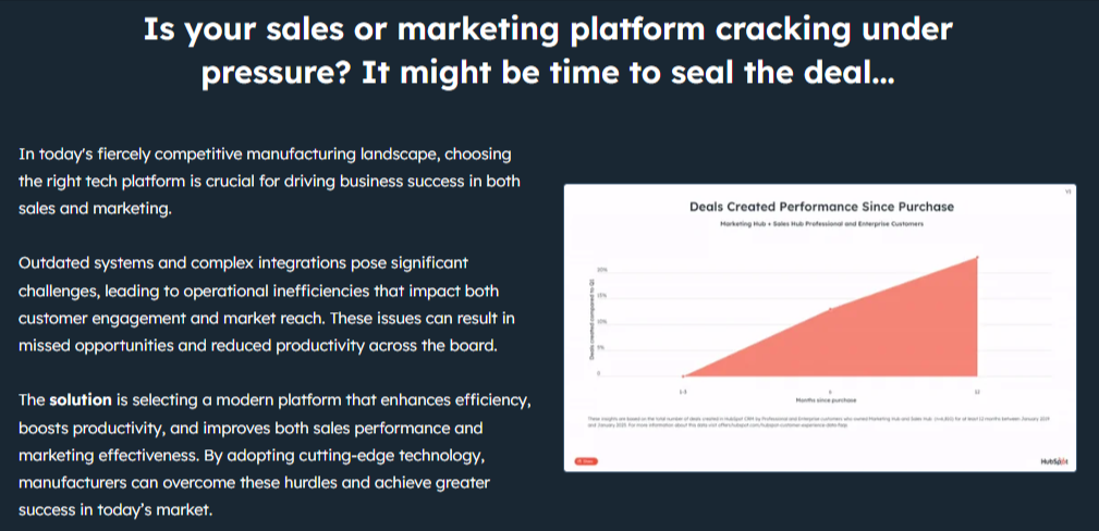
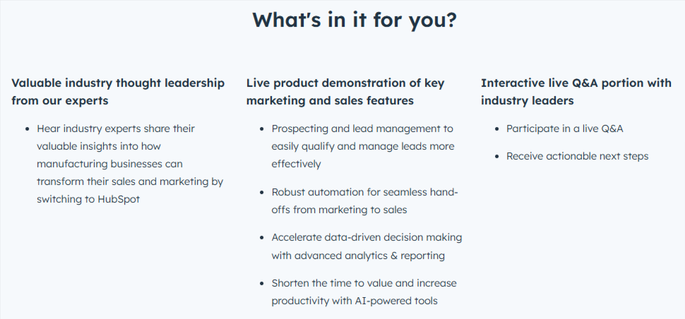
9. HubSpot "Must-Have Marketing & Sales Tools"
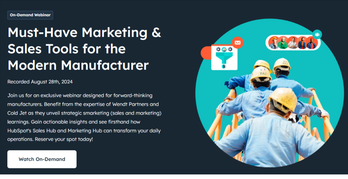
This on-demand HubSpot webinar landing page is on the longer side, but it works, thanks to a clean layout, clear sections, and persuasive copy.
Targeted at manufacturers, the page doubles as a sales pitch, highlighting common industry challenges and showing how HubSpot’s Sales and Marketing Hubs provide the solution.
Each section of the page strengthens the offer, encouraging people to sign up. Even if you skip straight to the sign-up form, there’s a blurb about why you should watch the webinar.
What else do we like about this webinar landing page?
👍 Strong title/topic telling people who this webinar is for
👍 The use of action words and phrases – “must-have”, “forward-thinking”, “transform”
👍 CTAs at the top and bottom of the page
👍 Eye-catching color scheme
10. Runway Coach NYC " How to become a model"
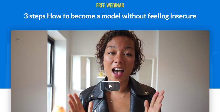
This is a free webinar promoting the services of a coach who helps people to perfect professional modeling techniques and to find success. Mandy offers courses, workshops, and one-to-one tuition.
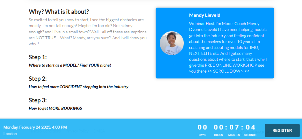
The landing page features a short intro video and a bio, with copy designed to welcome even those who might think the industry isn’t for them.
There’s also a countdown timer to create urgency (though as with most, it’s more for show). The webinar is on-demand, so once you register, you can watch it right away.
What else do we like about this webinar landing page?
👍 It’s brief and to the point
👍 It’s very creator-focused – people who sign up get an introduction to Mandy as well as getting an overview of the topic
👍 There’s a clear link to the paid offering
11. Airmeet "See Airmeet in Action"
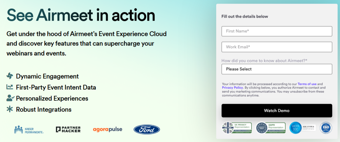
Airmeet’s landing page is designed to capture leads by offering a short webinar that demos its virtual summit, meetup, and workshop platform.
The page is on the longer side, serving double duty as a sales pitch.
CTAs appear at both the top and bottom, and a neat bullet list outlines what attendees will learn.
The landing page goal? Collect email addresses while getting people actually to watch the webinar.
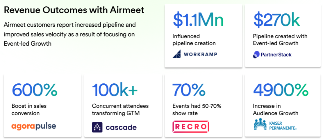
The rest of the page highlights the advantages of Airmeet, backed up with testimonials, numbers, and an overview of the platform’s features.
What else do we like about this webinar landing page?
👍 The use of data and client “name drops” to promote Airmeet’s offering and emphasize its authority
👍 The bottom CTA automatically takes people back to the top of the page to fill in the form
12. BigCommerce "Adapting to the New Era of Digital"
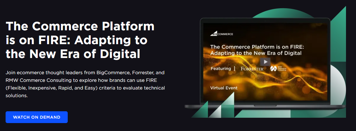
This entry from ecommerce platform BigCommerce is an example of an expert-led webinar landing page. In this case, the speakers and their bios are listed before the content of the webinar.
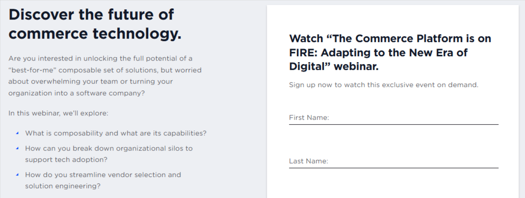
The page is set out in three clear sections with a subtle color scheme and key parts highlighted. The content of the webinar is set out as a bullet point list, which poses questions that the instructors will address.
The page has a bold CTA at the top, which automatically sends people to the sign-up form at the bottom of the screen. Clean, concise, clear.
What else do we like about this webinar landing page?
👍The title and graphic at the top really stand out
👍The landing page uses minimal text
👍The reader-friendly layout
13. Babbel for Business "Digital learning in the workspace"
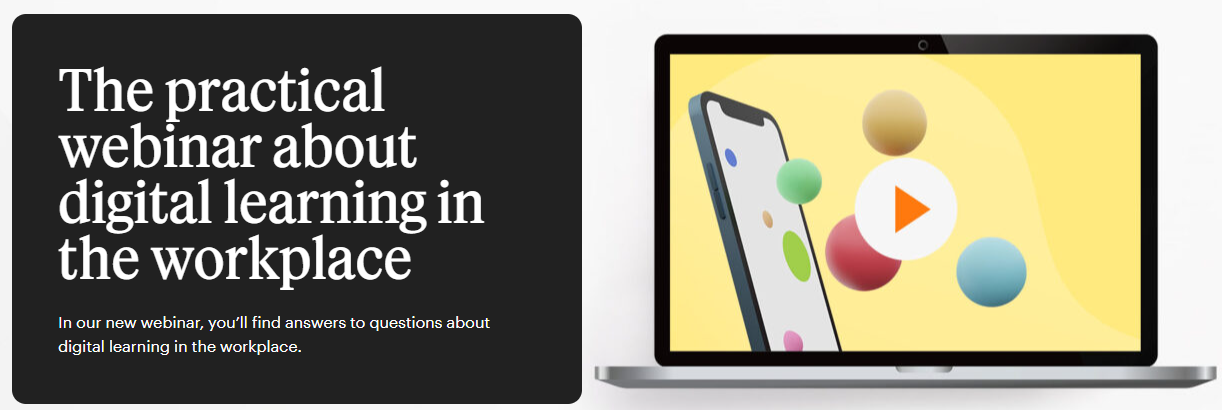
Our next example from language learning platform Babbel is another webinar landing page that adopts the effective above- and below-the-fold design.
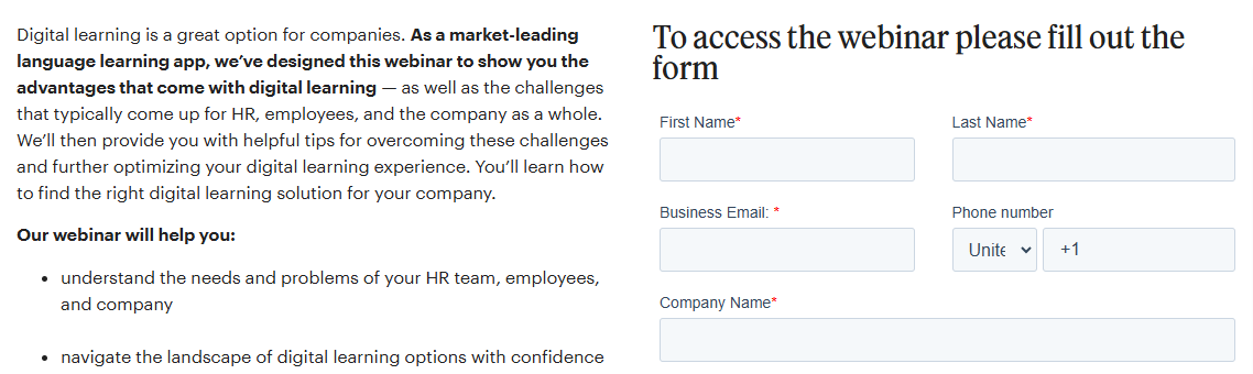
The top of the page has a standout headline in a bold color scheme and font, with an eye-catching image. The blurb tells people they’ll “find answers to questions” about digital learning, so anyone interested in this topic will be encouraged to sign up.
What else do we like about this webinar landing page?
👍 The use of highlighting in the text to make it easily scannable
👍 The numbered takeaways – “4 fundamental principles of digital learning”
👍The straightforward and knowledge-led approach – this is more a gentle sell than a hard sell
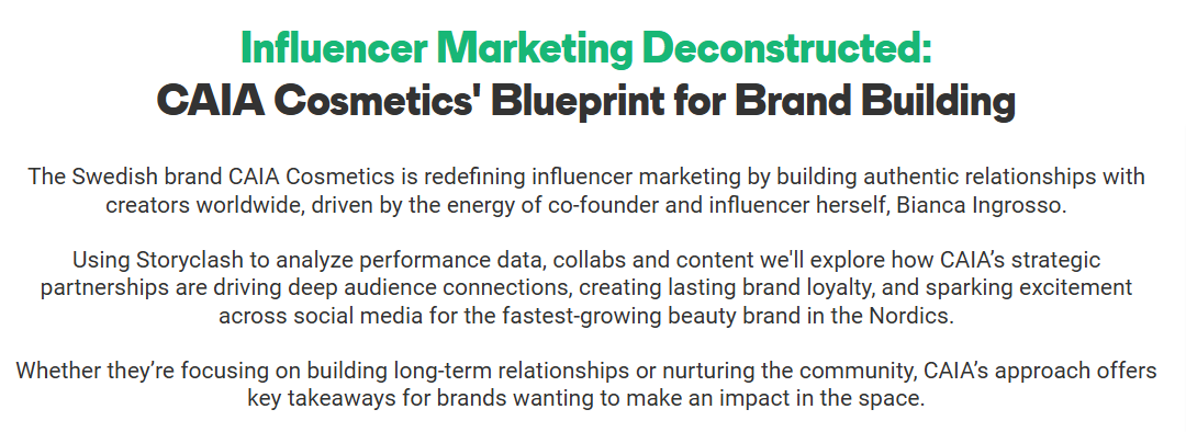
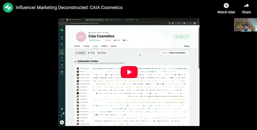
14. Storyclash "Influencer Marketing Deconstructed"
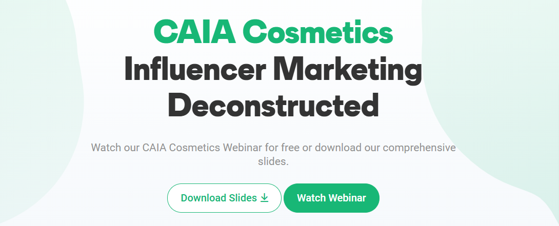
This landing page, promoting a case-study webinar from influencer marketing tool Storyclash for a cosmetics brand, shows how a fresh, well-organized layout can boost sign-ups.
The page pairs eye-catching graphics at the top and bottom with relevant stock images of makeup products. Clear sections, a clean black-white-green color scheme, and plenty of spacing make it easy to read and navigate.

Interestingly, the webinar can be accessed without filling in a form. When you click on the “watch webinar” button, it pops up as a YouTube video. However, the content is also available in slide form, which does require an email address.
It offers a reminder that content can always be repurposed, offering your audience multiple ways to consume the information.
What else do we like about this webinar landing page?
👍 The landing page links out to a relevant blog on the Storyclash website
👍 The page clearly breaks down the topics – this includes a Q&A session
15. Jon Schumacher :How to Confidently Sell Your Coaching"
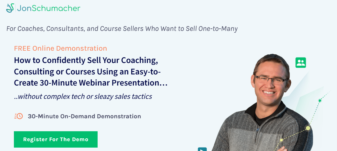
Jon Schumacher created a visually appealing, well-structured landing page for his webinar, designed to help people sell coaching and consultancy services.
Key details are front and center, followed by a deeper dive into the webinar’s process. The page also features three glowing testimonials from satisfied clients.
Clicking on the “register now” button launches a simple sign-up form. Interestingly, while the webinar is billed as “on-demand”, there are also scheduled sessions.
What else do we like about this webinar landing page?
👍 The overall friendly and accessible tone – essential in a personal business like coaching
👍 Three CTAs included in the copy – important in a longer landing page like this
16. Shopify "How to improve your TCO"
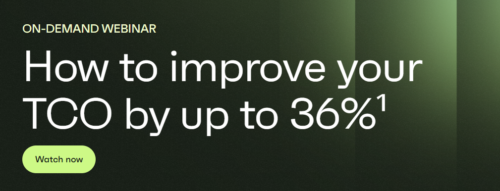
Ecommerce platform Shopify built a bold landing page for a research-led webinar.
The 36% figure in the headline provides a hook for audiences who already know about TCO (Total Cost of Ownership).
There are bios featuring pictures of contributors, followed by two paragraphs explaining the content of the webinar.
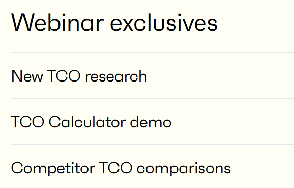
At the bottom is a list of “webinar exclusives” which include the original research and case studies.
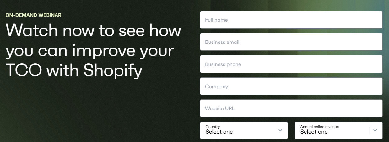
The CTAs stand out and take people to the simple form to fill in to access the on-demand webinar.
What else do we like about this webinar landing page?
👍 The webinar promises to share exclusive information – a great way to encourage people to sign up
👍 The eye-catching color scheme of black, white, and greens
👍 The reader-friendly mix of different size fonts
17. LinkedIn Learning "The Power of Learning"
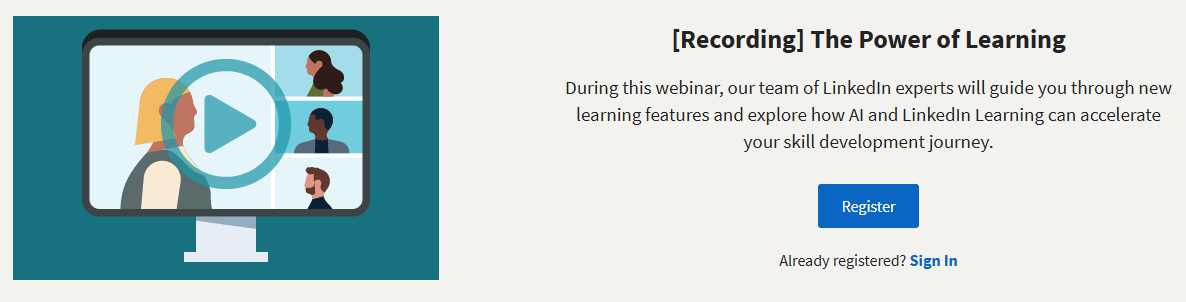
LinkedIn offers a range of video courses and webinars, and this landing page highlights a user’s 15-minute session.
The design is simple: a bold graphic and a short paragraph explain what the webinar covers. It’s concise and to the point, though adding a bullet-point list could make the info even easier to digest.
One interesting aspect is the use of a timestamped curriculum telling people the topics and their duration. The CTA takes people to a page where they log in to LinkedIn or sign up for an account.
What else do we like about this webinar landing page?
👍The compact style – the landing page only takes up half a page
👍 The LinkedIn branding – this webinar is informational but also a showcase for LinkedIn
18. Diageo Bar Academy "Lifestyle tips for better industry after hours"
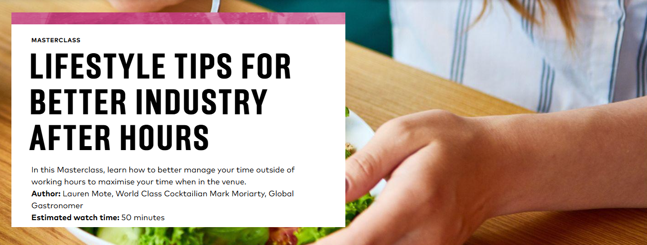
This example from the education arm of global drinks brand Diageo (which owns the likes of Guinness, Smirnoff, and Johnnie Walker), highlights how webinar landing pages can be valuable content in their own right.
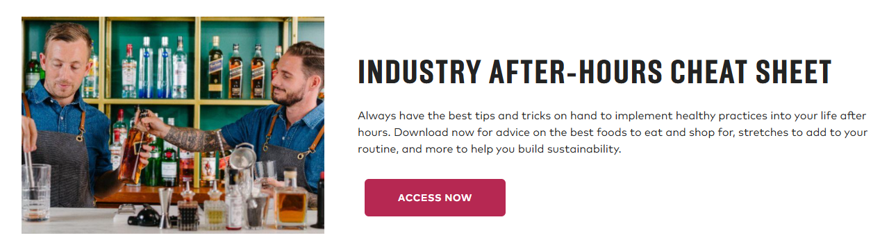
As well as offering immediate access to the webinar content, the page features a cheat sheet of tips on the topic and links to relevant blogs on the website.
The landing page also includes all the information needed about the webinar, including key learning outcomes and the contributors.
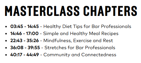
One interesting thing about this example? There’s no CTA or sign-up form.
Users can watch the webinar right on the page and access the PDF tips without an email address. The free educational content supplements the company’s main business and cements its authority in the drinks space.
What else do we like about this webinar landing page?
👍The clean and bold page layout
👍 The breakdown of the webinar into chapters
👍 The simple text that states what people will learn – maintaining a work/life balance in the drinks industry
19. BrightTALK "Decoding Bad Bot Attack Insights"
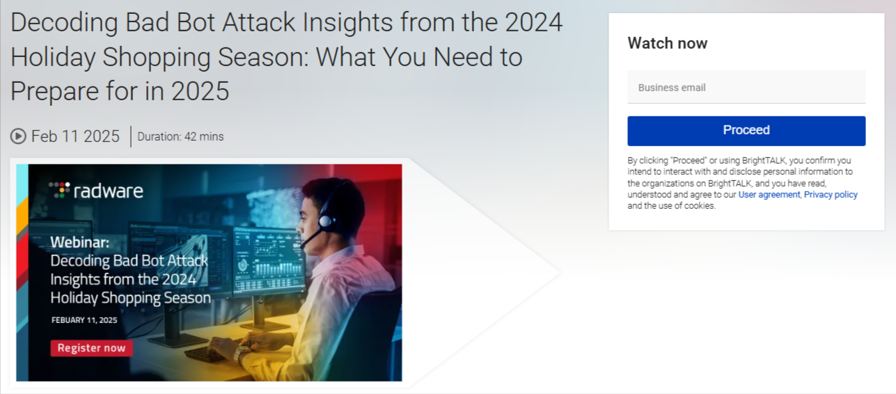
Tech media company BrightTALK hosts webinars like this one from cybersecurity firm Radware, which checks all the landing page boxes.
The headline hooks readers by offering a solution to the real threat of “bad bot attacks.” The page is data-driven, promising actionable steps retailers can take to prevent costly attacks, and the timely topic adds a sense of urgency.
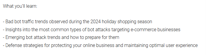
While the font and text aren’t bold, the copy is clearly set out, with a bullet point list. The focus is on providing information to users that can improve their cybersecurity and boost their revenue.
What else do we like about this webinar landing page?
👍The use of phrases like “actionable strategies”
👍The box at the bottom with information about Radware
👍 The clear CTA with just an email needed to sign up
20. Semrush "The Google Business Profile Game Plan"
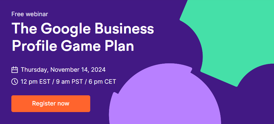
SEO and online marketing platform Semrush offers a range of informational webinars, including this example, which shows how you can use bold colors to attract viewers.
The landing page uses white, green, purple, blue, and pink to divide its content into clear sections - a synopsis, a bullet point list of key takeaways, and contributor bios.
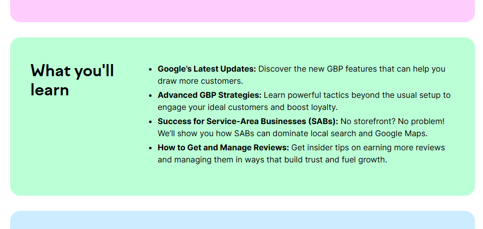
There’s a large sign-up form at the bottom in eye-catching purple with an orange “register now” button. As well as attracting people to sign up, the color scheme has a young vibe, underlining that Semrush is plugged in to modern SEO and online marketing trends.
What else do we like about this webinar landing page?
👍 Strong CTAs at the top and bottom of the page
👍 Social sharing buttons
👍 The graphic at the top contains all the important information about the webinar
21. The Scholarship System "6 Easy Steps to Find & Win Scholarships"

This site, aimed at helping college students and their parents access scholarships, has a whole range of resources, paid and free, including this webinar.
As well as the webinar, the page ties in with The Scholarships System’s entire offering.
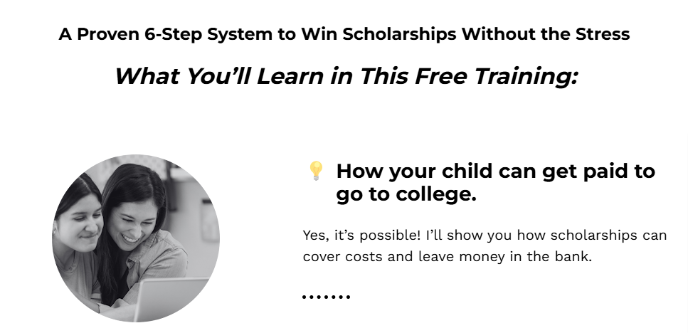
This webinar page basically doubles as a sales cheat sheet. It hits you with college debt stats, shows why paying for school is scary, lays out a “proven system” that actually works, and flexes some glowing user testimonials.
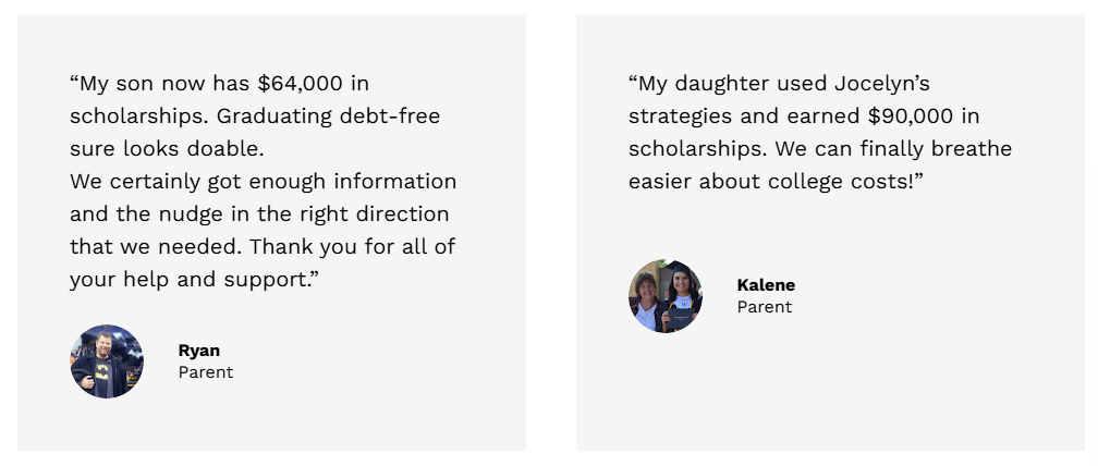
Because of all this content, the landing page is long, with multiple sections, graphics, bullet points, and a bold CTA at the bottom.
What else do we like about this webinar landing page?
👍 The clear problem/solution proposition
👍The “claim your free spot now” CTA – creates urgency by suggesting spaces are limited
👍 Uses emotive words and terms like “drowning in student loans”, “overwhelming”, and “terrifying” – almost scaring people into signing up
👍 It offers people who do sign up a bonus chapter of a related paid ebook as a tempter
22. DesignUp "From Graphic Designer to UX/UI"
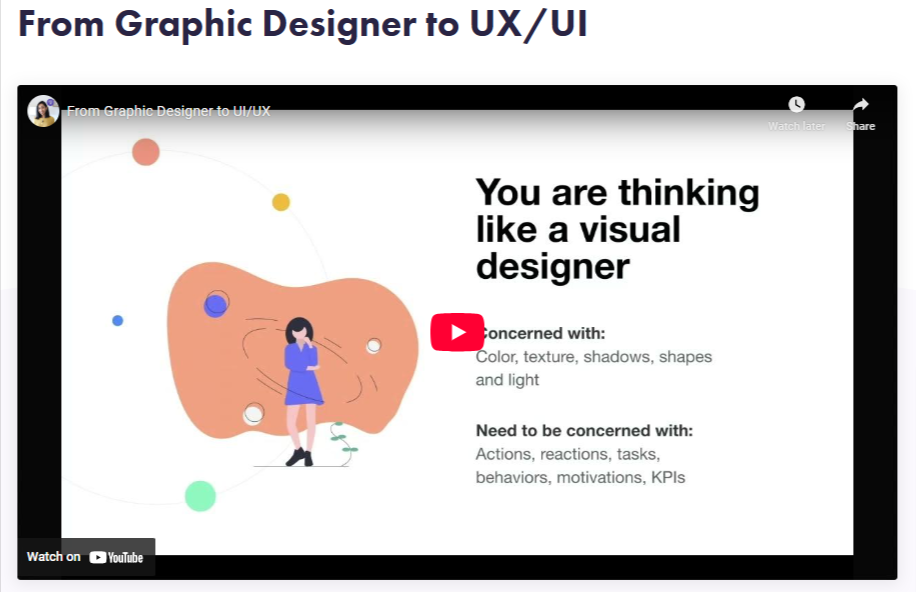
Here’s another straightforward landing page, this time for a webinar in a series helping designers level up their UX/UI skills.
DesignUp has paid courses, but this webinar’s free on YouTube – no forms, no emails, just hit play and learn.
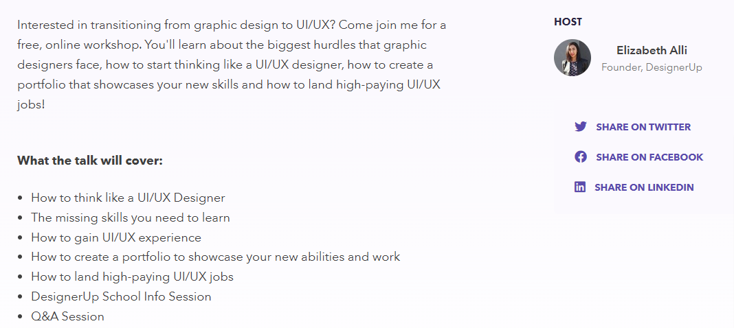
The landing page adopts a personal angle. DesignUp’s founder hosts the webinar, and the landing page includes phrases like “join me”. It also sets out the main takeaways, including that it can help people land high-paying UX/UI jobs
What else do we like about this webinar landing page?
👍 The inclusion of social sharing buttons
👍 The subtle color scheme
👍 The friendly and accessible tone
👍 Promotes a DesignerUp School Info Session – to encourage people to sign up for the paid course
23. OptinMonster "Unlock the Secrets to Growing Your Email List Fast!"
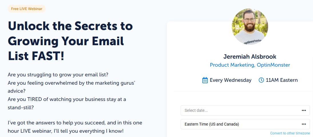
This landing page nails it (no surprises from a lead-gen platform) – strong, customer-focused copy, glowing testimonials, all the essentials.
Up top, it hits readers with questions that actually matter to them, while the instructor promises the info they need to get real results.
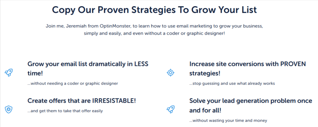
The bottom of the page includes the main takeaways set out in an appealing format, with five-star testimonials below.
The font and color scheme are easy on the eye, and the whole landing page gives the impression that signing up to the webinar is a no-brainer.
What else do we like about this webinar landing page?
👍 The inclusion of a CTA to sign up to the OptinMonster platform
👍 The use of emotive words and phrases to motivate people to sign up – “grow your email list dramatically”, “create offers that are irresistible”, etc.
24. Unbounce "How to get started with Unbounce in 30 minutes"
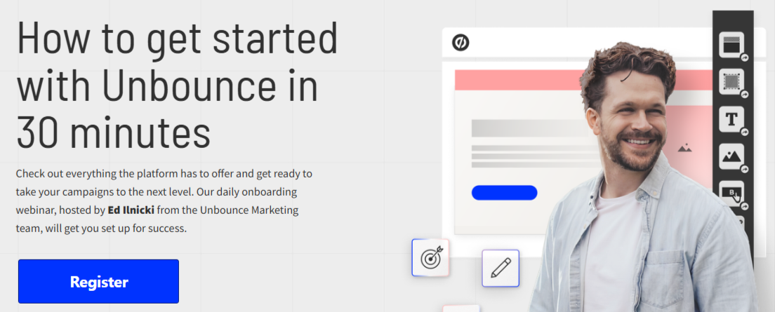
Another strong example from a company that specializes in – wait for it – landing pages!
This webinar offers a brief walkthrough of all Unbounce’s main features to help new users get up to speed.
The page is set out in three simple sections. At the top, there’s a bold image of the presenter. Further down, testimonials, and below those, a checklist of what the webinar will cover.
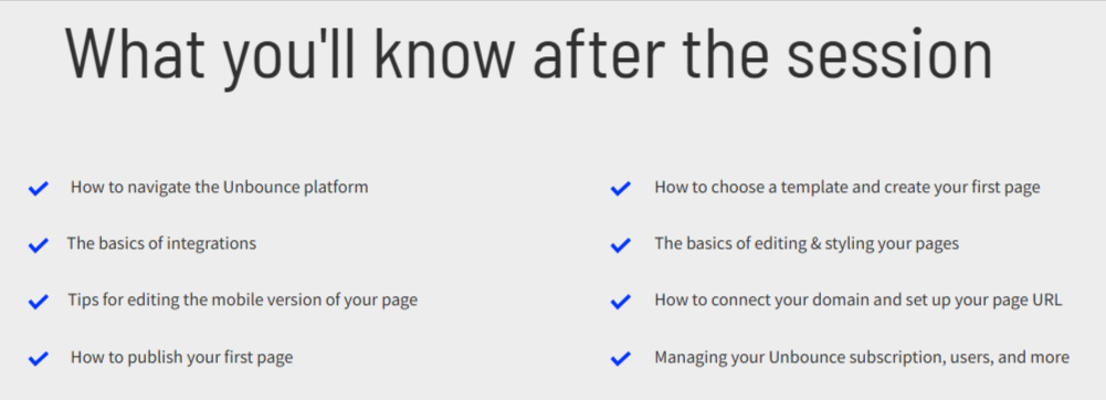
Other than a second CTA at the bottom, the landing page has all the important details and is presented in an appealing and friendly way.
What else do we like about this webinar landing page?
👍The muted color scheme with standout bright blue CTA
👍 The straightforward title – including the time commitment required to watch the webinar
👍 The option for people to watch a recording if they can’t make a live event
25. Bandzoogle "How to create an effective EPK"
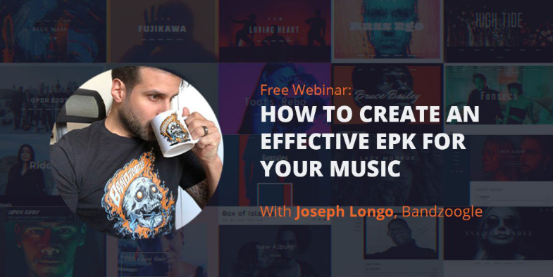
This example comes from a website builder that helps artists promote and sell their music.
The landing page for the webinar on building an electronic press kit (EPK) includes a link to a blog post on the topic. It also sets out that it’s an important marketing tool for musicians.
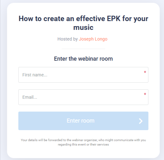
This all motivates people to click on the CTA and fill in the form to watch the free webinar.
At the end of the page is a link for people to build their own EPK, with a 30-day free trial of the Bandzoogle platform.
What else do we like about this webinar landing page?
👍 The cool graphic at the top which is in line with the brand’s tone
👍 The social sharing buttons and newsletter sign-up box at the bottom to encourage further engagement
26. Sprout Social "Demo Webinar"
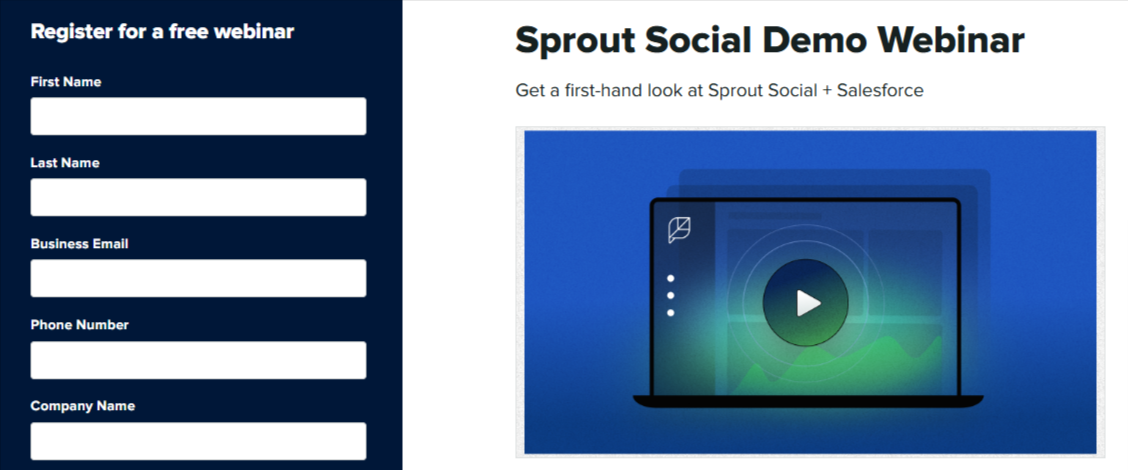
Next up is a compact demo-style landing page from Sprout Social and Salesforce.
All the key info is easy to find, plus there are instructor bios. The “save my spot” CTA adds a little FOMO, making it feel like spots are limited.
Unlike some other pages, the signup form gets its own column on the left, super prominent.
There’s also a CTA to try Sprout Social, so it doubles as a subtle sales push.
What else do we like about this webinar landing page?
👍The bold navy and white color scheme for the sign-up form ensures it stands out on the page
👍 Links at the bottom to other relevant webinars
27. Mailchimp "Build Stronger Customer Relationships with SMS Marketing"
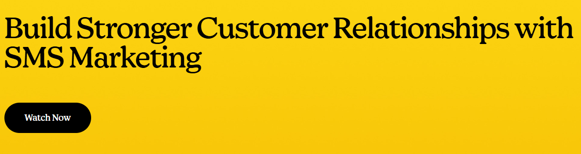
This landing page from Mailchimp is bold and straight to the point for their free on-demand SMS marketing webinar.
The headline hits both the topic and the main benefit (building stronger customer relationships).
Below that, a simple description and a bullet-point list break down what the webinar covers, followed by big, eye-catching images of the contributors.
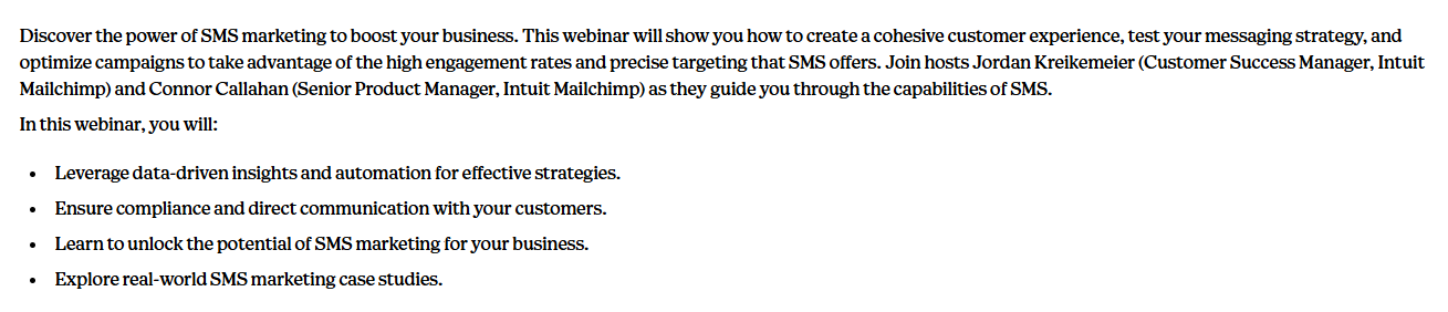
Scrolling to the bottom reveals more details on the webinar’s agenda. Clicking on the “watch now” CTA brings up a sign-up form.
What else do we like about this webinar landing page?
👍 The clutter-free page layout
👍 The use of Mailchimp’s distinctive yellow and black colors that brand the page
28. Crimson Education "Ive League Admissions Tips"
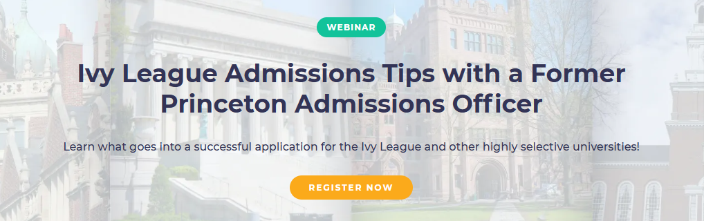
Crimson Education’s landing page for their free webinar grabs attention with a bold red, purple, gray, and white color scheme and on-brand graphics.
The page is neatly divided into sections, and the headline hooks anyone dreaming of an Ivy League spot – plus it gives the key webinar details right up front.
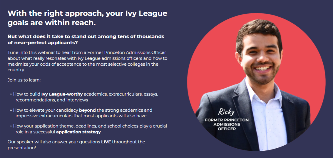
The following sections break down what the webinar covers and highlight that attendees can ask questions live.
There’s a speaker bio paired with images of Ivy League schools, and the page wraps up with a Zoom sign-up form at the bottom.
What else do we like about this webinar landing page?
👍Below the webinar information is some more details on Crimson – including stats on how many clients it’s helped
👍The CTA at the top takes people directly to the form at the bottom
29. Surfer SEO "How to Optimize Content with Surfer"
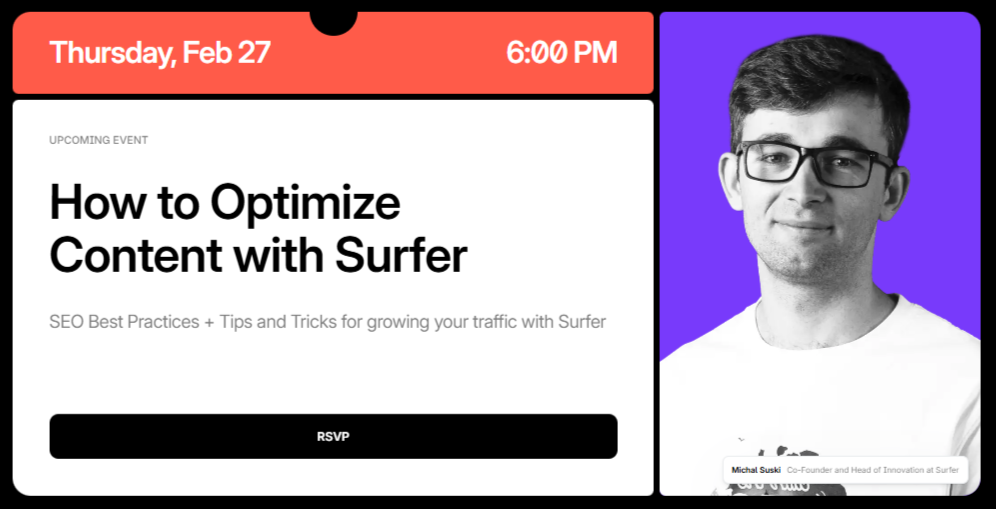
Surfer SEO’s compact webinar landing page nails it with a clean layout, putting most of the key info in the eye-catching top section.
Scroll down for a clear breakdown of what the webinar covers, with spaced-out text and a bullet list that’s easy to scan.
The copy makes it clear: sign up and you’ll get the tools and know-how to crush it with Surfer.
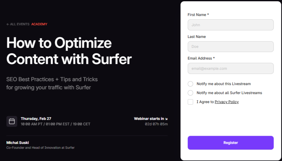
The purple “register” button stands out against the black-and-white color scheme. At the bottom is a prominent CTA for signing up to the Surfer SEO platform.
What else do we like about this webinar landing page?
👍 The addition of a countdown timer to prompt people to sign up
👍 The social sharing buttons to encourage engagement with the brand
30. ActiveCampaign "How to build your perfect dashboard"

This landing page for an ActiveCampaign webinar keeps it simple, spotlighting one of the platform’s features.
Unlike other bold, colorful pages, this one’s low-key, but still works.
The muted colors make the key elements pop: a large, eye-catching header and a bright blue “watch the webinar” button draw attention where it matters.
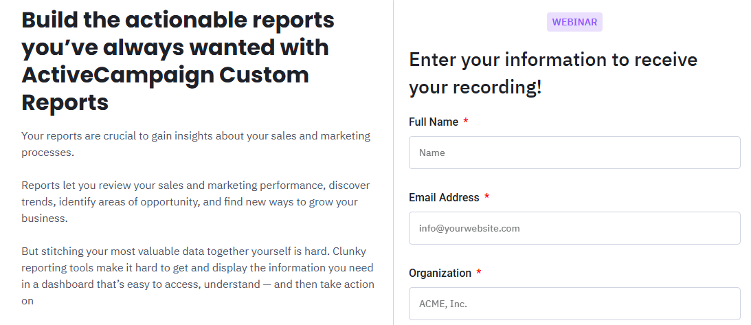
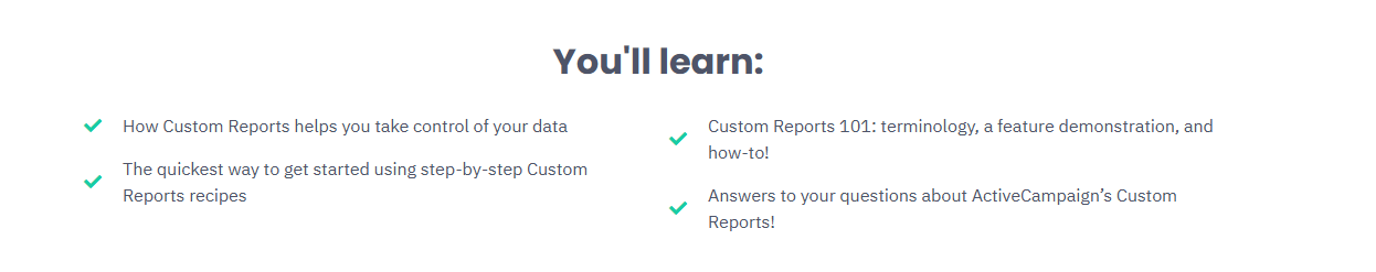
The page also features a bullet point list with green ticks and includes a positive testimonial about ActiveCampaign.
What else do we like about this webinar landing page?
👍 The no-frills approach
👍 The compact and reader-friendly page design
How to create a winning webinar landing page
After checking out all these webinar landing pages, a few key elements stand out:
- ✅ Headline that grabs attention – Make it impossible to scroll past.
- 📅 The basics upfront – Date, time (and time zone), presenter bio, and platform (Whop, Zoom, YouTube, etc.).
- 💡 A compelling reason to watch – Show what viewers will get that they can’t find anywhere else.
- 📋 What the webinar covers – Use bullet points or another easy-to-scan format.
- ✍️ Simple sign-up form – Name and email are usually enough.
- 🌟 Testimonials – Real feedback from happy users adds social proof and trust.
- 🚀 Clear, bold CTAs – Like “See results now” or something equally compelling.
- 🎨 Strong color scheme – Stay on-brand, highlight sections, and create contrast
Host your webinar on Whop

Feeling overwhelmed by all the options for building an online business? We’ve made it simple.
Whop is your all-in-one platform to create and monetize any digital product—including webinars.
Open a free account, and your Whop becomes your home on the web. Start with a blank slate and build exactly what you need using our apps.
Want to host webinars? There’s an app for that. Focused on gathering leads? We’ve got a tool for that, too.
Check out our posts on using the Webinars and Leads features to get started.
Plus, your Whop comes with its own customizable storefront (basically a landing page) to showcase all your digital products in one place.
Join tens of thousands of creators already living their entrepreneurial dream on Whop.
Frequently asked questions about webinar landing pages
What is a webinar landing page?
A webinar landing page is a dedicated webpage designed to promote your webinar and collect registrations. It usually includes the event details (topic, date, time, and host) plus a clear call-to-action for visitors to sign up.
Why do I need a landing page for my webinar?
A landing page makes it easy to share all the key details in one place, build credibility, and capture attendee contact info. It also helps boost sign-ups since you can promote the page through email, social media, or ads.
What should a webinar landing page include?
At minimum, include: a headline that grabs attention, the date and time of the event, a presenter bio, a list of key takeaways, and a simple sign-up form. Adding testimonials, FAQs, and strong CTAs will increase conversions.
How do I drive traffic to my webinar landing page?
The most effective methods include email marketing, social media promotion, paid ads, partnerships, and SEO. Many creators also repurpose content—like short video clips or blog posts—to funnel people back to the registration page.
Can I host a webinar landing page for free?
Yes. Platforms like Whop let you create a free, customizable landing page (your “whop”) where you can host webinars, collect sign-ups, and even sell access to recordings or related products.