Discover the importance of a good website design to attract viewers and convert them to customers and take a look at 25 beautiful websites for inspiration.
Key takeaways
- Beautiful design attracts visitors, but streamlined functionality and easy checkout convert them into paying customers.
- Smart product categorization and personalization features like quizzes help customers navigate large inventories without overwhelm.
- Social proof through reviews, testimonials, and influencer features builds credibility and drives purchasing decisions.
They say don't judge a book by its cover, but the reality is that we do. Whether it is books, food, clothing, or even websites, we are attracted to beautiful and eye-catching designs.
So, if you want to attract more visitors to your ecommerce site (or encourage those already on your site to stay longer) then you need a beautiful website. The basics will do the trick: a good layout, professional design and a user-friendly interface with high-quality photos.
But what compels a customer to purchase or sign up for a service? This is where you incorporate other elements such as adding a call to action and having a quick checkout process. The aesthetic draws customers to your website, but it is the functionality that converts them from viewers to paying customers. As long as you make the buying process easier for the customer and offer various payment options, making a sale shouldn't be a problem.
In this article, we'll discuss the importance of a good website design and offer tips to make your website stand out and convert. You can also take a look at our list of 25 beautiful websites for inspiration.
Why website design matters
A business owner's ultimate goal is to sell products and services.
For physical stores, business owners need to design them in a way that attracts new customers and encourages them to browse inside. For ecommerce stores, it's about creating and launching a professionally designed website to act as your storefront, showcasing your products.
While selling high-quality products can help you gain more customers, never underestimate the power of a good website design to attract new clients and keep current ones. A website that's difficult to navigate or confusing will result in lost sales.
It's important to include all the essential elements to increase traffic and drive conversions. Better yet, hire professionals if you're not experienced with website design.
23 of the Best Ecommerce Site Designs (and why they're so successful)
We've explained why website design matters – now let's see some examples of incredible site design in action.
1. Verve Coffee
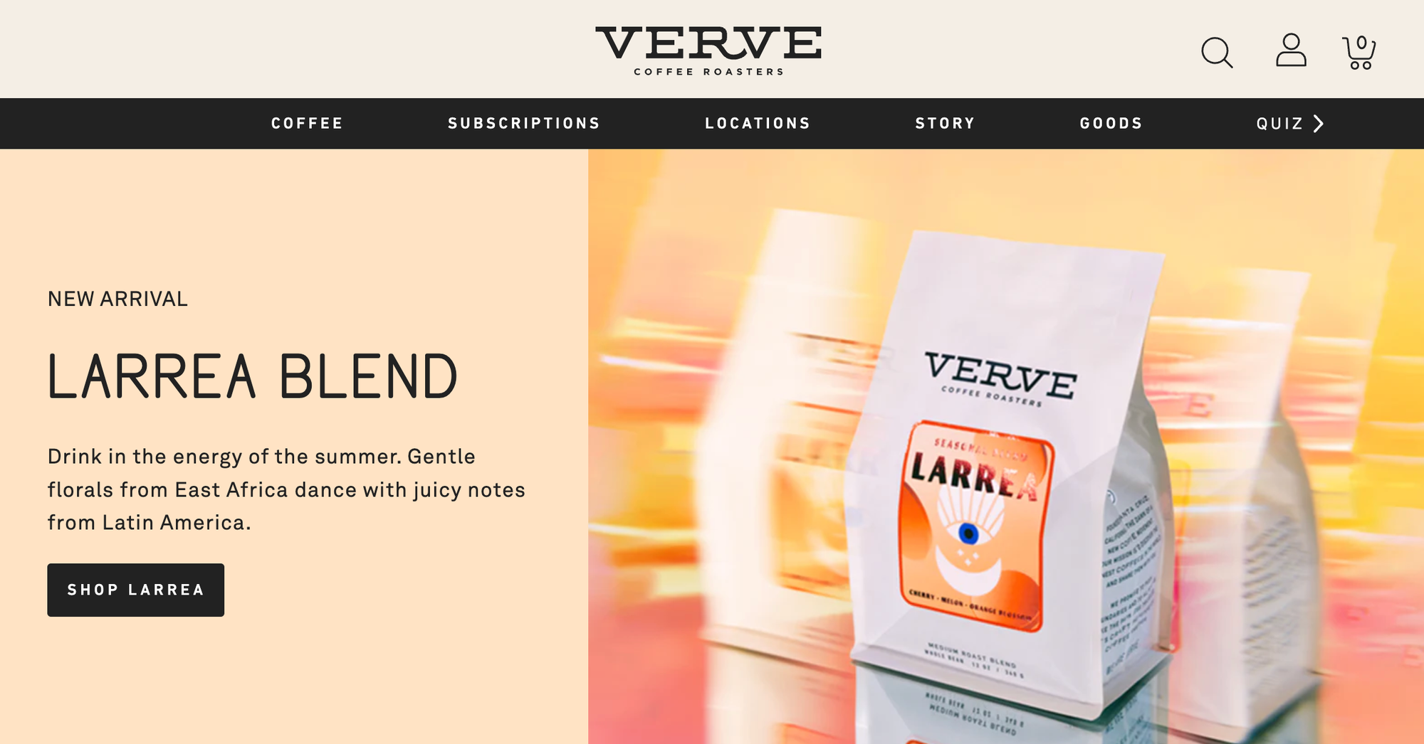
Verve is a website for a coffee roaster and its layout and colors are easy on the eyes. Plus, the site uses positive reviews for social proof, reassuring customers that they too will be happy with their purchase.
When it comes to buying with Verve, it is an incredibly easy process. All you need to do is tap "Quick Add", choose your Grind and Size and click "Add to Cart". It's that simple. No need to go to different web pages to make a purchase — you can do this with just a few clicks, and the checkout process is just as easy.
Verve goes a step further by even including a quiz to give you personalized coffee recommendations.
Why this works: From beautiful branding to personalized recommendations and streamlined purchasing, Verve makes shopping online easy, personal and fun.
2. Topo Designs

A good layout, clean designs and attractive product photos make this website appealing to customers. Offering a 15% discount when you sign up is also a plus. Its Index section looks neat, with information on returns and shipping, plus repairs. We also like that Topo Designs includes information about their company, giving them more credibility.
Why this works: With a website as colorful as its products and an "About Us" that makes you feel good about your purchase, it's hard not to want to buy with Topo.
3. Puravida Bracelets
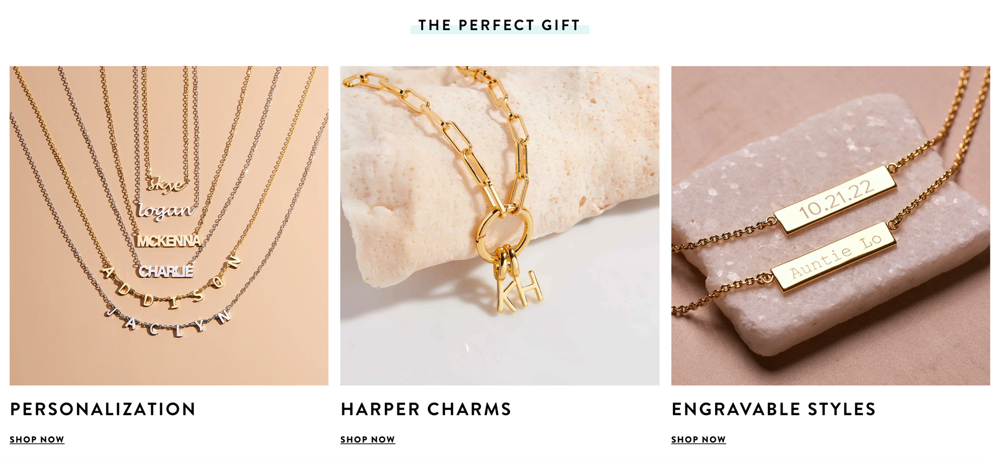
Puravida is a jewelry store, and the great thing about its design is the categories. With categories such as Trending Now, The Perfect Gift and Handpicked For You, customers are guided to where they need to be with ease, despite there being a large amount of products on offer.
Additionally, Puravida creates urgency by adding a timer to get a 30% discount, compelling a customer to purchase right away (or lose out on the lower price). There is also a large section of the site with social proof, where Puravida shares reviews, inspiration from Instagram, and media appearances.
Why this works: The number of products on the Puravida website could easily be overwhelming, but the intelligent design directs customers to where they need to be.
4. Finn
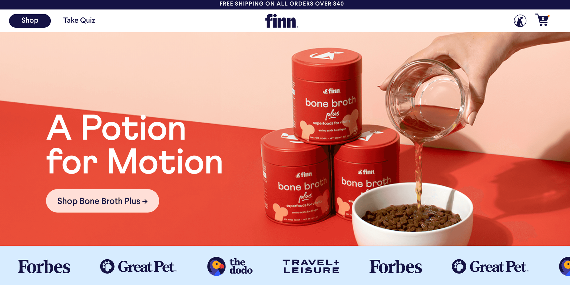
Finn is an interesting concept – the site offers pet supplements and consultations with a virtual vet, taking the guesswork out of making a purchase.
The ecommerce site is beautifully bold and bright, with a modern, attractive font and large, clear images. One of the first things you see is a scrolling bar displaying all the publications where Finn has been featured, and this feature, combined with vet endorsements and reviews, makes for great social proof.
Finn also includes a quick, two-minute quiz to help pet owners decide which product to buy. So, if prospective customers don't have the time for a virtual consult, they can simply complete the quiz. Having both options means there is something for everyone.
Why this works: If the eye-catching design and stylish images don't grab your attention, then the reviews and recommendations from real vets certainly will.
5. Kith
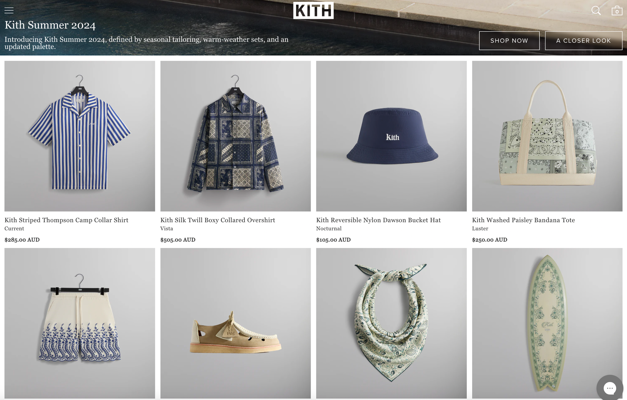
In contrast to Finn's bold design, Kith is a fashion ecommerce store with muted, serene branding. The clothes themselves are sophisticated and stylish, and the website design reflects this.
On the main homepage, you can see Jimmy Fallon wearing Kith golf apparel, helping customers perceive the product as high-quality, and making them likely to purchase. Kith also offers its customers an app, allowing them to conveniently purchase their favorite items.
The site allows you to scroll down and see each of the collections, or if you know what you are looking for, you simply open up the site menu on the side. Collapsible menus mean that customers aren't overwhelmed with choices, but can easily find what they are looking for.
Why this works: The site is as stylish as the products it is selling, and the navigation options are well-thought-out.
6. All Birds
All Birds is an eco-friendly shoe brand with a website that proudly displays its mission. The site's white background, clean layout and high-quality photos attract customers to the sustainable brand, and the separation of shoes into activity-focused categories helps consumers make informed choices.
While the first section of the ecommerce homepage is dedicated to the product, the second focuses on the brand's mission, sharing carbon footprint progress reports, sustainability initiatives, and even a marketplace for pre-loved shoes for dedicated eco-warriers.
Why this works: All Birds stays true to its brand with the website, ensuring customers can easily find facts and data to support sustainability claims.
7. Gentle Monster
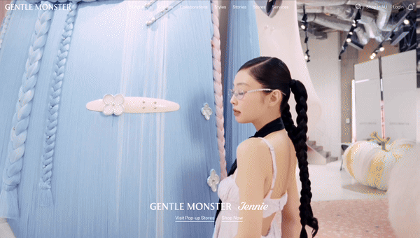
Soft pastels, giant fluffy rabbits and friendly unicorns: what could be more eye-catching? Gentle Monster is a South Korean luxury eyewear brand known for its innovative designs and high-quality glasses. The brand is also famous for its collaborations with fashion houses, celebrities, and other cultural entities, adding to its cult status among fashion enthusiasts.
As soon as you land on their website, you feel compelled to explore more, like you are venturing into a whole new world. Simply scroll down and read their stories to discover more about each campaign and watch it come to life in front of your eyes.
Why this works: The incredible imaginary world they have created through video and imagery draws the viewer in and invites them to explore the website.
8. Bite
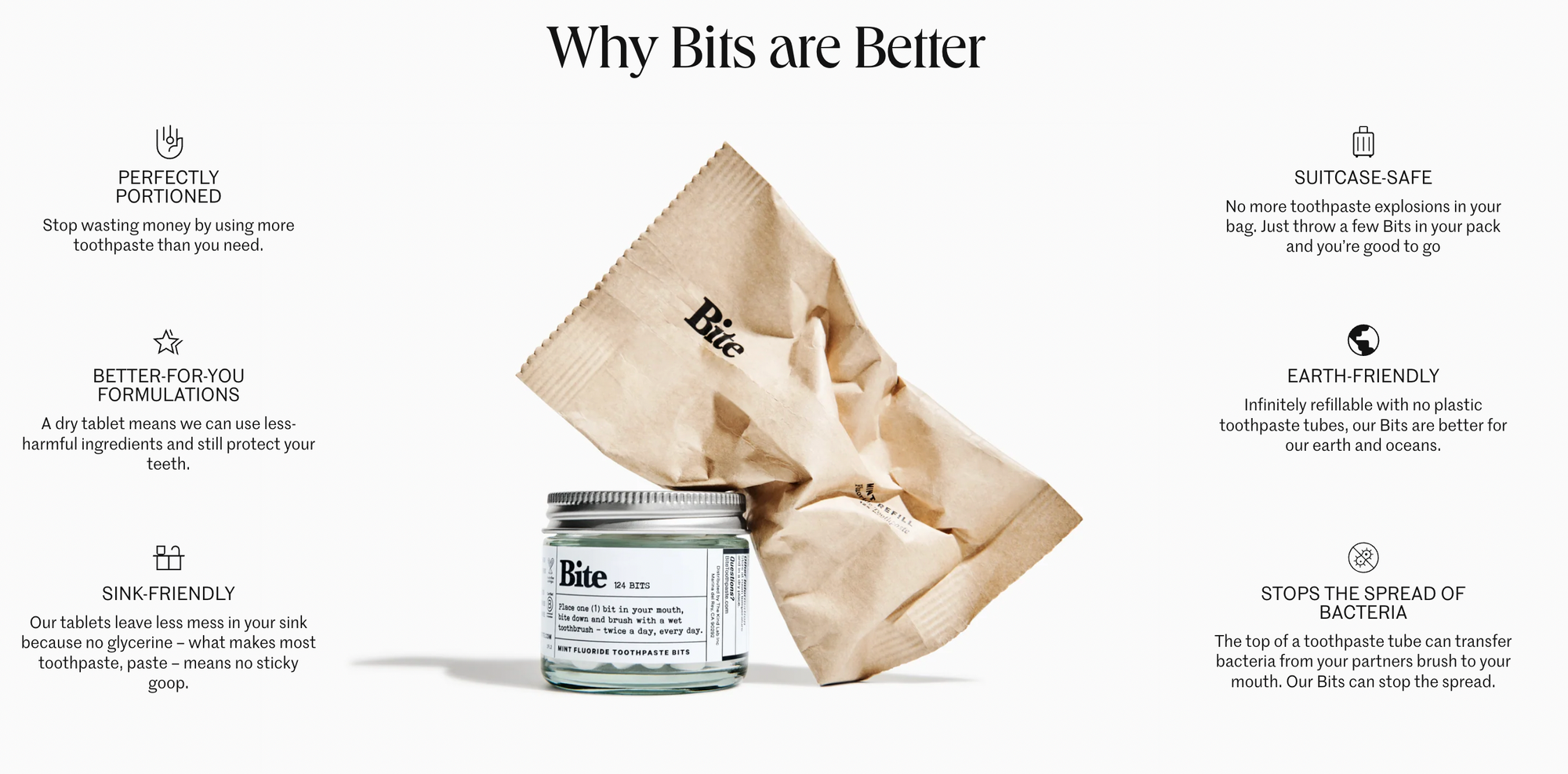
Who doesn't want to buy from a business that lists 20k+ reviews? If the positive reviews don't convince you to purchase, the clean design will.
Bite is a company selling 'toothpaste bits', an innovate solution to toothpaste tube waste. The first section of the page clearly and concisely outlines what toothpaste 'bits' are, and customers can find a more in-depth explanation as they scroll down the page.
The ecommerce brand is aware that this may be the first time a customer comes across this product, and so it gives customers all they need to know, from reasons why to use bits, to the most popular products, and FAQs on the home page.
Why this works: As a somewhat new-ish product it could be easy for customers to become confused when first visiting Bite, but the clear website design with thoughtful layout answers questions before they need to be asked.
9. Blissworld
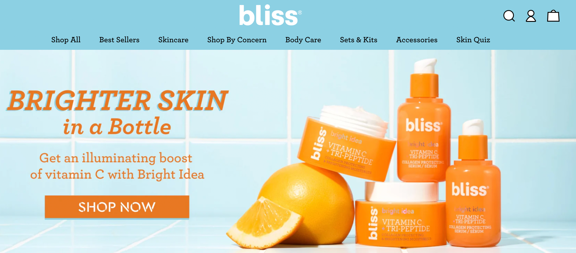
Like the products they sell, Blissworld's professional-looking website will also delight its visitors. It may not have a wide selection of items, but the user-friendly site with high-quality photos is pleasing to the eyes. They also added links to all their social media pages and Blissworld ships internationally.
The colors are bright and juicy (reflecting the branding of the products) and the website incorporates best sellers, influencer marketing, social proof and a skincare quiz. Customers may not know what they need when coming to buy a new beauty or skincare product, so the "shop by concern" feature is a great concept.
Why this works: Blissworld offers clean skincare with colorful packaging and the website reflects this. The inclusion of "best sellers" and "shop by concern", in addition to a "skin quiz" also guides customers to make informed purchases easily.
10. Baggu
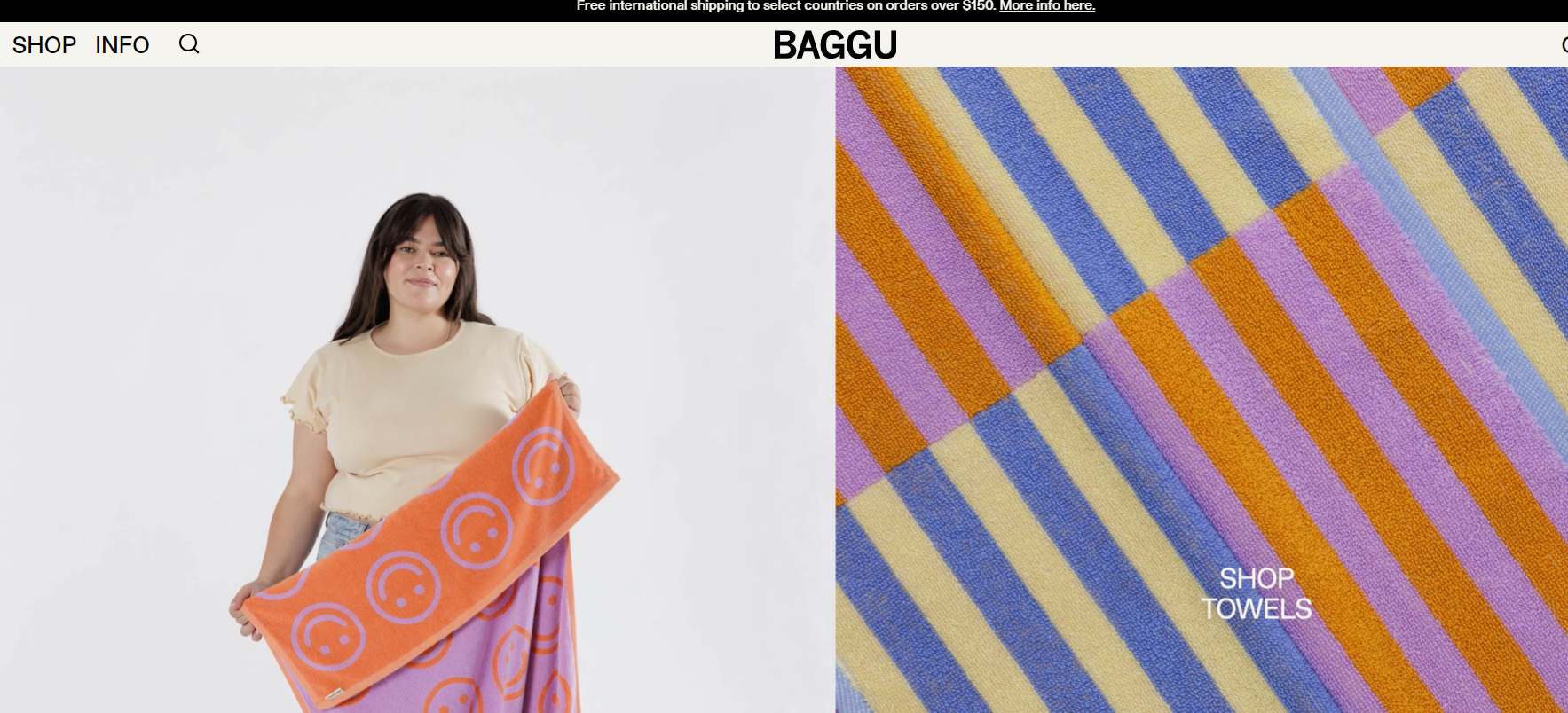
There's one thing clear as soon as you land on this website: Baggu sells towels and there are plenty of fun prints to choose from! From eye-popping colors to funky patterns, the moving parts of this website really help sell the brand right from the get go.
The enticement of free shipping on orders over $50 is a great incentive to get first-time (and return) customers adding directly to cart. Keep scrolling and you will discover they also sell backpacks, pouches, reusable bags and more, but most importantly, this business is all about loud and proud patterns. In fact, their "About" section is nice and simple 'BAGGU makes simple, playful things for everyday living'.
Why this works: From the moment you land on this website, you are drawn into their fun and playful world and know exactly what the brand is about. The site is nice and easy to navigate with so many great options to choose from.
11. Zenni Optical
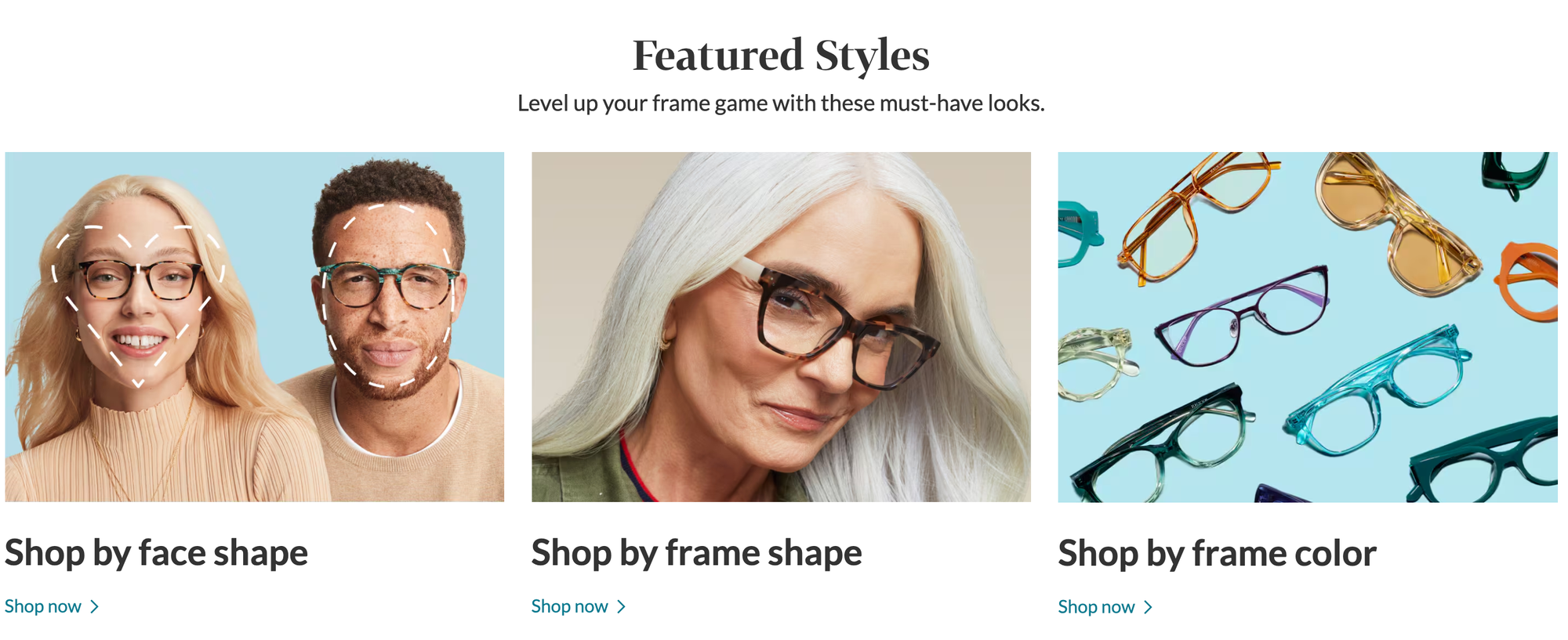
With its wide selection of glasses, customers at Zenni Optical are spoilt for choice. However, Zenni Optical makes finding the right glasses easy by categorizing their products with options like shopping by rainbow frames or shopping glasses perfect for migraines. Zenni Optical also goes the extra mile by featuring some of their customers on their website; you get a chance to be featured if you tag them on your Instagram.
We also like how they include a lot of details in their product descriptions, as this helps customers to make an informed decision.
Why this works: There are an incredible number of options for glasses, but Zenni Optical makes finding the right frames simple with its many categories.
12. Jackie Smith
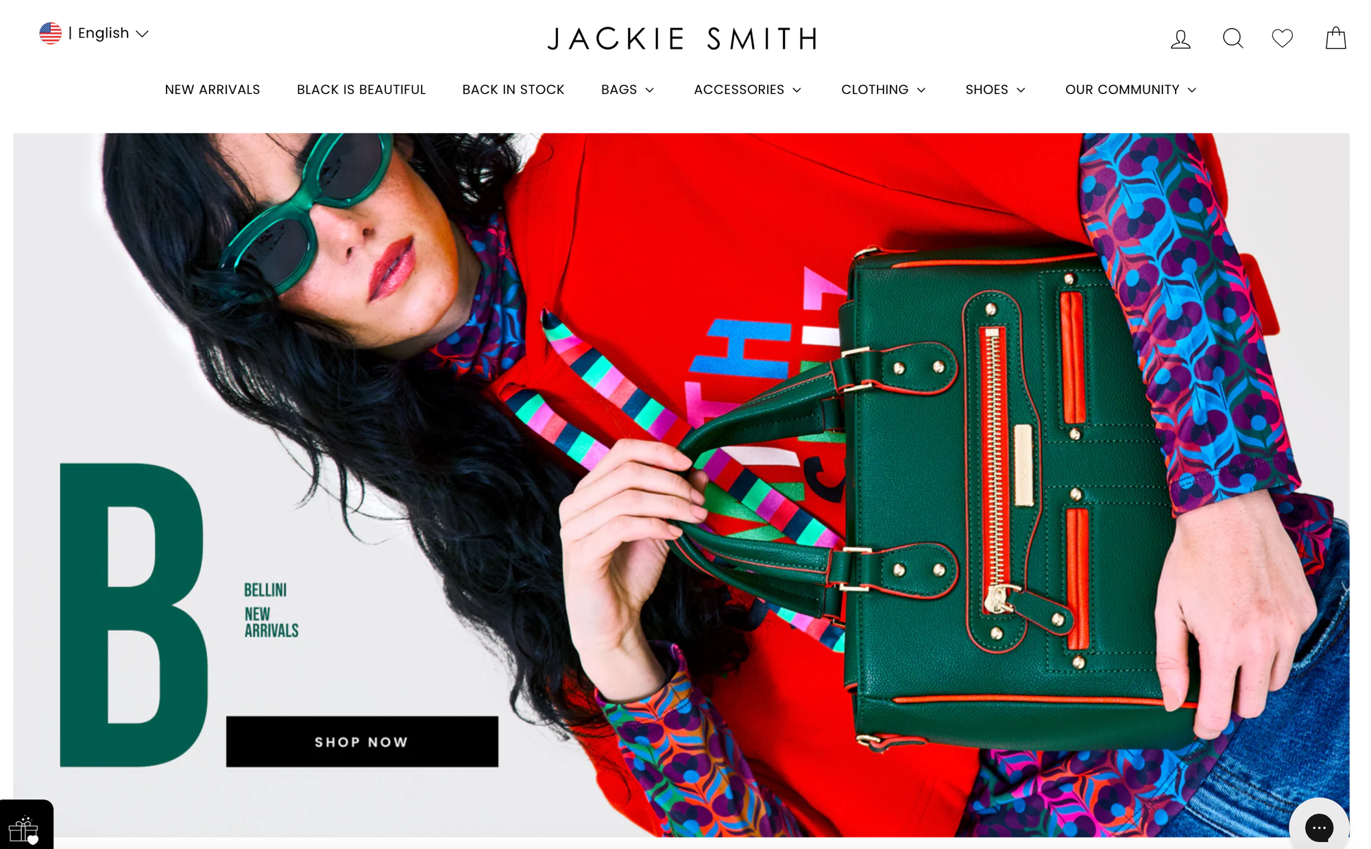
Jackie Smith is a stylish brand with an equally stylish ecommerce site that is elegant and easy to navigate. The website also includes very detailed product descriptions and how they emphasize free worldwide shipping on each of their product.
What sets them apart from other ecommerce stores? You don't need to open another page to see the products in each category. Simply point the cursor to the category to see ALL the items. It really saves time.
Why this works: Bright colors, simple design, and clever navigation all make shopping at Jackie Smith a great experience.
13. Oak Street Boot Makers
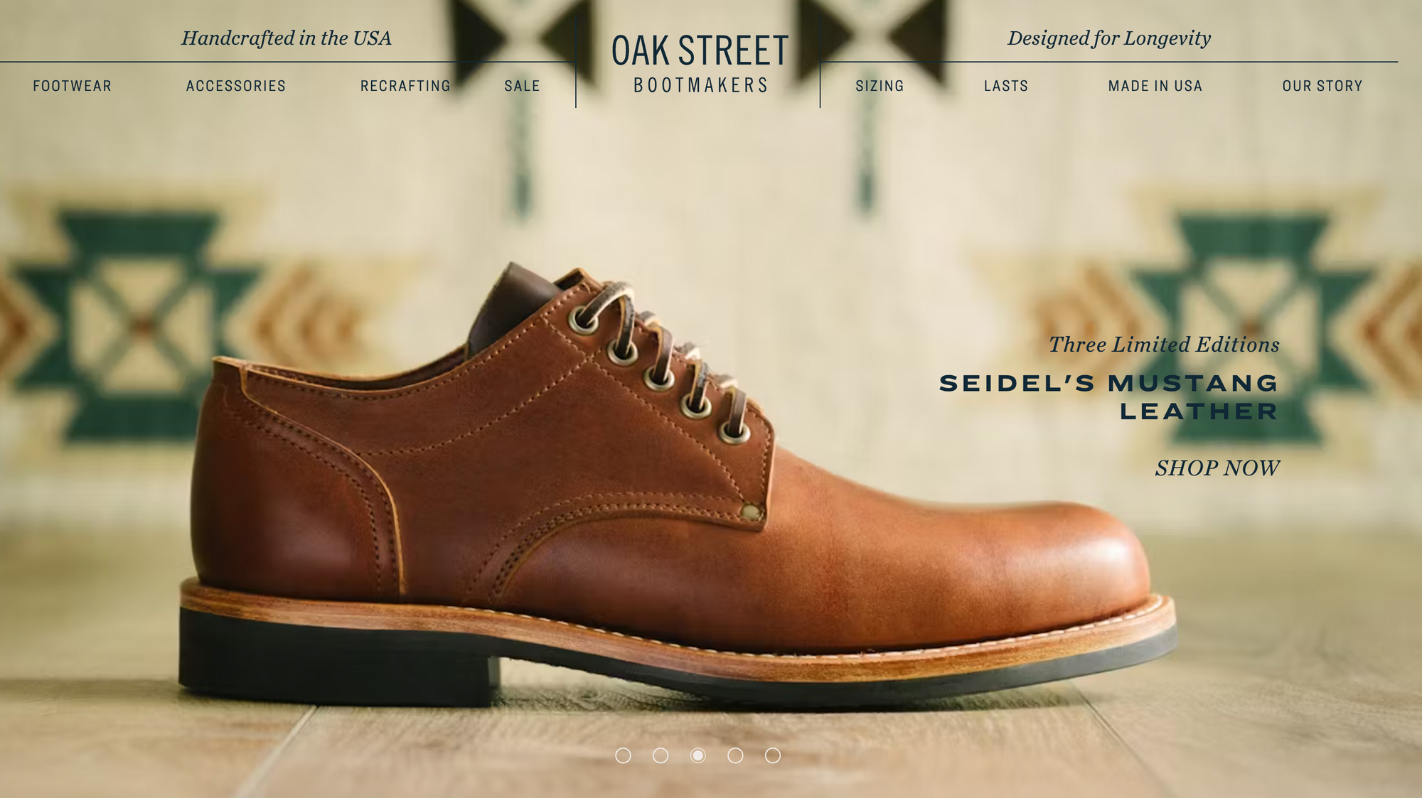
Oak Street Boot Makers takes shoe shopping to a new level. While most shoe stores would use models, Oak Street Boot Makers decided to upload huge photos of their shoes for the customers to get a feel of what each one really looks like.
Below the product images, the store shares their guarantees that their products are high-quality, including a willingness to repair or replace defective shoes. The homepage looks simple yet elegant and professional, with a classic feel.
Why this works: The brand promotes classic, high-quality footwear, and the attention to detail of the site with its product guarantees and notes from the founder reflects this.
14. Storq
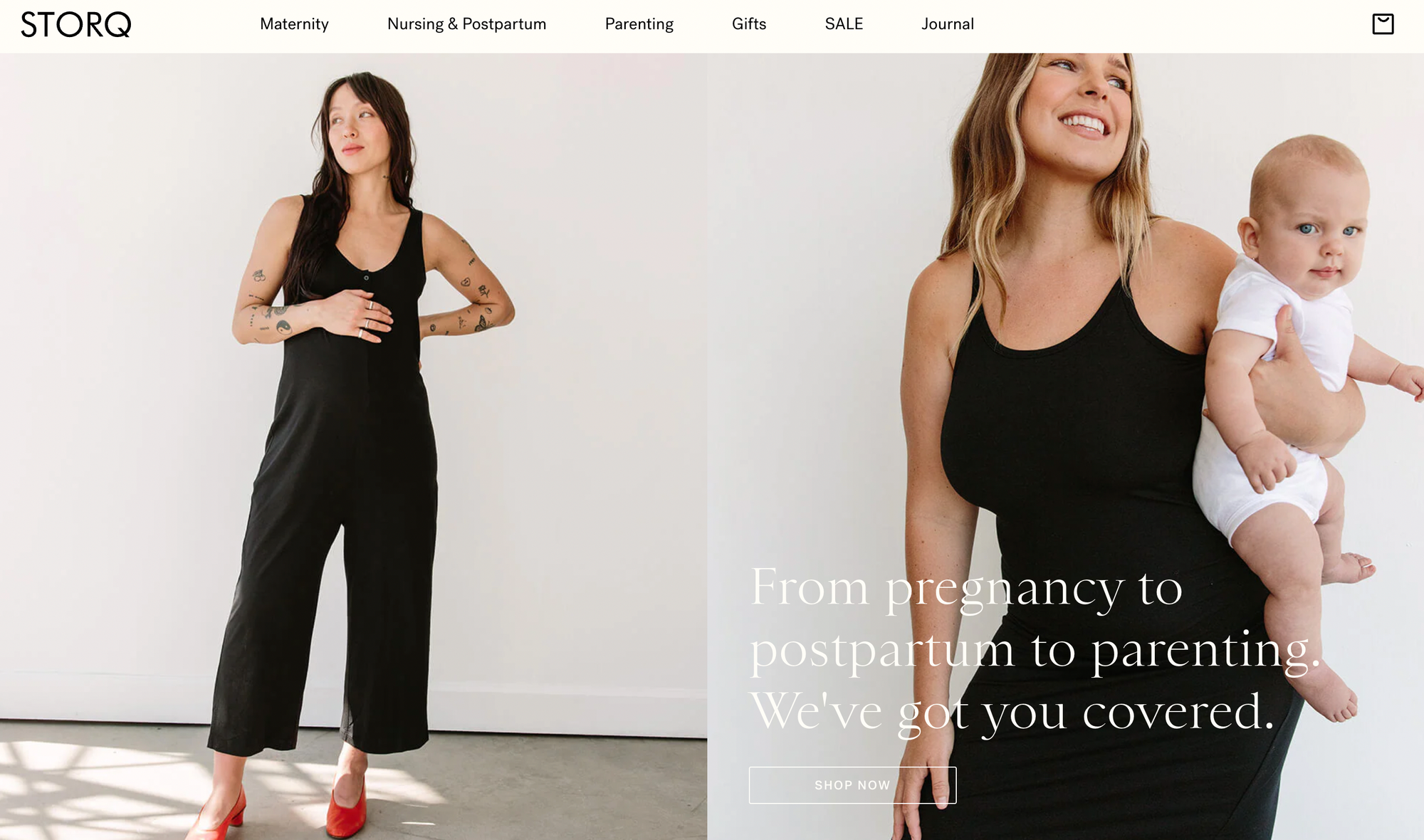
Storq is an ecommerce brand for all stages of parenting. The brand uses beautiful images of real models, stylishly showing the clothes.
Parenting is costly, and so Storq offers many discounts to potential customers. In addition to giving away a 10% discount when a customer signs up, Storq gives customers a chance to win a $250 gift card. Storq also offers corporate gifting for companies and includes a Sale category for discounted items, which is a plus.
Why this works: Storq combines beautiful imagery with social proof and enticing discounts, making it attractive to new parents.
15. Vitra
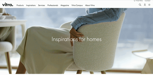
Vitra offers various home products and services, and the website's layout makes it easy for customers to find what they're looking for. The website design is simple yet attractive, thanks to the high-quality photos and videos. Vitra also published a long list of clients, demonstrating their accomplishments and helping them acquire new businesses.
Why this works: This ecommerce site reflects the modern, stylish image of the brand, with great use of both static and moving images.
16. The Birth Poster
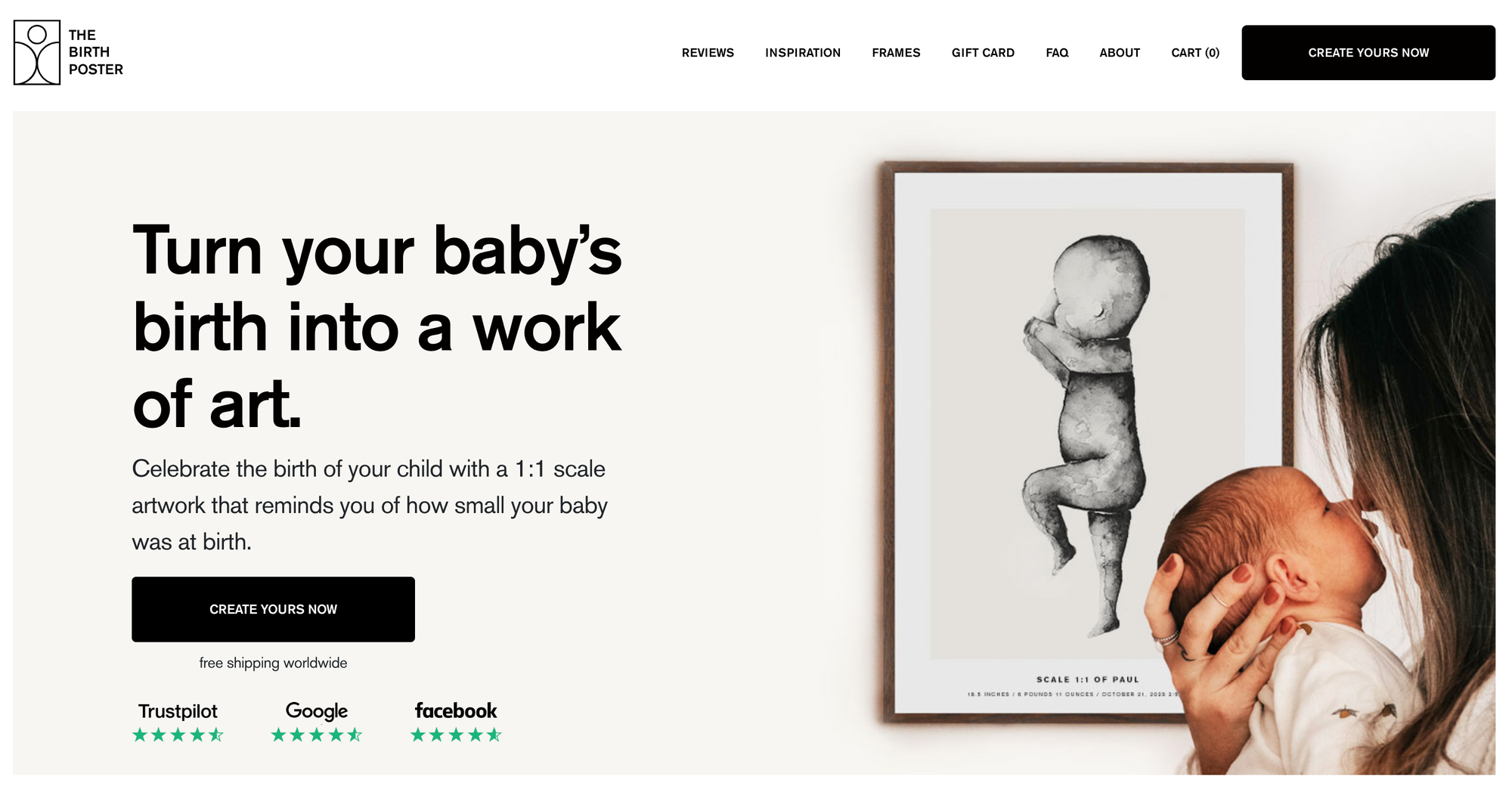
The Birth Poster targets parents who have just brought a new child (or children) into their lives. The website tugs on the heartstrings of new parents, asking them to celebrate the birth of their child with a 1:1 artwork to remember the size they were at birth.
A great feature of this site is the call to action on top of the page, while also letting customers know they ship worldwide, meaning that someone can quickly place an order without having to scroll through the site. The website is easy to use; just pick a design and answer a few questions before adding the item to your cart.
The collage of children next to their birth posters is a nice touch, showing how customers can celebrate their child's birth whilst sharing social proof.
Why this works: This is a personal product and the website reflects this with real-life use cases.
17. Smyths Toys
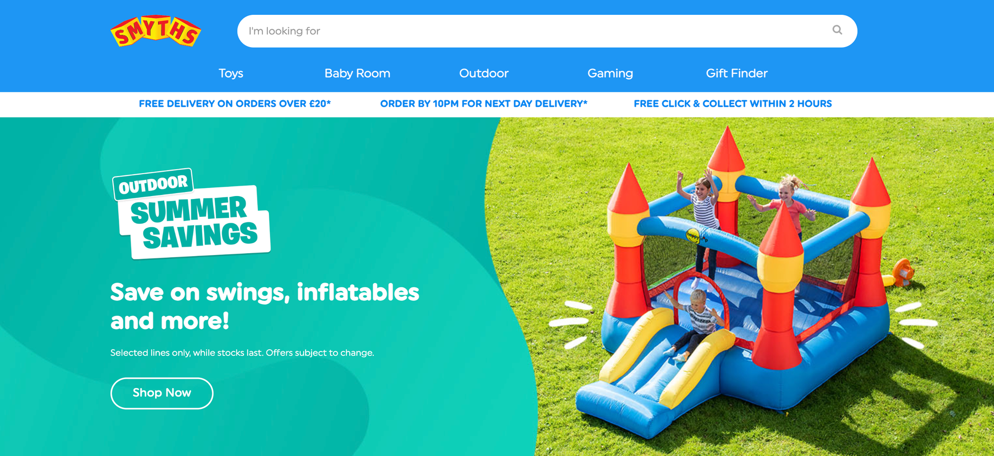
Smyth is an online toy store with bright, colorful branding. Whether you're buying toys for your kids or someone else's, Smyths makes it easier for you by categorizing the toys by age. You can shop toys for 6-8-year-olds or for big kids.
The website also allows pre-orders for interactive or Disney toys and offers weekly top picks for parents who can't decide which toys to purchase. Customers can also request a catalog to see a list of toys available on the website or in-store.
Why this works: With options to shop by age, best sellers, toy types and brands, Smyths makes it easy for anyone to buy toys online.
18. Europa Eyewear
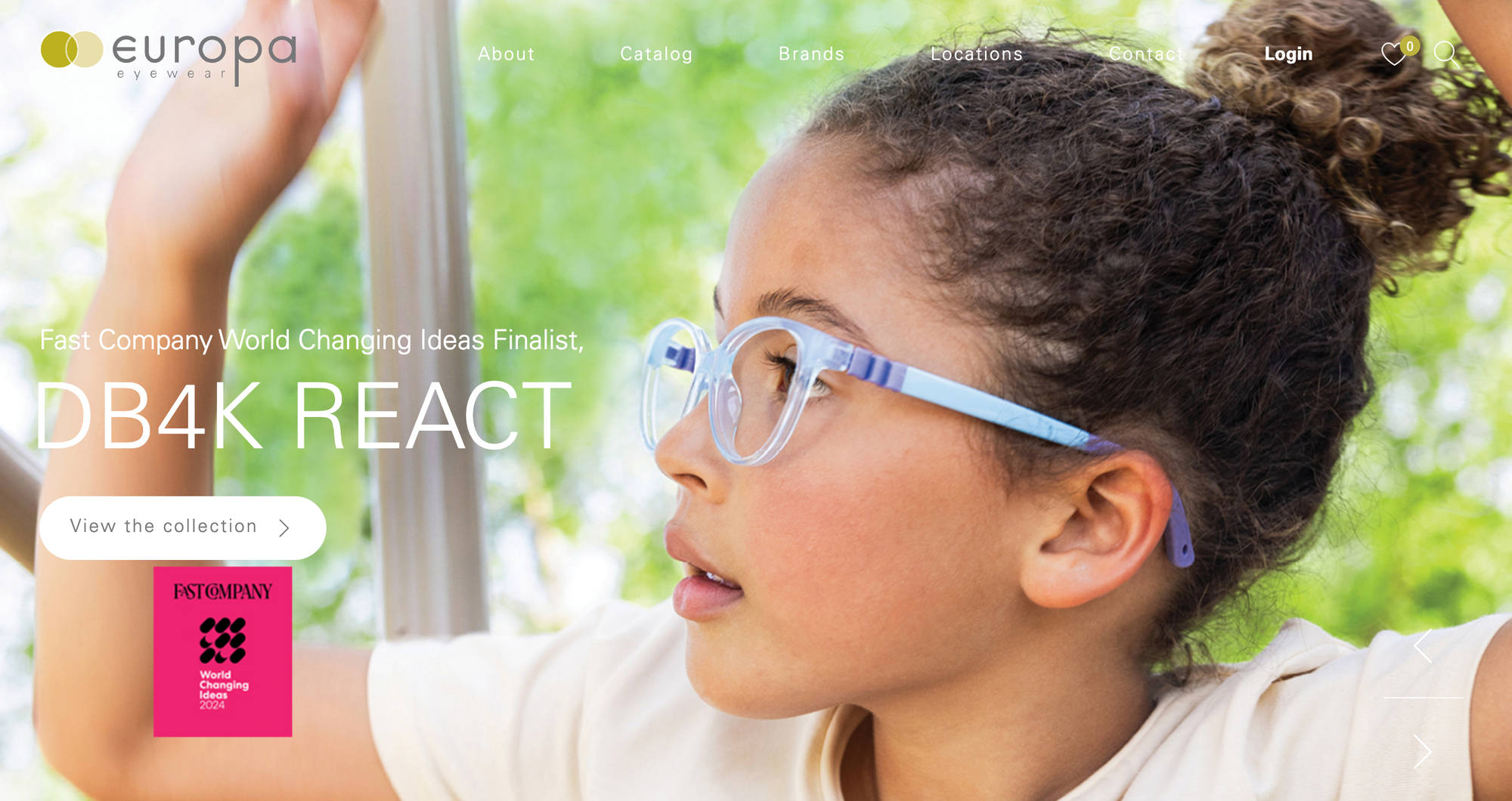
Another eyewear ecommerce site, Europa Eyewear showcases its products in a stylish and clean manner. The website shares innovative products front-and-center of the home page, and share's the brand mission directly below. After this, there is a clear list of the brands Europa sells before a selection of featured frames.
The result is a clutter-free homepage that shares all the information you need to know without becoming overwhelming.
Why this works: The ecommerce site is simple yet stylish, allowing customers to browse styles without being overwhelmed.
19. Write Pads
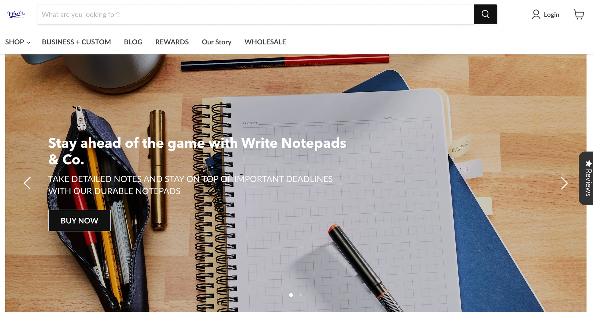
A writer or not, notebooks sold at Write Pads will make you want to purchase notepads. The imagery is inspiring showing products in use, allowing you to not only purchase a single item, but all the products in that 'desk' image.
The long product descriptions are full of imagery and important details, compelling buyers to purchase. But the best part of this site is the blog, which publishes articles about journaling and how the right notebook can help you during meetings.
Why this works: The product is aimed at writers and the website reflects this, with flowery descriptions, beautiful imagery, and an informative blog.
20. Northern Fitness
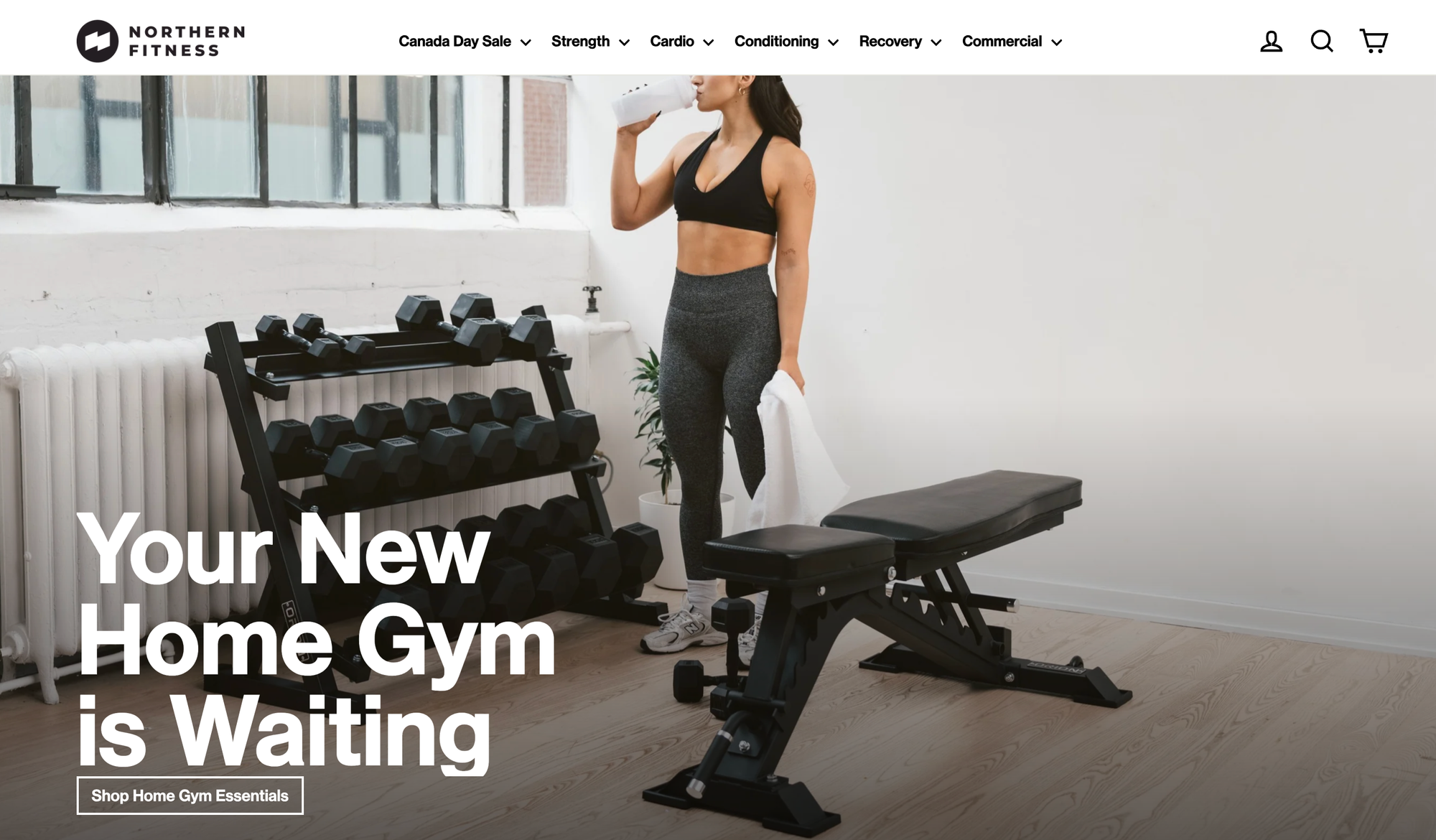
Fitness enthusiasts can visit Northern Fitness for gym equipment such as benches or treadmills. There are a lot of products to choose from, and customers can scroll through to see products by category, staff picks, brands and best sellers. The top navigation bar also outlines products that are perfect for recovery, conditioning or strength training.
Not only this, but Northern Fitness also employs consultants to assist their clients with designing their home gym.
Why this works: Creating a home gym can be a confusing process, but Northern Fitness makes this easy with great navigation, clear categories and personalized help.
21. Adorned Vintage
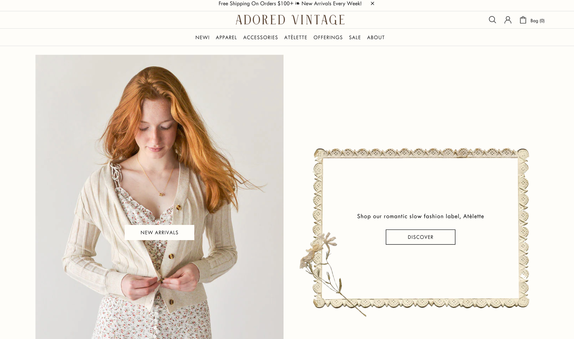
Just like the products they're selling, Adorned Village's website has a beautiful, vintage feel. The muted colors and simple design reflect the products they are selling.
Customers can also easily navigate the products by scrolling through and shopping categories. On the product page, you'll see important information about the item such as the measurements and what it's made of. Adorned Vintage also include information about returns and refunds, and related products you might be interested in.
Why this works: The website clearly reflects the clothing, making you feel you are already a part of the brand. Clothing is displayed clearly and from multiple angles.
22. Artisaire
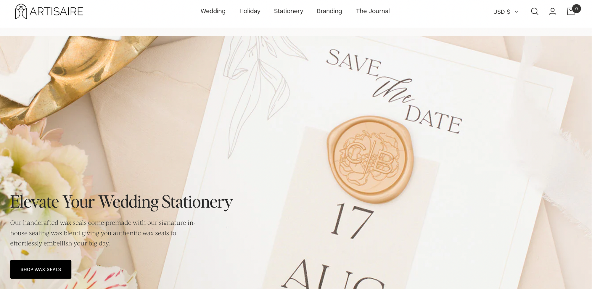
Artisaire's website looks sophisticated and elegant, just like the services they're offering. Plus, they boast almost 5,000 reviews, which indicates how satisfied their customers are and is the perfect encouragement for potential customers to take the plunge and purchase as well.
And did we mention they also published helpful guides? Content marketing doesn't just improve their reputation, it also helps with SEO. Over time, it can help you get better search engine rankings.
Why this works: With clear images, thousands of reviews, and great branding, Artisaire has set itself up as a reputable and trustworthy brand.
23. Pot Gang
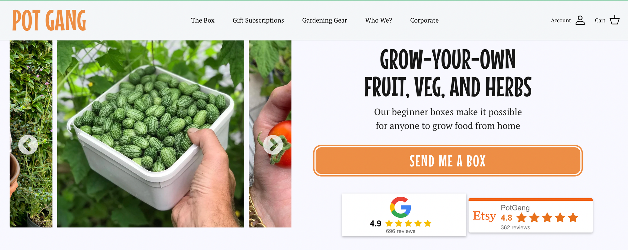
Pot Gang is a subscription-based website that sends its customers everything they need to grow a vegetable and herb garden. The attractive photos of vegetables look so enticing, that customers will feel excited to get started on their own garden.
The website also offers gardening gear and gift subscriptions, giving customers more options. Plus, the inspiring customer stories with photos encourage more visitors to try gardening.
Why this works: Simple, colorful, friendly branding encourages every visitor to have a go at growing their own produce.
Tips to make your ecommerce site stand out
A website serves as an online marketplace where customers can browse and shop your range of products and services. We recommend incorporating the following elements below if you want to stand out and make more sales. Also, don't hesitate to hire experts to help you design and launch an attractive and professional-looking website. Check out these tips:
Simple Design
You can always benefit from a simple design when it comes to selling products or services online. If you include a lot of features, chances are the user may be too distracted to purchase right away. Always opt for a simple yet professional design. As much as possible, hire an expert to help with the layout. More features may also affect your website's speed and you can't afford to have a slow website or it might turn customers away. Also, a slow website will affect your search engine rankings.
Just make sure you have clear photos and descriptions of your products, and that your customers can see the "Buy" button. Writing an enticing product description also helps highlight the product benefits to encourage the customer to purchase.
Be Professional
Your product or service is your customer retention tool. However, you need to also work on your brand reputation to entice potential customers to purchase from you. Be consistent with your brand colors or slogan so customers can identify you. You have to also figure out what makes you stand out from the rest. What is different about your brand? Be creative with your storytelling.
As much as possible, hire professional writers to help with your branding. Upload high-quality photos and videos. If you're selling a physical product, we recommend hiring a professional photographer to take pictures. Imagery can also help you win more customers.
Share Social Proof
Today, most customers would check out a website's social media profile before buying from them. If you have a huge following on social media, chances are your customers will perceive you as a trustworthy brand and may likely buy from you. If you don't have a large following on social media, we recommend regularly updating your social sites. Better yet, engage with your audience. Customers like to purchase from businesses that don't hesitate to connect with their target market.
Smooth Checkout Process
The last thing a customer wants when buying things online is a tedious and long checkout process. As much as possible, make the checkout process easy and quick. Offer as many payment options as possible, as some customers may not have a credit card. You might want to consider offering Paypal, Amazon Pay, Stripe and BNPL (buy now, pay later) options.
Use the Right Platform
Choose a user-friendly platform that offers professional yet simple website designs for your store. We also recommend choosing a platform that allows you to fully customize your website. Before signing up, make sure you've checked all their features to determine if the platform is right for you. Read as many reviews as possible, and while price isn't a top factor to consider, it's always better to also select a platform that offers the best value for your money.
Optimize Your Website for Mobile
More customers these days prefer to purchase products and sign up for services using their mobile phones. Before launching your website, make sure it also runs on mobile. Otherwise, you will lose a good percentage of your sales.
Looking for business advice? Find it right here on Whop
Whether you're starting a new venture or looking to expand your existing business, creating a beautiful website and planting your foot in the online space is essential in today's digital market. Not sure where to start? Head over to Whop.
The Whop marketplace is home to plenty of ecommerce and business communities all eager to share their advice and experience. Browse the relevant categories on the marketplace and find communities, courses, and ebooks all dedicated to helping others create and grow their businesses. Whether you're a first-time entrepreneur or an experienced ecommerce owner, Whop has something for everyone.
Ecommerce frequently asked questions
Below are some of the most commonly asked questions from ecommerce website owners:
What are some of the best practices for ecommerce sites?
Before creating and launching your website, ensure you have a clear idea of who you are selling your products or services to and the age groups you're targeting. Knowing your target market can help you craft content tailored to your target audience. We also recommend working on website speed to avoid losing potential customers and ensure the website is easy to navigate.
It's crucial to make your site mobile-friendly as most users these days purchase products with their mobile phones or tablets. Most importantly, ensure the checkout process isn't complex or customers may change their minds about buying.
What are the best ecommerce hosting sites I can use for my website?
Shopify, Hostinger, Wordpress and Bluehost are some of the website hosting options you can use for your websites. Check out each of their features to determine which one suits your needs. Don't forget to also check out Whop for all your digital product needs.
How do I optimize my website for search engines?
You can increase your chances of getting more sales by optimizing your website for search engines. Some of the things you can do include making your website more user-friendly and publishing relevant content. If possible, hire IT experts to work on the technical side of SEO. Once it's optimized, don't forget to also measure efforts to determine which SEO strategies work.
What are the best ways to build traffic?
Aside from optimizing your website or search engines and making it mobile-friendly, other ways to generate more traffic include link building, publishing high-quality content, email marketing campaigns, redesigning your website and incorporating social media.
How can I generate more sales with my website?
Publish high-quality photos and craft enticing product descriptions that highlight the benefits. Also, the checkout process should be easy and quick. If possible, design it in a way where customers don't need to visit different pages just to make a purchase. Also, include other modes of payment such as Apple Pay and other e-wallets or Paypal. Don't forget to also improve your products and services, so customers will keep buying from you.