A bad product page can make or break a sale in ecommerce. Discover what 21 of the best ecommerce product pages have in common - and use these tips to increase your conversions!
Key takeaways
- Interactive features like virtual try-on tools and shade-matching personalize the shopping experience and boost purchase confidence.
- User-generated content showing real customers using products builds trust and helps buyers visualize results.
- Clean, minimal design with clear navigation and transparent pricing reduces friction and drives conversions.
When people decide to buy from you, guess what they’re doing first? Yep, they’re scrolling through your product page. It’s one of the biggest dealmakers (or breakers) for shoppers.
Despite how important this is, research shows plenty of room for improvement. Only 48% of top-grossing US and European sites have “decent” or “good” product page UX. That's a lot of missed opportunities.
To help you avoid being part of this statistic, we’ve pulled together 21 stellar product page examples that can help you connect with your customers and boost your ecommerce conversions.
P.S. The key is to nail the messaging, use high-quality images, and add interactive features that make shopping with your brand easier.
What is an ecommerce product page?
An ecommerce product page provides potential buyers with detailed information about a specific product, aiming to convert them into buyers. These pages typically include high-quality images of the product, a compelling description, key features, pricing, availability, and a clear call-to-action (e.g., "Add to Cart" or "Buy Now").
21 product page examples for your ecommerce website
1. Blume
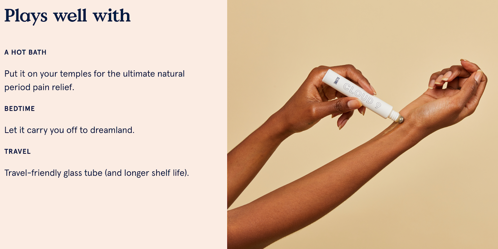
Blume’s product pages are designed with empathy and relatability, tapping into its target audience's main pain points. Each page highlights how the product addresses real-life concerns through thoughtful messaging and intentional imagery.
Example: Cloud 9 cramp oil
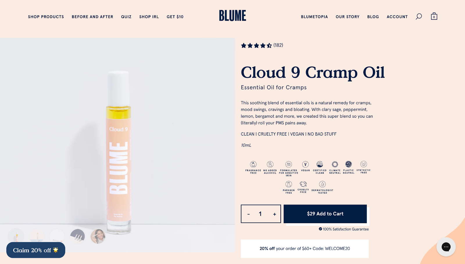
The product page establishes an emotional connection by using conversational language that feels like advice from a friend. It speaks directly to common menstrual struggles, making the message both personal and reassuring.
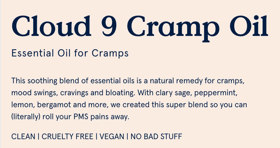
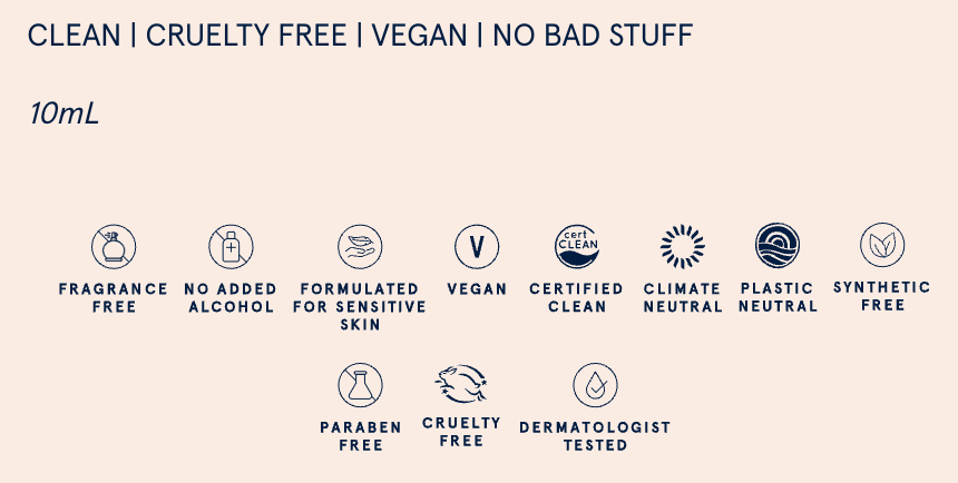
Blume also earns trust with its straightforwardness. It lists ingredients clearly, pairing them with simple explanations of their benefits, making everything transparent and easy to understand.
The lifestyle imagery ties it all together, showing how the product fits seamlessly into daily life, helping customers visualize using it themselves.
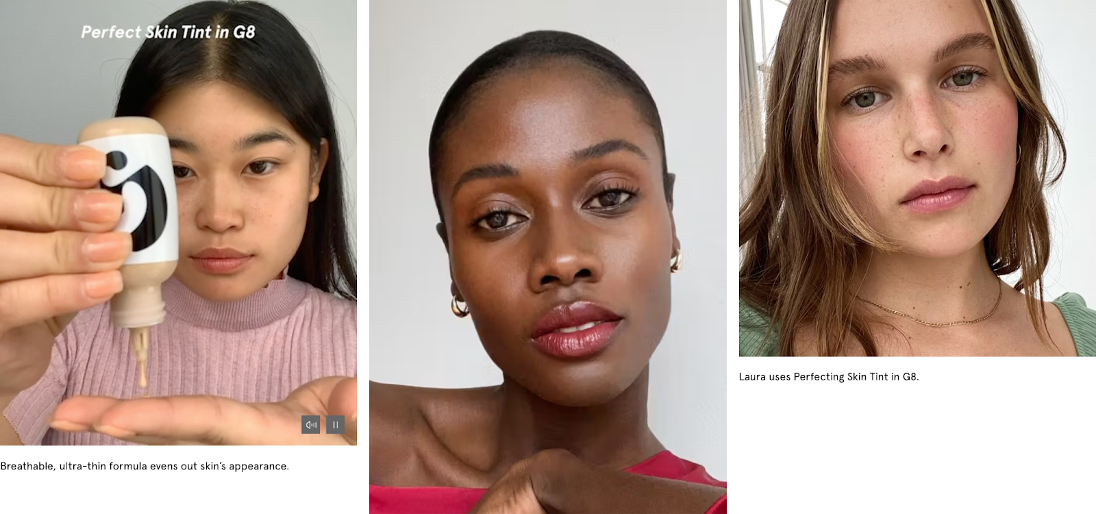
2. Glossier
Glossier invests in clean, minimal design that puts user experience front and center. Staying true to its “skin first, makeup second” mantra, the beauty brand highlights real people using its products. This helps build authenticity and trust. Plus, the detailed descriptions don't just list ingredients—they break down how everything works, giving shoppers full transparency.
Example: Perfecting skin tint
It offers shoppers an interactive shade-matching tool to help them find their ideal shade, personalizing their experience. Think of it as a fun, engaging way to make shopping feel more personal.
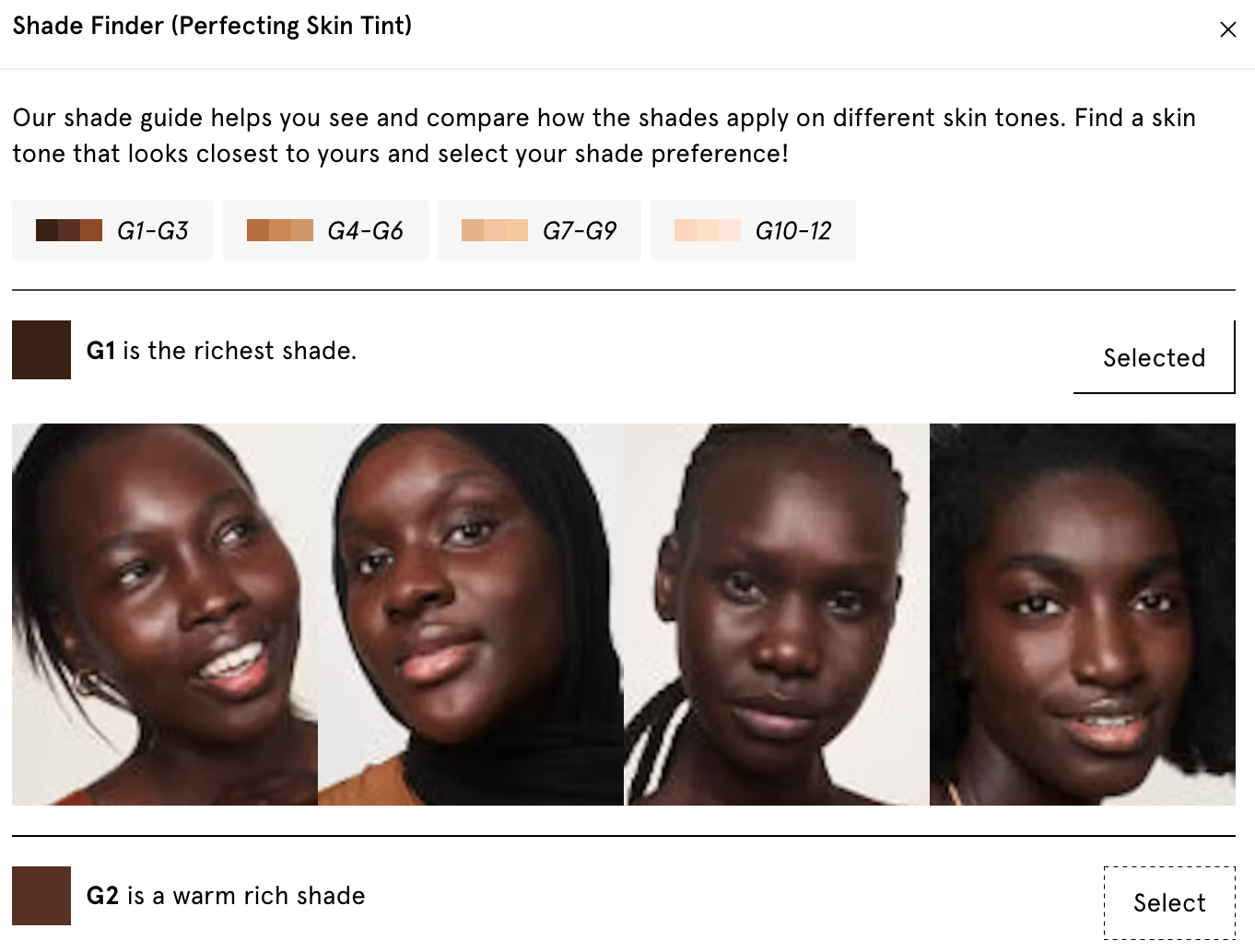
To further enhance the experience, Glossier integrates user-generated content, displaying customer photos and videos to show how the product looks on different skin tones. This adds credibility and helps potential buyers visualize the results.
Lastly, with a minimalistic layout and simple navigation, shoppers can explore products without hassle.
3. FlipFlip
FlipFlip proves that simplicity can lead to big results. Its product page is clean and straightforward, focusing on what matters most—offering a premium community full of reselling tools and strategies. The minimalist design works to its advantage, making the value proposition crystal clear: tools, insights, and resources designed to help members succeed in online reselling.
Example: Whop marketplace landing page
The benefits of joining the FlipFlip community are front and center—access to automation tools and bots that make product flipping more efficient. Membership options are clearly laid out, with detailed perks for each tier, helping visitors easily pick the best plan for their needs.
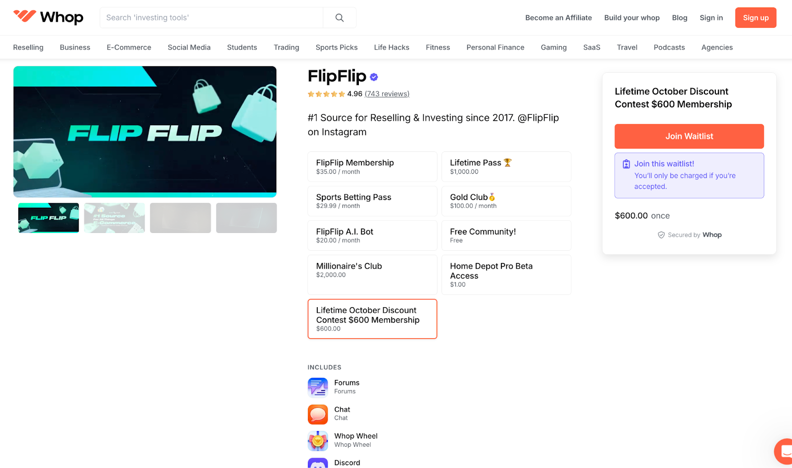
Restock alerts, item monitors, and personalized mentorship are just a few of the features that stand out, all presented in a way that shows how they can boost profits. The layout builds trust with user-friendly navigation, testimonials, FAQs, and transparent pricing.
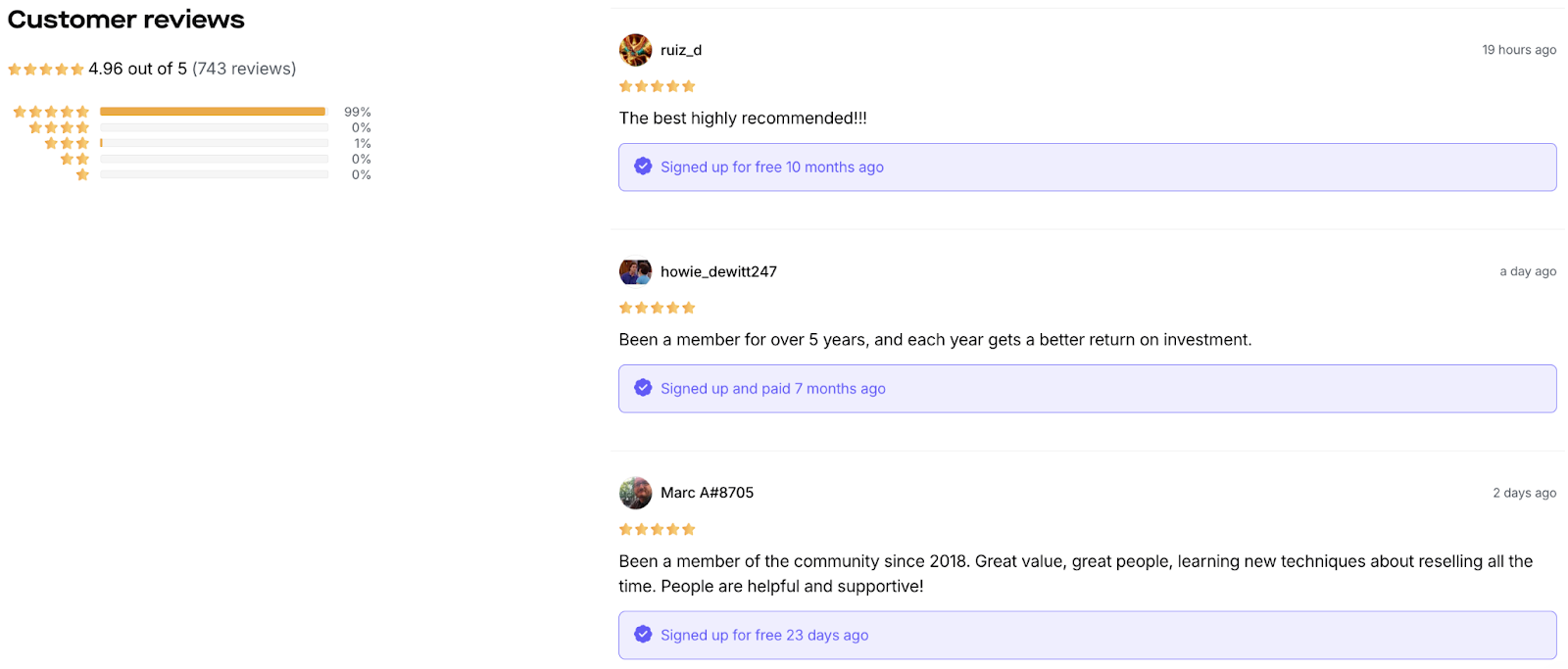
With 700+ glowing reviews and a high satisfaction score, FlipFlip’s credibility is solid. Integrating Discord and other platforms strengthens the sense of community, offering direct access to valuable resources and support.
4. Magic Spoon
Magic Spoon has perfected the art of balancing fun, information, and visual appeal on its product pages. The playful tone invites customers in, while still driving home the health benefits. The bright, quirky design perfectly matches the brand’s vibe, while the product and lifestyle shots make the cereal look as tasty as it is healthy, pulling you in with both flavor and fun.
Example: Peanut butter cereal
Right off the bat, you see the important details shoppers need—high protein, low carbs, natural ingredients—all neatly laid out for the health-conscious crowd. Options for flavors, quantities, and subscriptions are front and center, with a clear emphasis on how much you can save by subscribing.
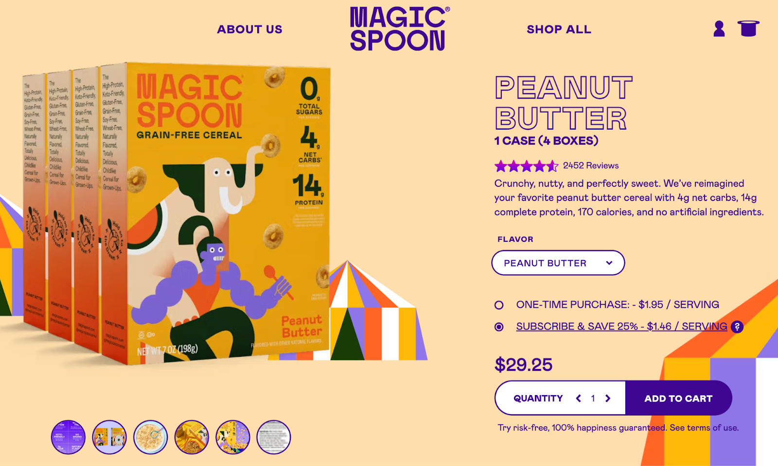
A bold “Subscribe & Save” call-to-action, paired with a risk-free guarantee, builds trust and gently nudges shoppers toward making a decision.
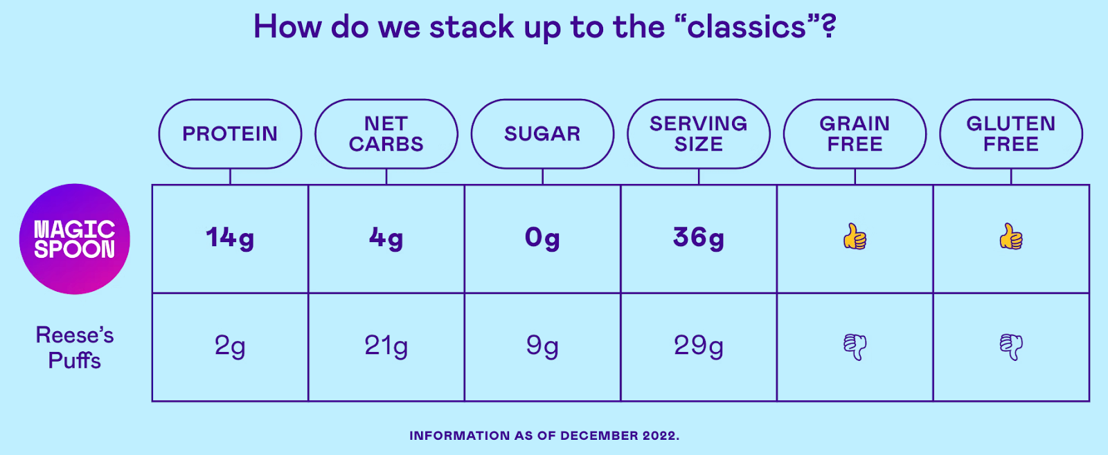
As you scroll, a playful, interactive magic spoon adds to the fun, keeping you engaged. But the real winner is the comparison chart with mainstream cereals to subtly reinforce how much healthier Magic Spoon is, without coming across as preachy.
5. MVMT
MVMT has mastered the art of creating clean, visually appealing product pages that cater to a shopper's need for clarity and style. Its overall approach is simple yet effective, offering key product details in an easy-to-digest format to keep you engaged.
Example: Chrono ceramic watch
The structured, color-blocked layout helps break the page into different sections, guiding shoppers to the most important details. This design enhances the product's visibility and ensures all the essential details are in the spotlight…
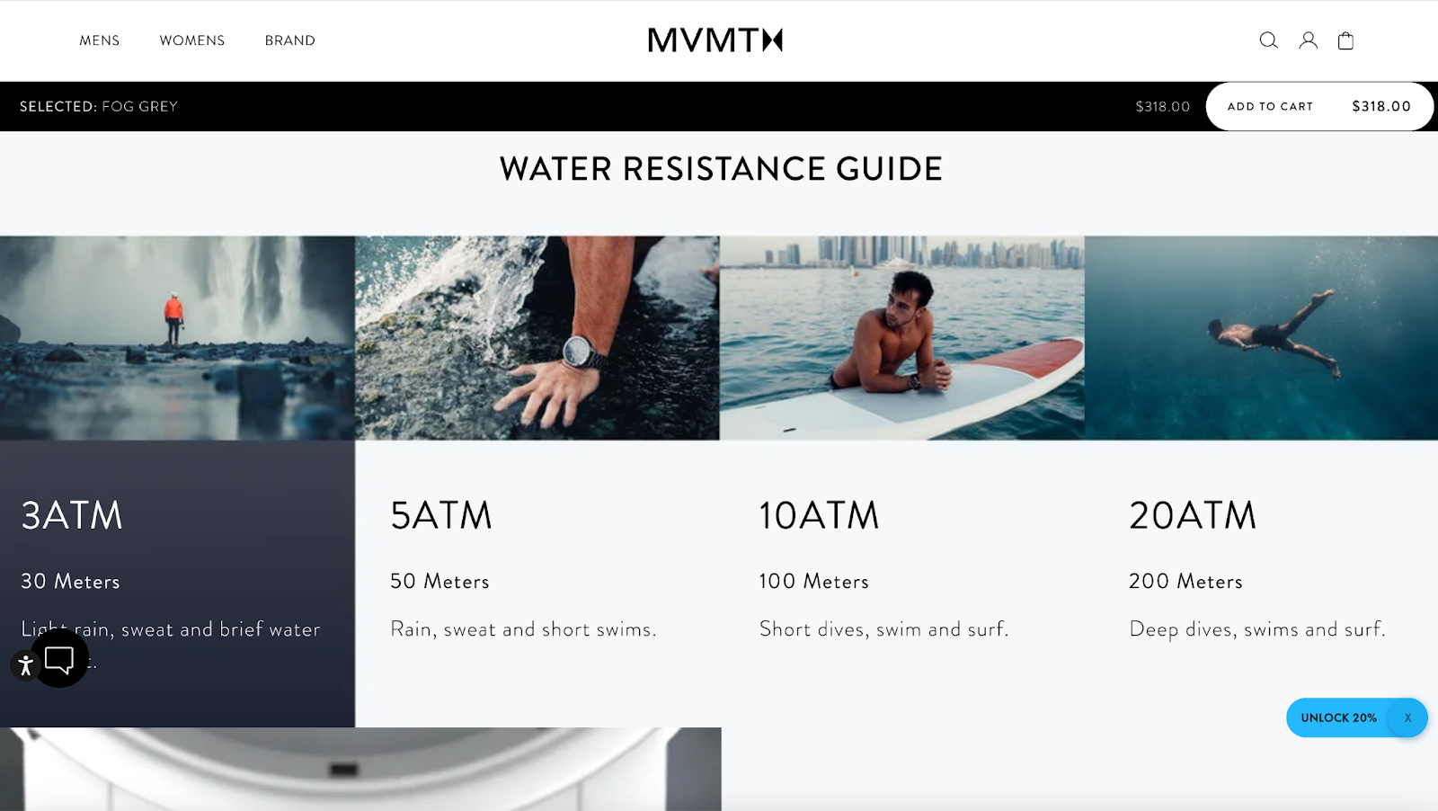
…while the high-quality product videos bring the watch to life. Customers can see how it looks and functions in real time, which builds trust and drives purchase intent.
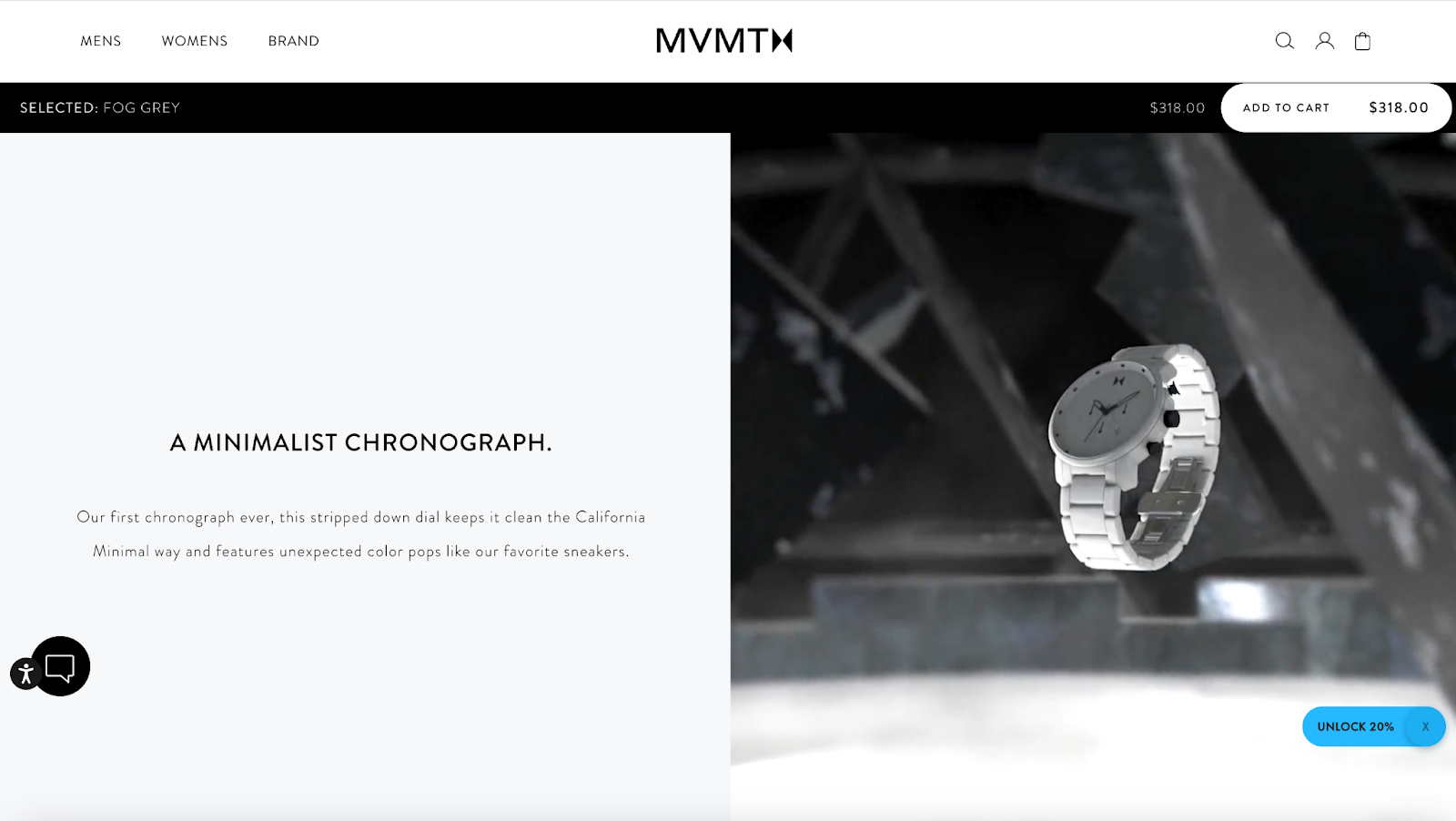
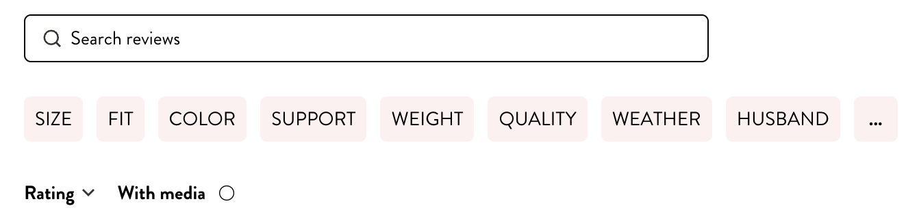
MVMT also takes a smart approach to customer reviews. Shoppers can filter reviews by size, fit, color, and quality, which makes it easier for them to find feedback that matches their preferences.
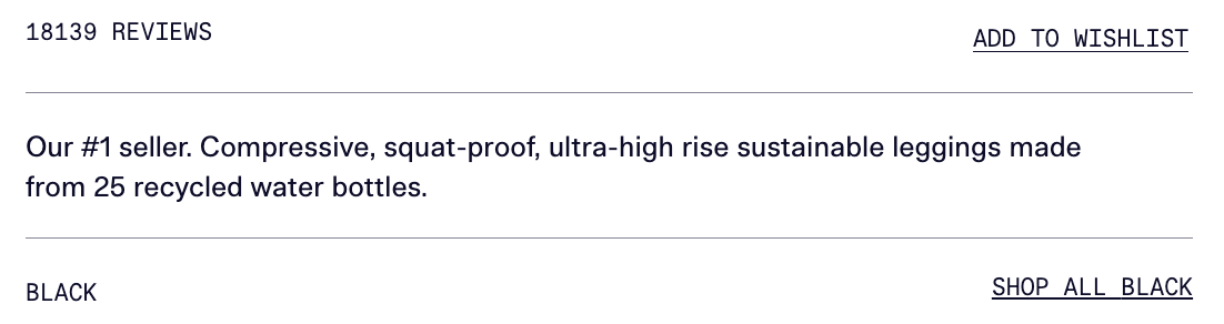
6. Girlfriend Collective
Girlfriend Collective’s product pages do more than just showcase leggings—they embody the brand’s commitment to sustainability and inclusivity. You'll notice an eco-conscious narrative that immediately pulls in socially conscious shoppers.
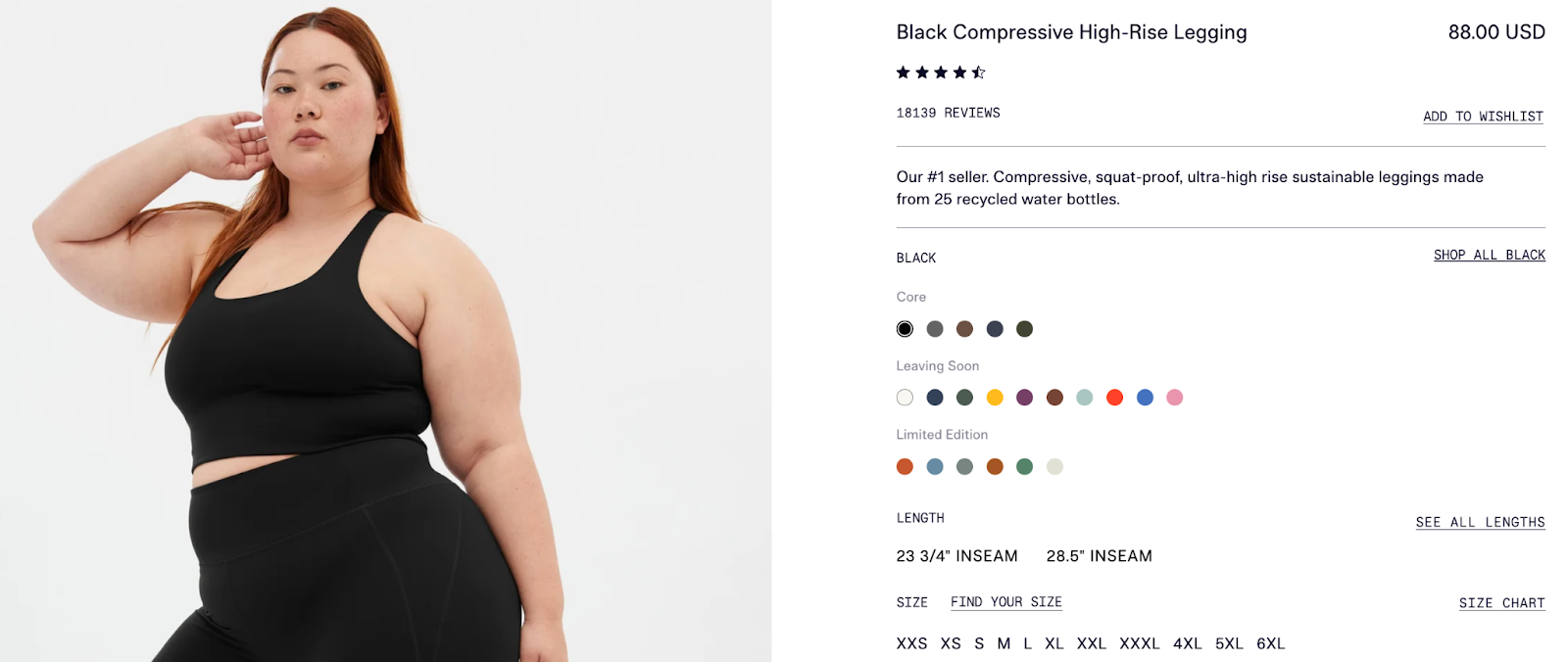
Example: Compressive high-rise leggings
Notice how the product description mentions the leggings are made from recycled water bottles. This gives shoppers that “feel-good” factor knowing their purchase is positively impacting the environment.
The product images don’t disappoint either. You get clear, detailed shots from multiple angles, modeled by people with different body types. With sizes from XXS to 6XL, it’s obvious Girlfriend Collective is serious about inclusivity—everyone’s welcome here.
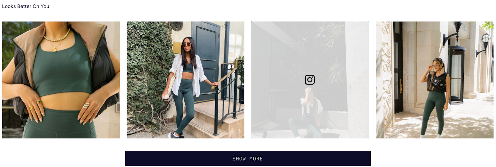
To top it off, there’s a section packed with user-generated content. Seeing everyday people rocking these leggings builds trust and community, creating a sense the brand is more than just a product—it's a shared experience.
7. The Package Free Shop
The Package Free Shop knows its audience—eco-conscious consumers who want to make a difference. Sustainability isn’t just a buzzword here, but the entire brand's foundation. That's why its product pages go beyond selling; they're designed to educate, with a focus on cutting down single-use plastics.
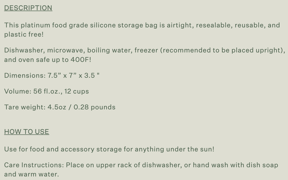
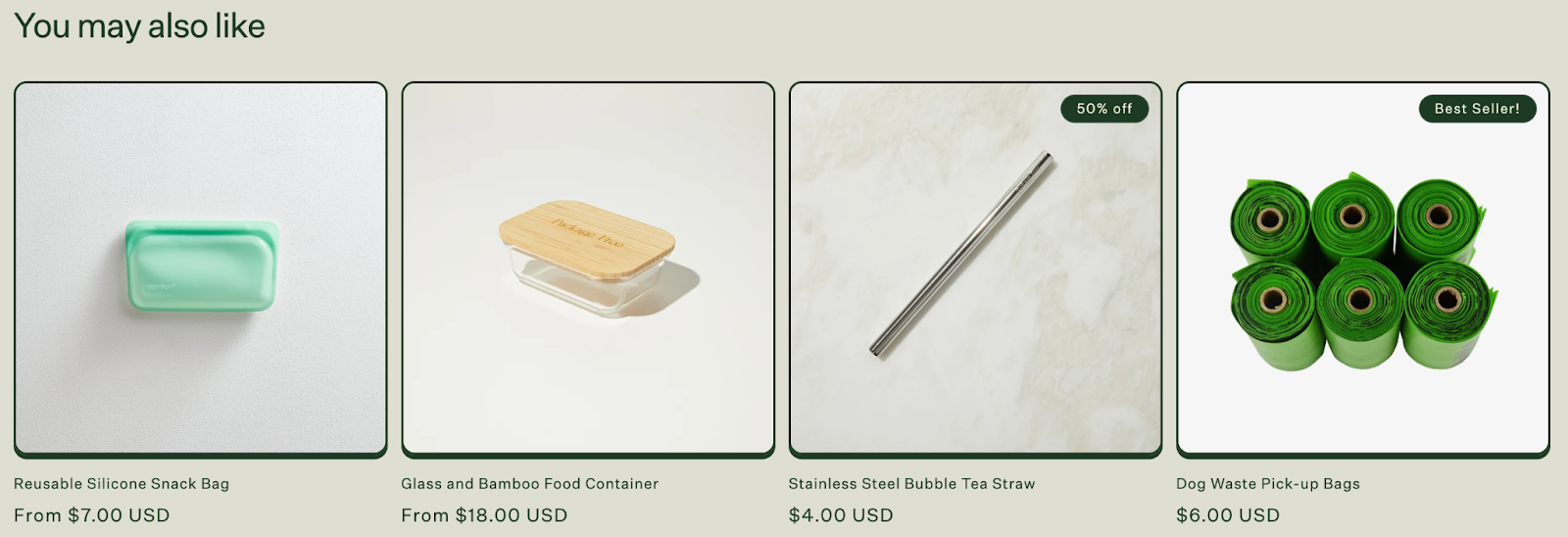
Example: Reusable silicone stand up bag
This product page does a great job of showing shoppers how versatile the product is, detailing how it can be used in the freezer, microwave, and oven. Plus, the clear usage instructions make it easy to see how this product fits into your daily life.
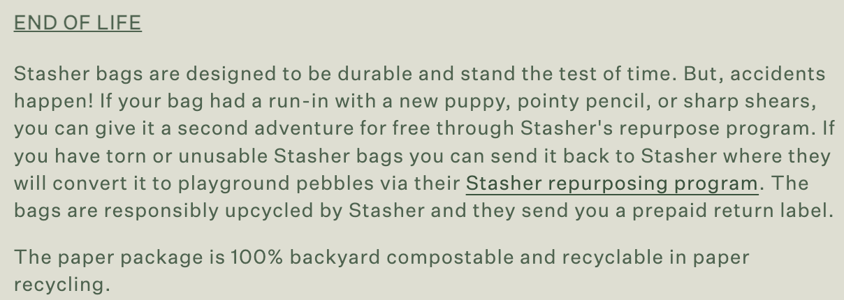
The brand also builds community through initiatives like Stasher's repurpose program. Torn or worn-out Stasher bags? They’re turned into playground pebbles. This gives shoppers a sense of contributing to something bigger than just buying a product.
Finally, the 'You may also like' section smartly promotes related products, increasing the chance of additional sales through cross-selling. These elements together create a compelling and environmentally-focused shopping experience that enhances the brand's connection with its customers.
8. Warby Parker
Warby Parker gets the balance between sleek design and usability just right. Its product pages are clean and simple, but they don’t skimp on the details. You’ll find high-quality images that allow you to view the glasses from every angle. Plus, finding your perfect pair is a breeze, thanks to the smooth navigation.
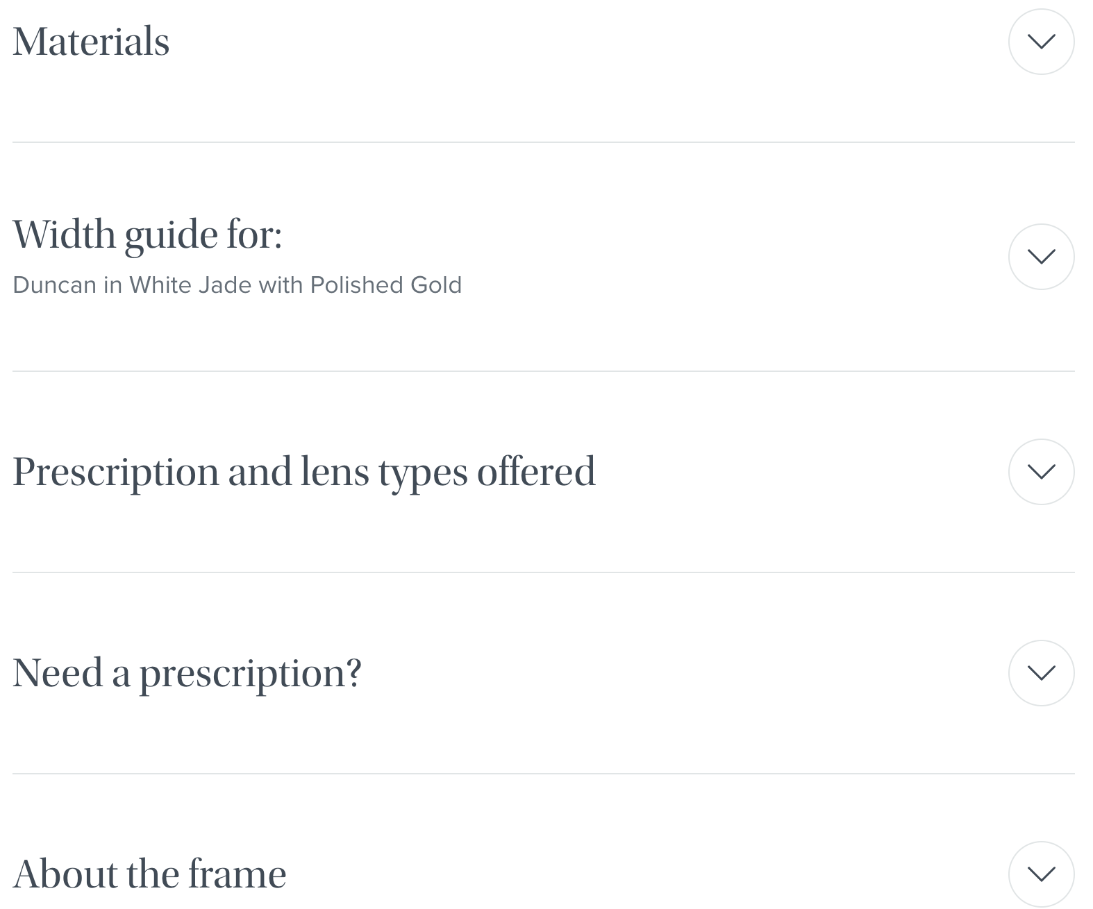
Example: Duncan sunglasses
The real star here is the virtual try-on tool. Using augmented reality (AR), shoppers can see how the frames will look on their face—no more guessing if they’ll fit your style. It's a confidence booster for anyone hesitant about buying glasses online.

The product pages also provide multiple views of the frames, clear specs on materials, and details about frame sizes, with easy customization options for size and color. This level of personalization makes the shopping experience feel tailored to each shopper. Finally, a handy FAQ section answers common questions right on the product page, so visitors never have to go searching for extra information.
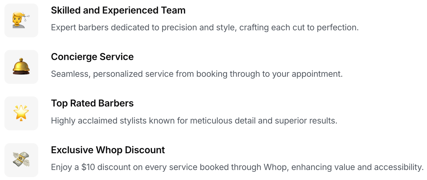
9. Gentlemen's Barbershop
Gentlemen's Barbershop's product page on Whop feels like a breath of fresh air—clean, sharp, and polished. The large images and straightforward descriptions give off a high-end vibe, perfectly matching the premium grooming services they offer.
Example: Whop Marketplace Landing Page
The page’s professional tone makes it clear you’re stepping into a top-tier experience, which builds trust right from the start. Plus, there’s a $10 discount for booking through Whop, which adds just the right touch of urgency without feeling pushy.
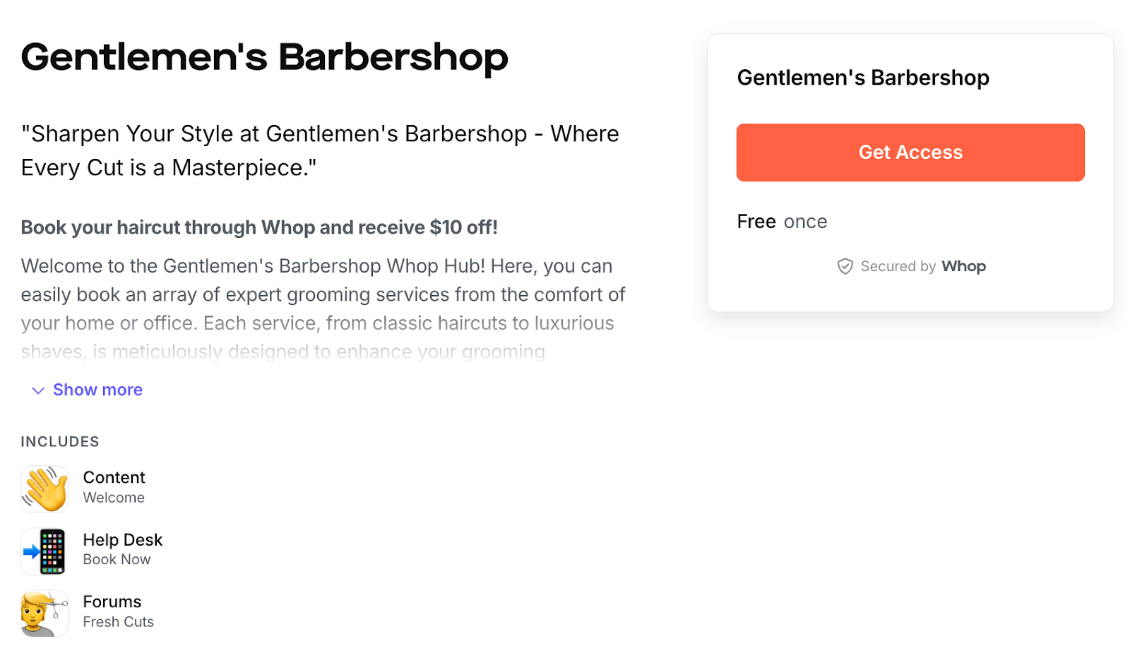
Each grooming service is described in a way that makes the customers feel informed, not overwhelmed. It’s simple and clear, helping shoppers choose what’s best for their grooming needs while reinforcing the shop's high standards.
And if that wasn’t enough, there’s even a Customer Q&A section. Curious visitors can ask questions, and once answered, they’re visible to everyone—both interactive and super helpful for future customers.
10. Floyd
From the moment you land on Floyd’s product pages, everything feels refreshingly simple. The product descriptions, prices, and visuals are laid out in a way that just makes sense. No clutter, no confusion—just a clear, easy-to-navigate shopping experience that puts the shopper in control.
Example: The bed frame
One standout feature is how Floyd avoids the common ecommerce product page mistake of mixing pricing with other product details. The discounted price is clearly visible right at the top, making it easy for shoppers to see the deal upfront without hunting for it in a cluttered layout.
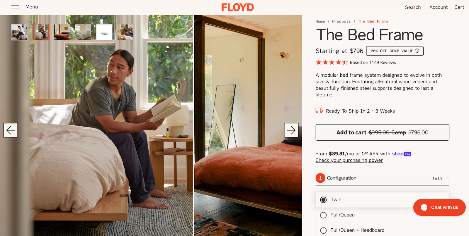
The product images are another win—they show the bed frame in real-life settings, helping the shopper picture it in their own space. And with clickable links to 'Shipping Costs,' 'Return Policy,' 'FAQs,' and 'Contact Us' tabs just below the fold, any hesitation a shopper might have got resolved instantly.

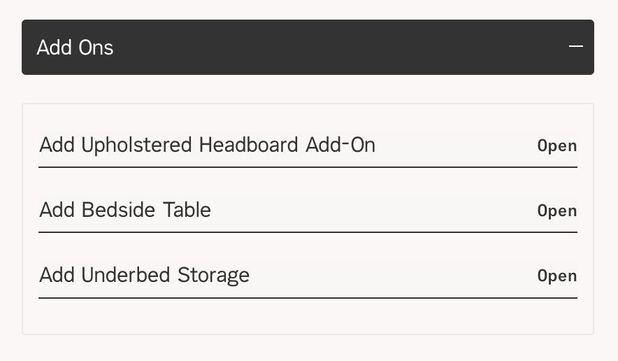
An 'Add Ons' section cleverly nudges shoppers to explore matching furniture pieces, turning a single purchase into a thoughtfully curated collection. It's a subtle and effective way to increase the average order value (AOV) without overwhelming the customer.
11. Apple
Apple focuses on what really matters: how its tech makes life easier. Each feature is tied to a real-world benefit, creating a story that shows exactly how the product fits into and improves everyday life. It’s not just about listing the specs, but rather the experience of owning an Apple product.
Example: iPhone 16
From the clean layout to the high-quality images, every detail is crafted to show off the iPhone 16’s design and features.
Interactive elements like the 360-degree view and color selection tools let users experience the phone without needing to hold it in their hands…
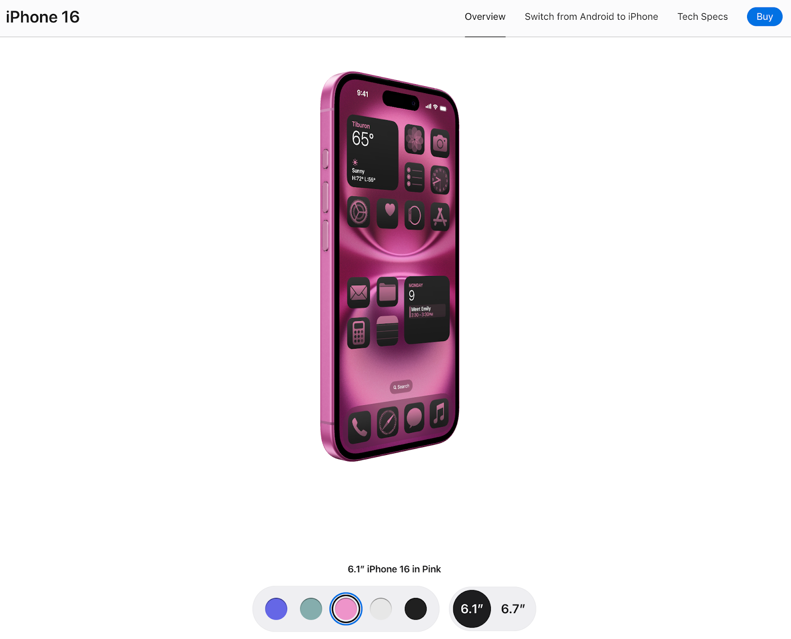
…while animations showcase features like Apple Intelligence and camera capabilities, helping shoppers see how these innovations could work for them.
Apple’s approach is all about making the complex simple. Even features like the A18 chip and battery life are broken down into digestible chunks, ensuring the page feels both informative and fun to explore.
12. MATE
For every product page, MATE clearly outlines its ethical manufacturing process, detailing where and how the product is made. This openness about sourcing eco-friendly materials like organic cotton helps build trust with conscious shoppers who care about sustainability and ethics.
Example: Organic cotton classic tee
A cool feature on the page is the "Buy More, Save More" slider, which spells out how buying additional items nets you a discount. It’s a win-win—customers feel like they're getting more bang for their buck, and it encourages larger purchases.
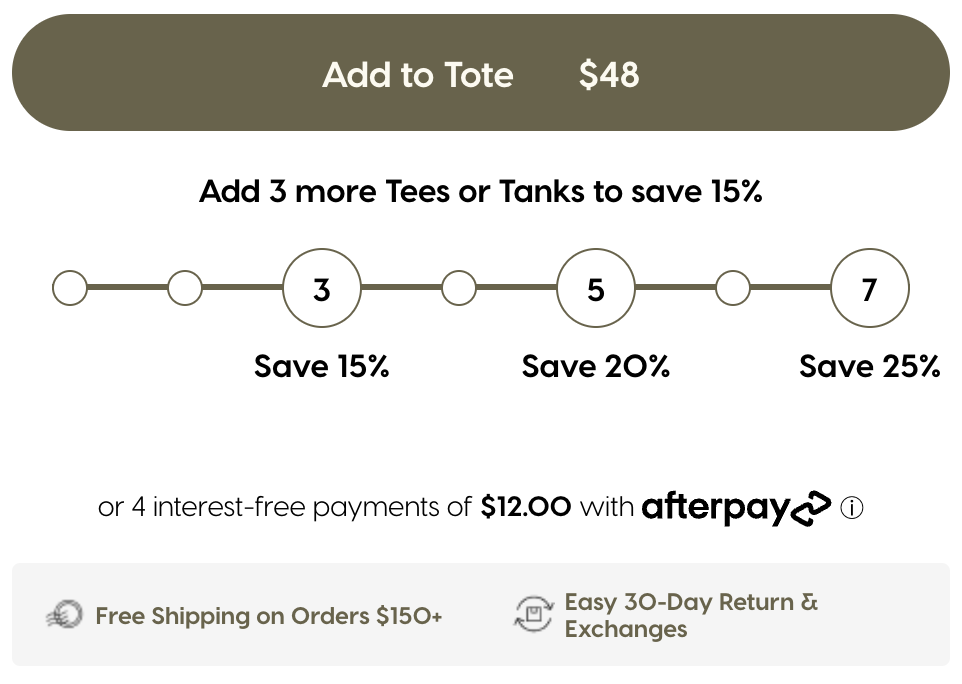
The product page also highlights key features in a clean, easy-to-read format, using icons to show that items are plastic-free and ethically made. A helpful size guide is there too, cutting down on returns and improving customer experience.
All these thoughtful touches reflect MATE’s dedication to sustainability while ensuring a top-notch shopping experience.
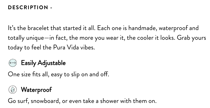
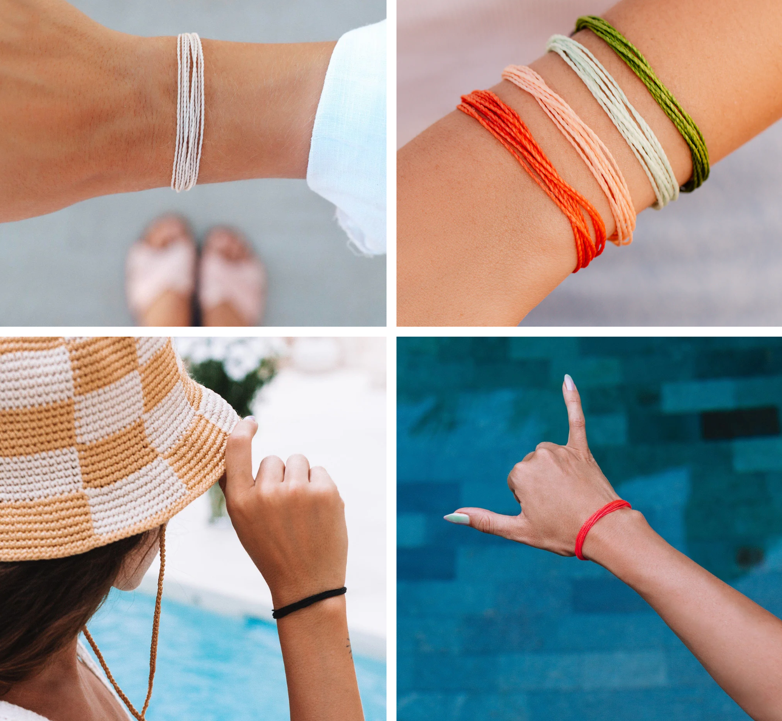
13. Pura Vida
Pura Vida Bracelets’ product pages embody the laid-back, beachy vibe it's known for. The page layout is clean and minimal, letting the vibrant products do the talking. You’ll find (lots of!) high-quality visuals, descriptions highlighting the brand’s mission of supporting artisans, and social proof to engage and resonate emotionally with the customer.
Example: Solid original bracelet
The product description is concise but effective, highlighting the bracelet’s versatility without drowning buyers in too many details. It’s a smooth, no-fuss approach that lets the product speak for itself.
High-quality images show the bracelet from every angle, so the shopper can practically feel the bracelet in their hand. The focus on close-ups adds a tactile feel, making it easy to imagine it on the wrist.
Lastly, customer reviews and ratings are front and center, building trust with real-world feedback. No need for guesswork—shoppers can see what others think before hitting ‘Buy.’
14. Rothy’s
Every detail on Rothy’s product pages is designed to make the shopper’s life easier—from the clear, organized layout to the eco-friendly product insights. You get everything you need upfront—size info, care instructions, customer reviews—to make a quick, confident decision.
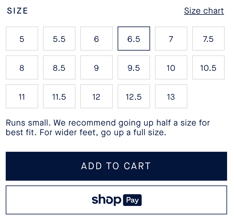
Example: The point
Rothy’s addresses sizing questions right from the start, offering clear, straightforward advice. This eliminates confusion and streamlines the process for shoppers, ensuring they get their fit right. Once a size is chosen, the checkout process flows effortlessly—no unnecessary steps or clicks. Just smooth sailing with direct payment options or a simple "Add to Cart" button.
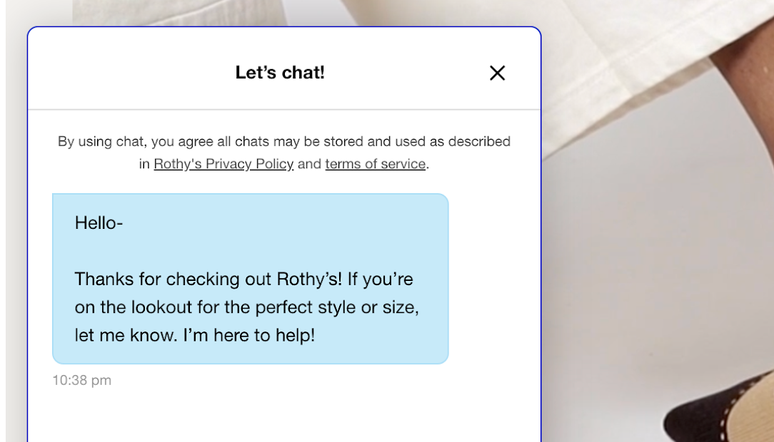
On top of that, Rothy’s smartly integrates a helpful chatbot. Whether it’s sizing, product details, or checkout queries, the chatbot offers instant assistance, making the shopping experience even more convenient.
What seals the deal is the trust Rothy’s builds with its customers. It sprinkles real-life photos and social proof throughout, plus glowing customer reviews strategically placed beside product details.
These touches offer reassurance and confidence to buyers, showing them others have made the same choice—and loved it.
15. Italic
Italic’s product pages perfectly capture the brand’s mission of offering luxury without the steep price tag. Its focus on transparency, quality, and affordability is clear, making it easy for customers to trust the value they’re getting.
The overall approach is simple, offering just the right amount of information to make customers feel confident in their purchase decisions.
Example: Pure mulberry silk pillowcase
Here, the hero element is the comparison table, which boldly places Italic’s pillowcase alongside pricier competitors like Blissy™ and slip®.
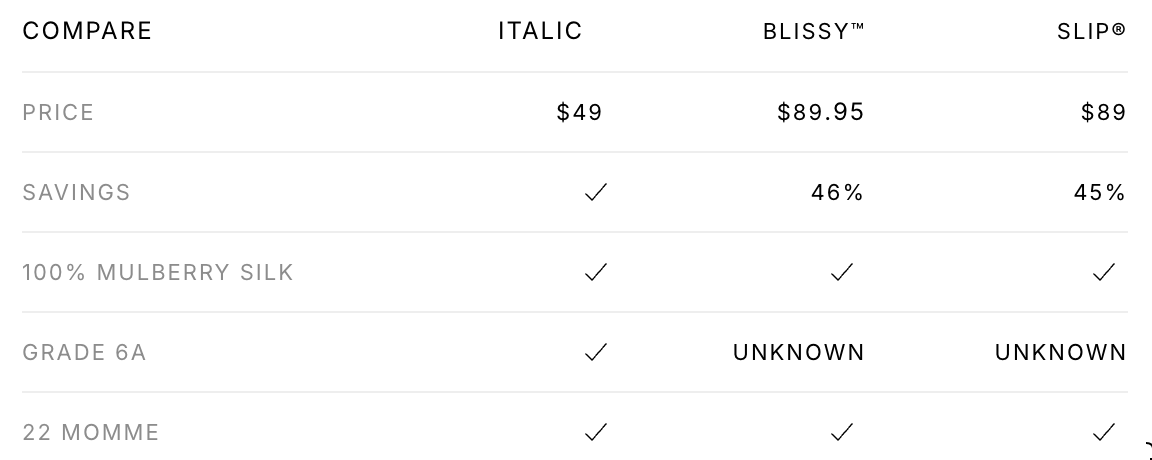
By showing how its product stacks up against these luxury brands, Italic emphasizes how this mulberry silk pillowcase delivers the same benefits as luxury alternatives.
But at a much lower cost. This reinforces the brand's promise of affordable luxury, builds trust, and speaks directly to budget-conscious shoppers seeking high-quality online products.
Additionally, the thorough product details—covering everything from the benefits of silk for hair and skin to precise measurements and care instructions—further reduce any buying hesitation.
16. Superhuman
Superhuman offers sleek, minimalist product pages with just the right amount of fancy.
With smooth animations and an intuitive layout, the site oozes premium vibes, perfectly matching the high-end feel of its product. The clean visuals and smart user flows keep things simple, spotlighting the essential info without any unnecessary clutter—just like the efficiency Superhuman promises.
Example: Enterprise service page
On the Superhuman Enterprise page, a few features really pop.
Right at the top, you’re greeted with the three big benefits: speed, accuracy, and focus. These benefits are front and center, letting potential customers know immediately what makes Superhuman so powerful. It's a quick hit of exactly what busy professionals need—no fluff, just results.
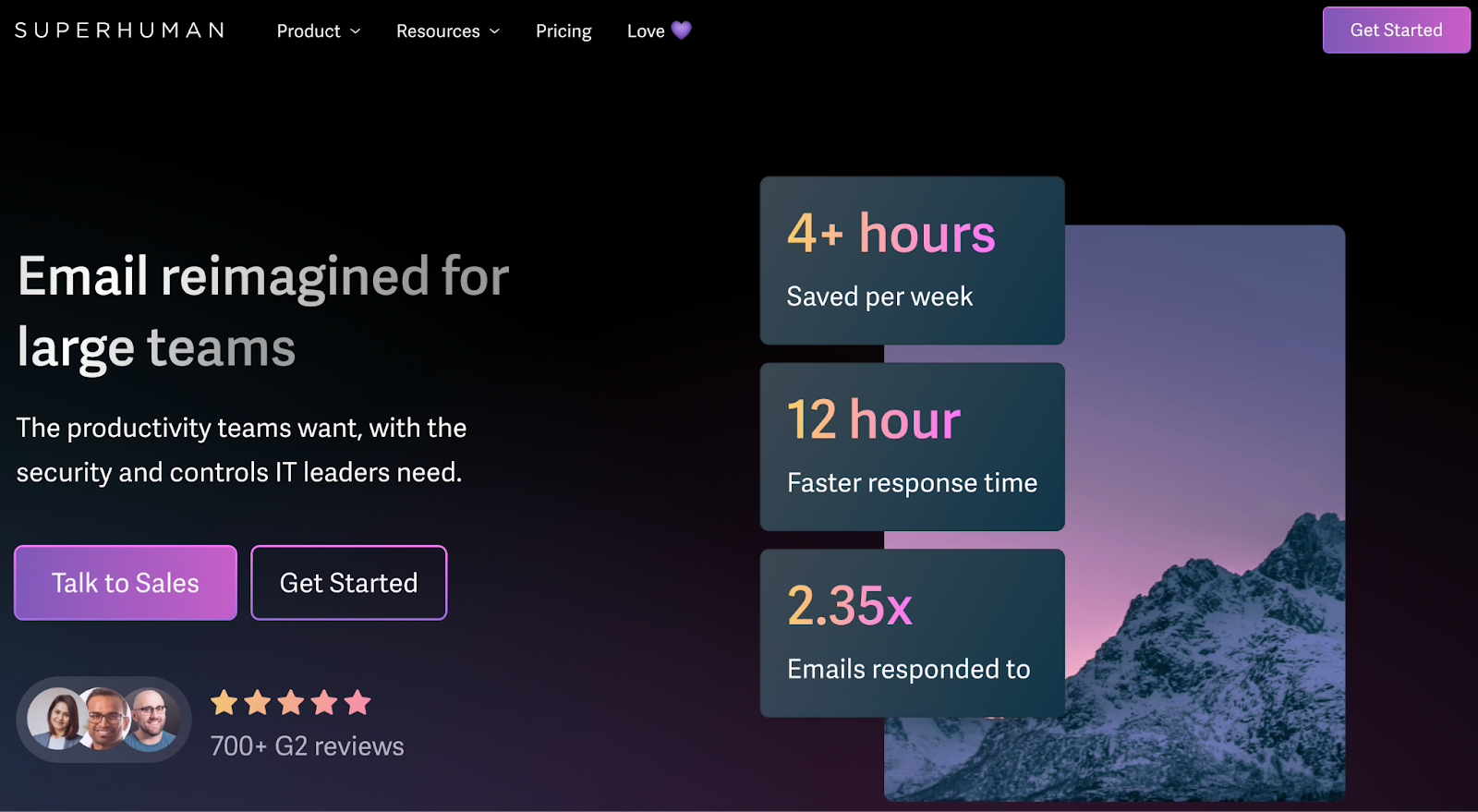
Add bold headlines and real user testimonials to the mix, and you’ve got a perfect recipe for showing off just how much faster Superhuman makes email management.
Another standout? The moving banner flaunting logos of major companies using Superhuman. It’s an instant trust-builder, showing top-tier teams rely on it to keep their workflow smooth.

And then there are the customer success stories, complete with images of real clients. It’s a clever way to humanize the brand and showcase actual people benefiting from the tool.
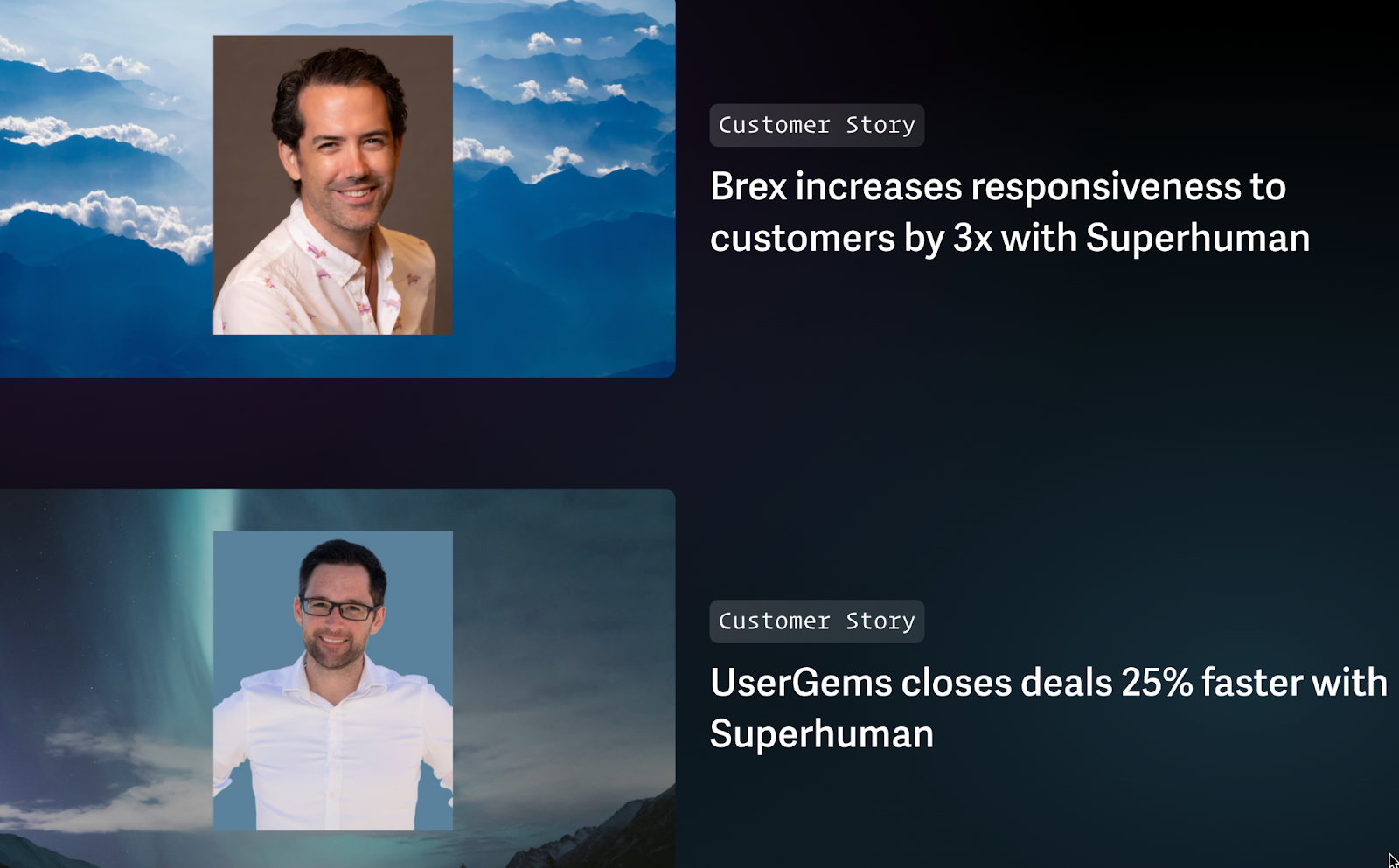
These stories add a personal touch, building social proof while subtly reinforcing that Superhuman is a reliable solution for teams looking to boost productivity.
17. Beardbrand
Beardbrand speaks directly to its target audience: grooming-conscious men. Its product descriptions don’t feel like bland sales copy—they're witty, fun, and engaging, like a friend giving you grooming tips. Even the simplest product feels like it has a story worth hearing.
Example: Utility beard oil
Beardbrand's copy is full of personality and does more than list features—it tackles real grooming issues head-on, making the tone feel personal and relatable. That connection is what keeps loyal customers coming back for more.

Let's not forget the spot-on visuals. Spot on. High-res images let you get up close with the product—the packaging, texture, everything is crystal clear. For grooming products, that’s huge. Customers want to see exactly what they’re buying, and these visuals not only help with that but also elevate the shopping experience.
Here’s something to think about: over half of brands skip adding descriptive text or images for their products, and it costs them conversions. Not Beardbrand. Instead, it goes deep into explaining the benefits of every ingredient, especially when it comes to scent and beard health.
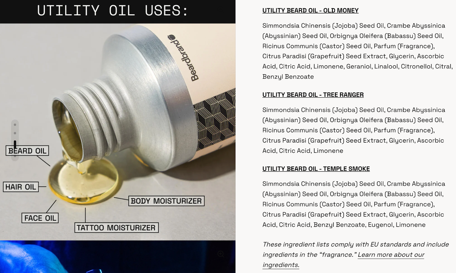
This kind of detail shows they know their stuff, making customers feel confident about what they’re buying.
18. Allbirds
Allbirds' approach to product pages emphasizes clear messaging on sustainability and eco-friendly materials, balancing product details with a strong narrative about their environmental impact. This helps educate the shopper without making it feel like a lecture, keeping the vibe light and engaging.
Example: Men's wool runners
This page puts the spotlight on the shoe’s sustainable materials—Merino wool and low-carbon production—letting shoppers see how their purchase aligns with Allbirds’ eco-conscious mission. Think: “Here’s what you get” and “Here’s why it matters” for environmentally savvy buyers.
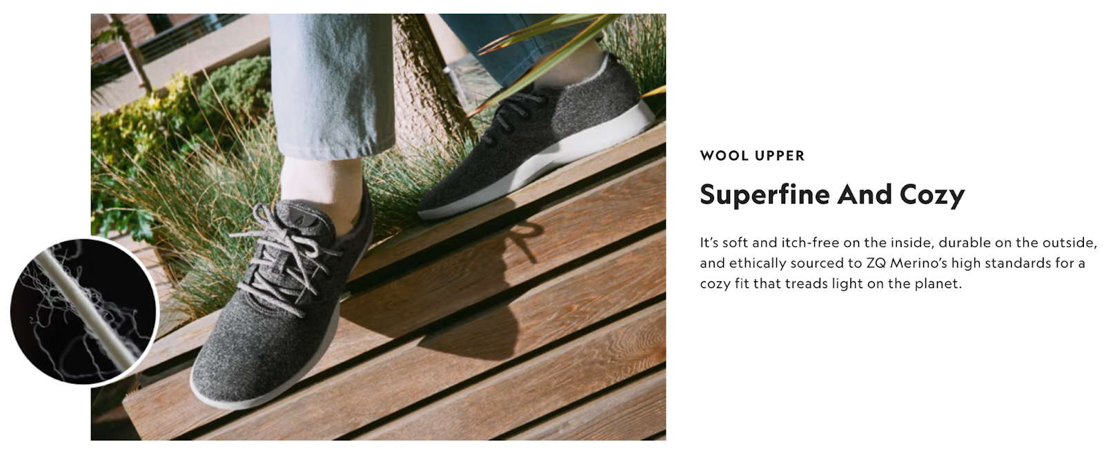
The clean and minimal design, with crisp product images from multiple angles and lifestyle shots, helps the shopper imagine slipping on these comfy runners. Plus, the color options make picking favorites super easy.
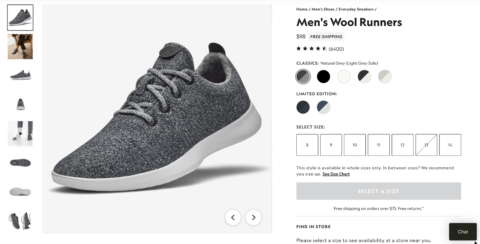
Practical details like price, available sizes, and a simple size guide are right up front, so there’s no hunting around for the basics. There's also a chatbot in case anyone needs more help. And for those on the fence, the page rounds things off with customer reviews, giving that all-important peer validation to help seal the deal.
19. Casper
Buying a mattress can feel like a big decision, but Casper knows how to ease this pressure. Its product pages offer all the details you need without overwhelming you. From clear product breakdowns to technical images and real customer reviews, Casper makes the shopping experience feel effortless.
Example: Snow mattress
Instead of just listing features, this product page invites you to “Take a look under the covers,” revealing its six-part construction:
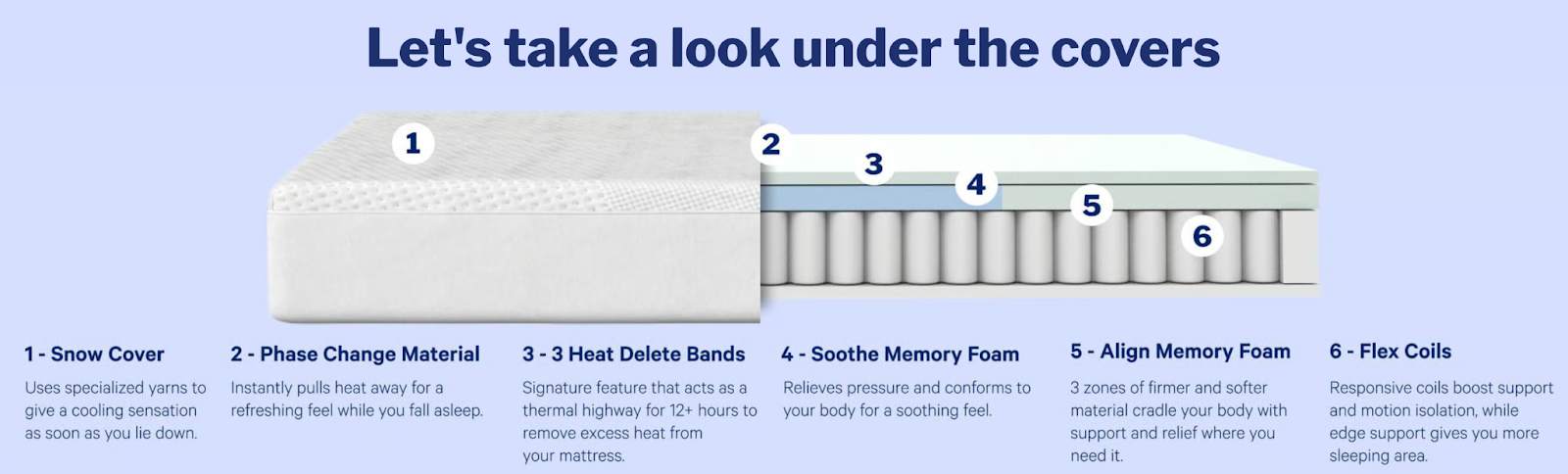
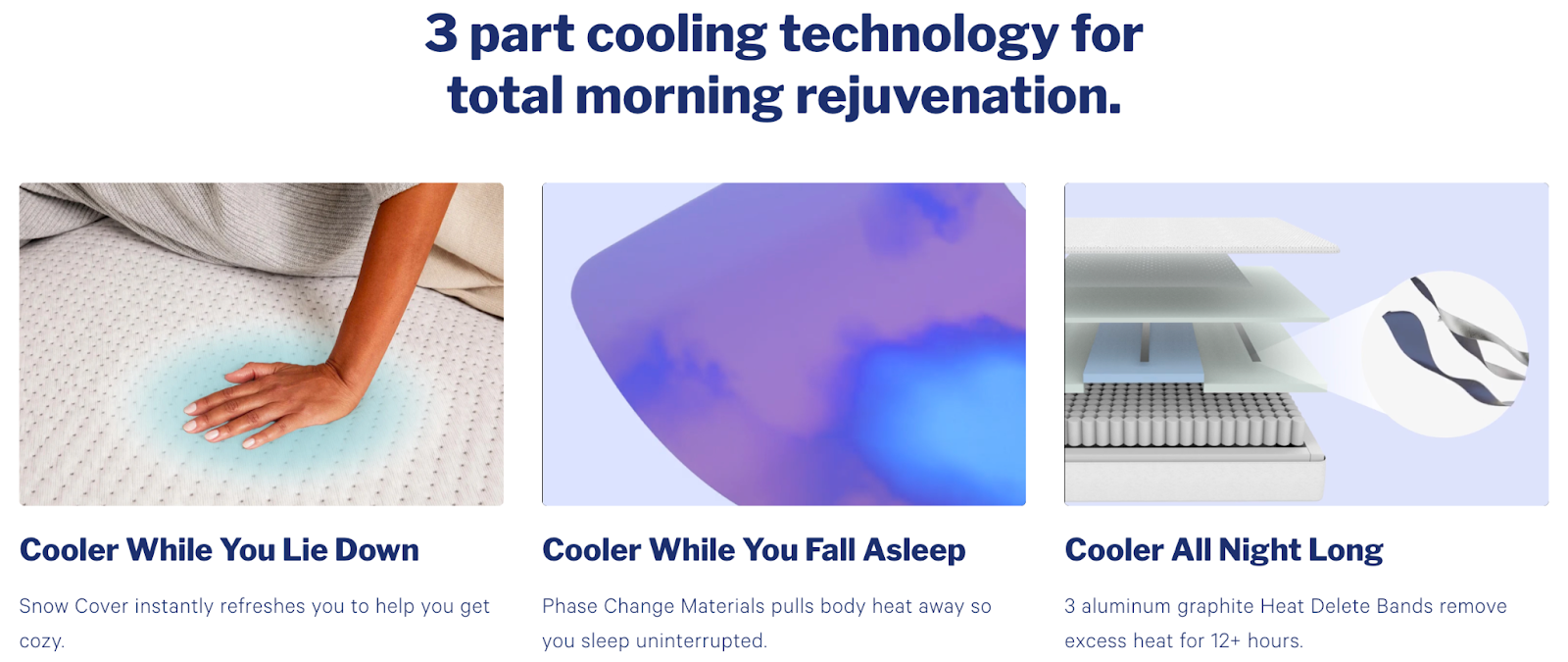
This transparency gives you a real feel for what you're getting. Casper even breaks down the cooling tech into three parts, making it crystal clear how the mattress will keep you comfortable:
Additionally, comparisons with competitors and direct access to Casper's Sleep Specialists build trust, while a quick list of perks (10-year limited warranty, 100-night risk-free trial) in the end gives shoppers extra reassurance.
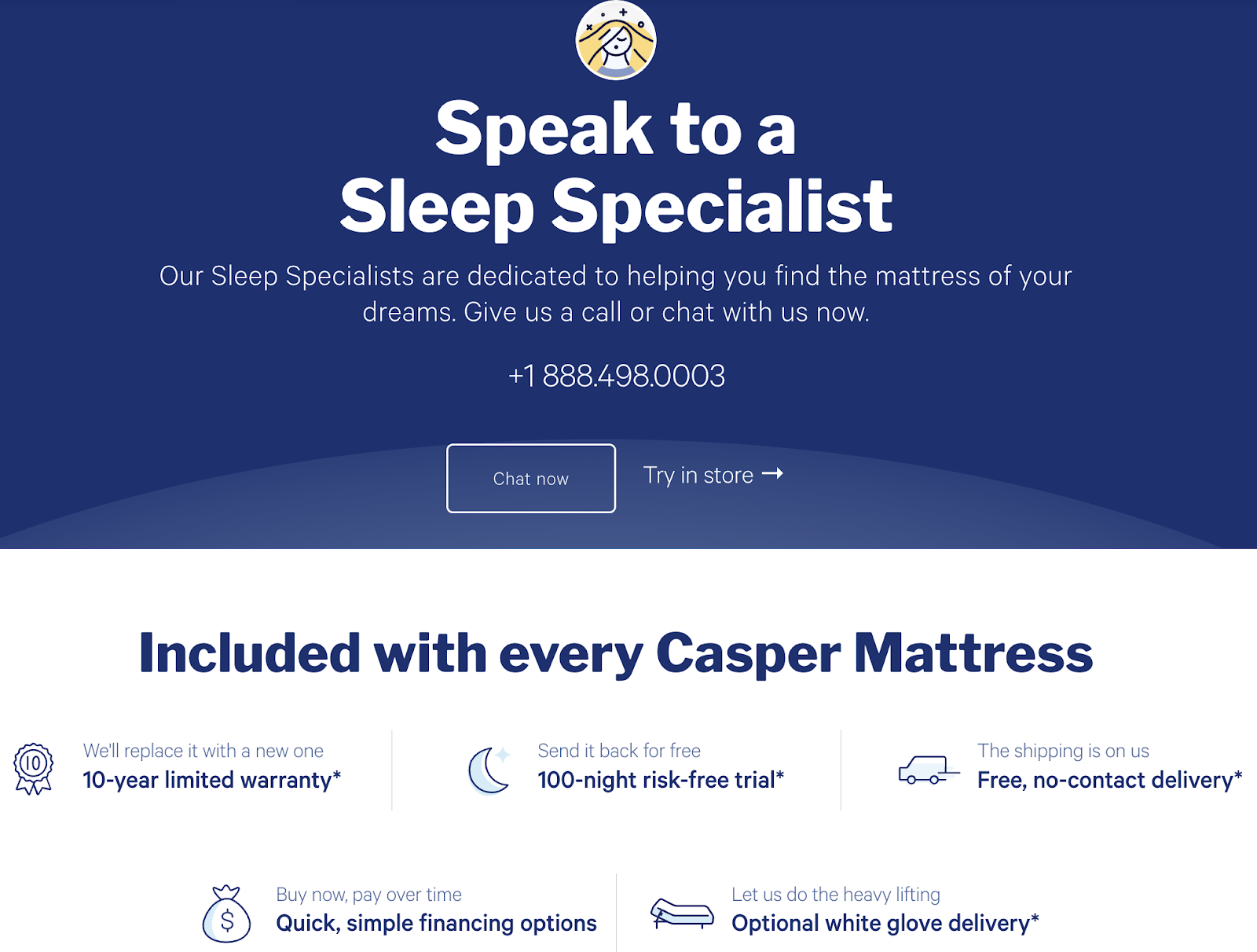
By making technical details digestible and presenting helpful resources, Casper builds confidence and invites customers to make informed, worry-free purchases.
20. Aurate
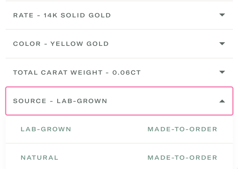
Aurate masterfully blends luxury with sustainability, and its product pages reflect that effortlessly. The jewelry brand doesn't just sell jewelry—it tells a story about quality, transparency, and craftsmanship. With lab-grown diamonds and ethically sourced metals, Aurate makes sure shoppers feel great about their purchases.
Example: Diamond solitaire pendant
This product page goes beyond a standard description, guiding the shopper through the crafting process and highlighting the premium materials and ethical practices behind each piece. This makes the shopper feel like they're not just buying jewelry but investing in something meaningful and luxurious.
Visually, Aurate nails it too. Crisp, detailed images make it easy to imagine the pendant in their hands. The brand also doesn’t skimp on details—visitors get all the specifics on the diamond’s cut, clarity, and size.
And the 360-degree view? It's a game-changer. Shoppers get a full look at every angle, bringing that in-store vibe straight to their screen. It helps them visualize exactly how it'll look when worn, bridging the gap between online and in-person shopping.
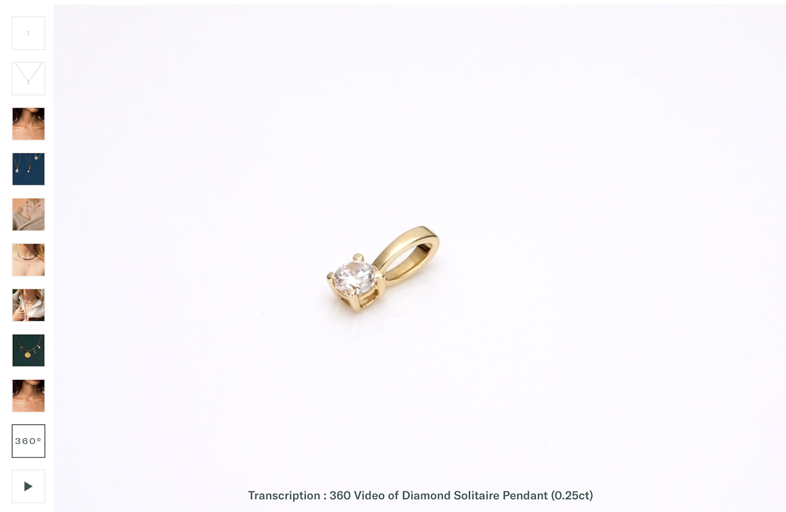
With customization options for chain length and gold color, the overall shopping experience feels even more personal.
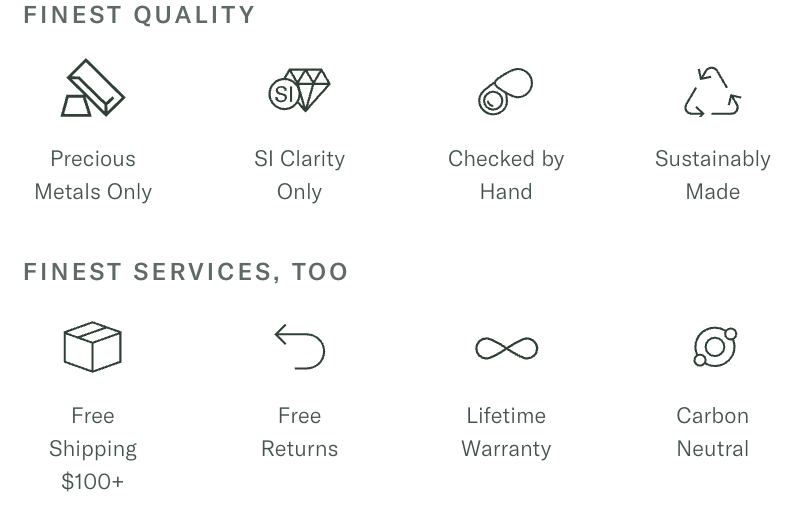
Aurate also ensures a seamless shopping experience with its clean, user-friendly layout, free shipping, lifetime warranties, and clear policies. The brand prioritizes making the process both smooth and satisfying for its customers, and it shows.
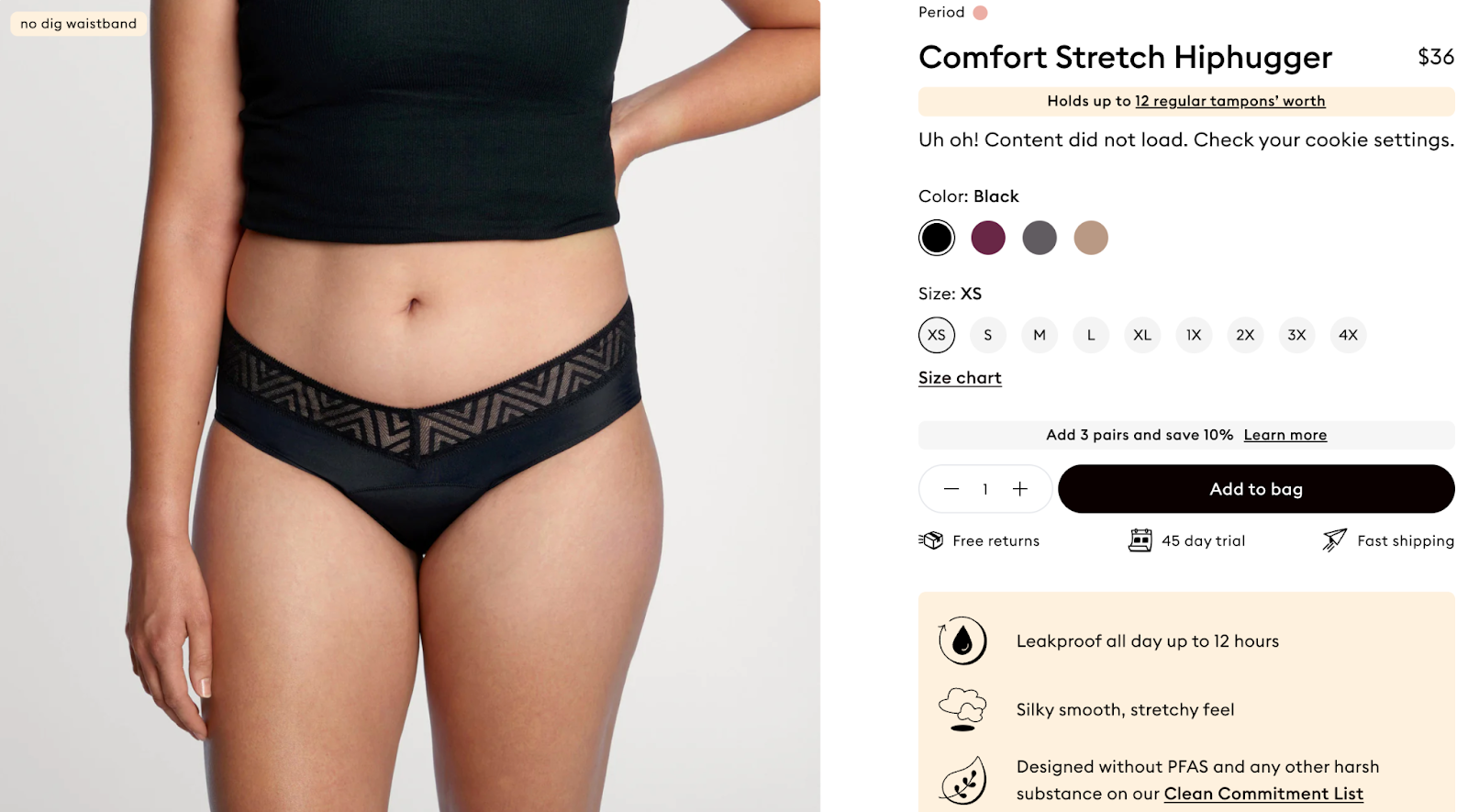
21. Thinx
Thinx does a great job of making the shopping experience educational, empowering, and seamless. Its product pages normalize menstruation, presenting the brand's offerings as practical, stylish solutions rather than something taboo. How? By highlighting the product benefits and ensuring customers feel confident in their choices.
Example: Comfort stretch hiphugger underwear
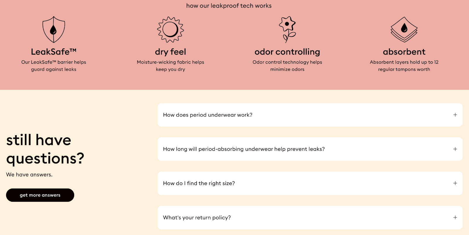
Thinx doesn’t just tell you what the product is—it dives into how it works, answering questions before the visitor even thinks to ask. Diagrams and a well-placed FAQ address important details like absorbency, fit, and care, and a clear explanation of its leakproof technology educates how it prevents leaks.
This approach reduces the hesitation or uncertainty a shopper might feel, especially when buying a relatively new product category like period underwear. This level of transparency makes shoppers feel reassured about the product's reliability.
Next come the inclusive and practical visuals. By featuring models with different body shapes and sizes, Thinx helps customers visualize how the product will fit them. A handy usage guide also shows how the Hiphugger can be paired with other period care products, emphasizing how easy it is to incorporate into an existing period care routine.
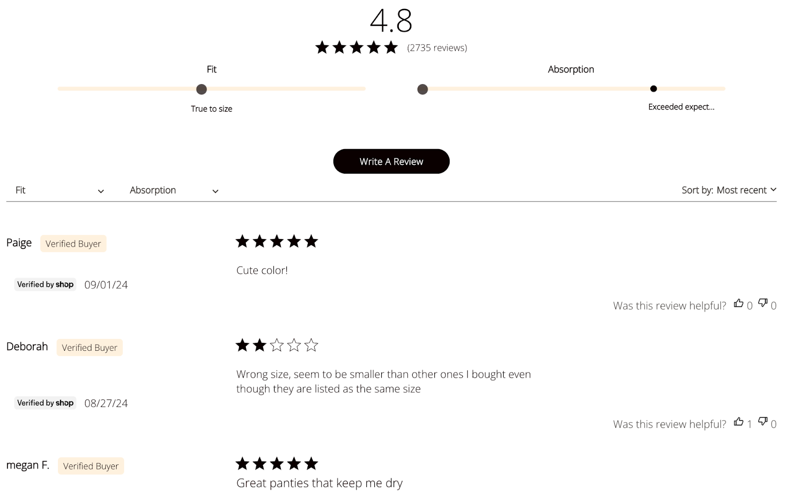
Given that period underwear is still relatively new to many, Thinx highlights customer testimonials in just the right way. Real-world feedback from users on heavy flow days or overnight use adds a level of trust that goes beyond what the brand promises. Consider it social proof to help convert those on-the-fence visitors into customers.
The product page itself is clean and easy to navigate. No clutter, no distractions—just a clear focus on what matters: the product’s features and benefits. It’s all designed to help customers easily explore the website.
Follow these best practices when crafting an ecommerce product page
Follow these best practices to make sure your product pages engage and convert:
- 🏆Prioritize Your Above-the-Fold Information
When someone lands on your page, you’ve got seconds to grab their attention. That’s why the key details—product name, price, main features, and a clear “Buy Now” button—should all sit above the fold. It speeds up decision-making. Blume, for instance, does this perfectly by placing the price and size of their products front and center. This strategy works particularly well for customers already close to buying. - ✍️Write Detailed, Benefit-Focused Descriptions
Your product descriptions should go beyond listing features—they need to show why the product matters. Thinx nails this by simplifying complex tech (like its multi-layer absorbency) into easy, relatable benefits. It not only explains how the product works but also reassures customers about performance in real-life situations. The key is to connect emotionally and practically with the customer. - 📹Incorporate Product Videos and Interactive Visuals
Today’s savvy shoppers want more than just static images—they want to see the product in action. That’s where videos and interactive visuals, like product demos or 360-degree views, come in. In fact, 90% of customers say product videos help them decide what to buy. Brands like MVMT know this well, using visuals to showcase how its watches look and feel on your wrist, making the shopping experience feel more real and informative. The fact that videos also break down complex features in a way text can’t is another advantage. - ⭐Use User Reviews and Testimonials as Social Proof
Many shoppers are hesitant to try unfamiliar products. By incorporating reviews and testimonials directly on the product page, you can provide valuable social proof to build an extra layer of trust. For instance, Casper prominently displays customer testimonials to explain how its mattress ensures a good night's sleep. This removes any last-minute doubts, especially in categories where the product is a big investment. - 🚢Clarify Your Shipping and Return Policies
Surprise fees at checkout? No thanks. Shoppers hate that, and it’s a major reason for cart abandonment—18% of users drop off when they can’t see total costs upfront. Clear shipping and return policies right on the product page help avoid this problem. Beardbrand, for example, has a dedicated FAQ for shipping and returns, easing customers' worries before they even hit "buy." This kind of transparency builds trust and makes the buying decision easier.
Launch your ecommerce business with Whop
Starting your ecommerce business should feel exciting, not overwhelming. A great product page isn’t just about listing products—it’s about creating a smooth, engaging experience that builds trust with your customers and turns clicks into conversions.
If you're selling digital products, software, exclusive content and community access, Whop can make the whole process easier. From payment processing to customer support, Whop has everything you need to manage your business in one place. Plus, with Whop’s pay-as-you-sell model, there are no upfront costs, so you can focus on growing your business with zero financial pressure.
Check out Whop for yourself to see exactly what the all-in-one platform has to offer.